
|
stocks & Markets blog |
|
I don’t want to spend hours and hours on this because I had a heavy day on Twitter yesterday taking a complete battering from all the ‘Long Only’ merchants and I wrote a fair bit on a Blog last night about what is happening on the Macroeconomic side and my Strategy to cope with whatever way the Markets move. You can find that Blog below this one and I suggest you read it with an open mind and don’t get psychologically wedded to a stance one way or another – in this game we need to be flexible and have a Plan which can quickly adapt.
Allowing yourself to suffer immense Cognitive Dissonance and to get Emotionally strung-out is not an effective way to manage Risk and make money in the Markets.
I have spent most of this afternoon chatting to mates on the fone who are very worried about the state of the Markets and the outlook for Economies. It is obvious to me that people are getting quite jumpy and the common attitude is to take some money off the table. This seems very wise to me and it astonishes me how some very experienced Investors seem to be doing impressive impersonations of Ostriches.
My main focus here is to look at the Long Term picture and to figure out where significant Support is from previous years but I will also look at the very Short Term picture because the US Markets have a cracking setup for a Bounce, and if they fail to manage this on Monday and Tuesday and drop below Support from the Low on Friday, then things are really ugly. As always the Charts I show are from the excellent SharePad software I use and in theory if you click on them they should show more detail and get bigger. However, I have been having problems recently with the Upload of Images to Weebly and I have been in conversation with Weebly Support about how to fix it but as yet it is still a pain. I will try a different method tonight which may or may not work. You should be able to see enough to understand what is going on and my words should make it clear anyway. If you look at your own Charting Package/Website then you can get more detail that way. S&P500 First up a very long-term Chart of the S&P500. My Red Line (marked by my Red Arrow) is pointing to an area that should be very strong Support down around 1600 and if we go this low then things would be truly horrific. My gut feel is that this will not happen but of course anything is possible. More important is the Blue Support Line marked by my Blue Arrow. This is crucial because as long as that Blue Support Line holds, then things may not be too ugly – I will drill in to that on the next Chart. 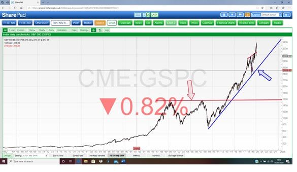
Here I have reduced the timeframe to mostly where the Blue Support Line is. If we focus on this, the Price can drop back to about 2600 and be nicely within the confines of the Blue Support Line but it must move up off this Line. If the Price falls below 2600, then it sets up Support where my Black Arrow is which is at about 2350. I think that is a very strong level of Support.
If that fails, then we drop down to a wide Support Zone where my Black Ellipse is which runs from about 2200 to 1850. 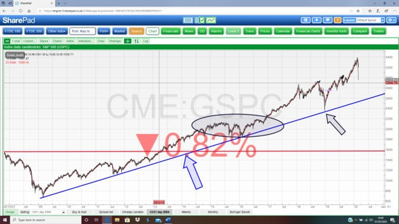
I have zoomed in again on the Chart below. Ignore the Wavy Lines as we will come to those in a bit – at the moment we are working Strategically and high-level. My Black Ellipse shows a Zone of Support just below the Low Point of Friday and the Key Level here is 2800. If that fails, then we set up 2700 as Support where my Green Arrow is. If that fails, then we get into the Blue Line which I mentioned on the previous Charts (you can see it here a little bit) and this means Support at around 2600. If that fails, the Support at 2350, which was pointed at with the Black Arrow on my last Chart, comes into view.
So that’s the big picture, let’s now look more short term and why I think there will be a Bounce (I would love this because I am Short on the S&P500 – see my ‘Trades’ page on WD1 – and I would like to Short a bit more. However, if Support from the Low of Friday fails then I will be Shorting more on Monday Night most likely).
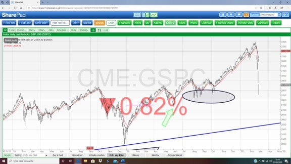
Before we do that though, I will just cover a couple more Indicators as well. On my Chart below my Black Arrow is pointing to a ‘Bear Cross’ between the Black Wavy 13 Day EMA Line (Exponential Moving Average) and the Red Wavy 21 Day EMA Line. This is probably my favourite Indicator and gives very clear and reliable Signals. Until we get a ‘Bull Cross’ where the Black Line moves above the Red Line, this Market is Bearish and is weak. The beauty of this Cross is that it has plenty of ‘room’ for Bounces without giving False Signals. You can see a Bull Cross back in October 2019 and that predicted an incredible run up. My Blue Arrow here is pointing to a belter of a Hammer Candle and after the rapid plunge last week, this is a superb Reversal Signal and suggests a Bounce. We cannot know how much of a Bounce it will be but my sense is that it will be very much a ‘Dead Moggy’ and the key thing to watch is those 13/21 Day EMA Lines. The Low of the Hammer on Friday was 2855. If that fails as Support, things are getting nasty. An inability to Rally off such a strong Bullish Signal is a big indication of weakness. 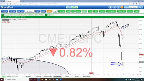
Another excellent predictor of a Bounce on the next Chart (“you can’t time the markets !!”) where my Black Arrow in the bottom window is pointing to an RSI Reading of 22 (Relative Strength Index) and it should be obvious that this is extremely low. My Blue Ellipse is highlighting where the RSI dropped to in the Credit Scrunch.
FTSE100
OK, that’s enough on the S&P500 and I will try to whizz through the FTSE100 so I can close this off. Below is the big picture for the FTSE100 and first off look at my Red Line that is pointed at by the Red Arrow. This is near-term Support and if you look where the Price is from Friday, it is around this Line and it must bounce up now. The important Level here is 6500 and if that fails there is more grief to come. Below that, 6000 is Support and then 5500. On the extreme side (and I doubt this will happen but it could) my Black Line with the Black Arrow is key. This is Support at about 4900/5000 and if that fails then the Support from where my Green Arrow is at 3300 comes into play. I cannot imagine that happening but it might. My Blue Arrow is pointing to a Blue former Support Line at about 6950 and because this has failed, it now becomes Resistance so expect the FTSE100 to find this area tough if we do bounce. 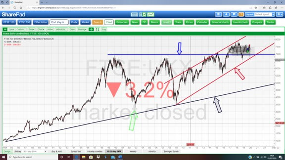
On my next Chart I am looking at the 13 and 21 Day EMA Lines again and where my Red Arrow is we had a ‘Bear Cross’ and until this reverses with a ‘Bull Cross’, this Index is in Bear Mode.
My Green Arrow points to a Big Down Candle from Friday and the Low was at 6460 which should be Support. If that fails things are bad. This Market Closed before the US rallied on Friday evening so I suspect that if the US Bounces, then the FTSE100 will be dragged up with it. Please ignore the other Arrows and stuff. 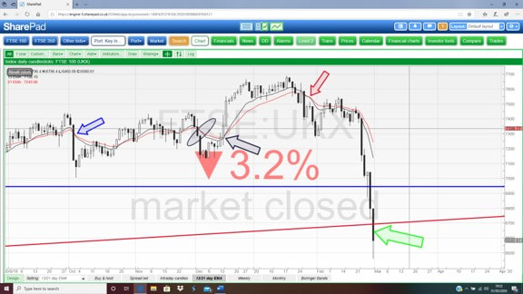
Finally we have the RSI for the FTSE100 Daily in my bottom window. Where my Black Arrow is we are on an RSI of 20 which is crazy low and about as low as it ever gets. Of course it could drop lower, but that is extremely unlikely and is consistent with my view that we will get a Bounce of some sort.
Right, that’s it. Good luck for the coming ‘fun’ and think hard about your Exposure on both the Long and Short side of things and don’t get wedded and emotionally entrenched to one particular direction for the Markets. Think flexible and stress-test how you Portfolio is positioned. Cheers, WD. 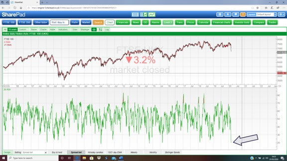
0 Comments
Leave a Reply. |

Stocks & Markets WheelieBlogsThese tend to be more Markets and Stocks related and timely - the Blog Page on the Main WheelieDealer Website has the 'Educational' stuff (well that's the theory anyway !!). Archives
October 2021
Categories
All
|
