

|
stocks & Markets blog |
|
I am starting this on Saturday Night again and trying to watch the Formula 1 Qualifying at the same time !! It is so nice to have a nearly decent sport back on the tellybox again, and I guess it could be viewed as another slug-like slow step to semi-normality. Hopefully my health aggro will not prevent me cracking on with this and as I start I am feeling quite good and perhaps I will be able to get a lot done before having to abandon it.
“A work of art is never finished, it is just abandoned…….” The title this weekend relates to something I want to highlight when we get to the Charts bit, which is essentially how an extended RSI reading (Relative Strength Index) to the upside (pretty much without exception), predicts a falling Price not long afterwards. We have been treated to 2 excellent examples of this just recently and I will show both of them.
Of course, the other big development this week is that we issued Podcast TPI 45 on Friday and this one has an extremely Special Guest in the form of Tim Rogers (@timrogers1962 on the tweets), who is the former CEO at AB Dynamics ABDP, the vehicle testing specialists. Tim’s views on the future of the auto industry are particularly worth listening to and I also picked up a lot on his humble approach to investing, whereby he realizes his limitations and his life aims/goals, and he therefore in effect outsources management of his money to other people (and his Japanese Motorcycle collection).
As always you can find the ‘Twin Petes Investing’ Podcasts on pretty much all the big platforms, and you will find them at the ‘Conkers Corner’ channel on the likes of Apple, Audioboom, Spotify, YouTube, Overcast, Google+ and probably a few others. This link will get you it on Soundcloud: https://soundcloud.com/user-479955511/conkers3-wheeliedealer-45-winning-stocks-tsla-vs-vow-bmy-abdp-hfd-pets-gaw-ixi-sdg-ai Last Week Well that was quite a strange one. It seemed like very hard work at the start of the week and I was really surprised when I realised on Thursday Night that I was up a tiny bit for the week. So I was even more surprised when I saw how strong Friday was and as a result, my Portfolio ended up gaining 1.2%, so I am really happy. In fact, my Portfolio is just a tiny bit away from its All Time High (which it hit midweek, 2 weeks ago) and I will be immensely happy if the last couple of days of March go ok and I can put in a nice score for that month. In terms of Strategy, I am pretty much doing nothing. I have had some idle thoughts about perhaps switching out of Glencore GLEN and into a Mining Fund like Black Rock World Mining RBWM; but at the moment I am really unsure. I want exposure to Mining but GLEN bothers me because of its appalling ESG (Environment, Social stuff and Governance) aspects and I worry that any minute some sort of corruption scandal could erupt and the Shares will get whacked. This seems to be a challenge with all the big miners (and the little ones !!) and having a Fund might spread the risk more. I am just toying with this at the moment. I then wonder if I should even bother with mining anyway….. Other than that, I have a tiny Short (just 3% of my Long Portfolio) on the Nasdaq 100 and it is a right choppy little devil. I am certainly of the view that Tech is crazily overvalued in many instances and not only that, the mood seems to have shifted from hot growth stories over to more ‘old fashioned’ stuff. I will keep a close tab on it and if I get a clear signal, I will short a little more. I still want to buy something in my Income Portfolio and Supermarket REIT SUPR is right at the top of my list, but I am preserving Cash and being cautious because March/April can be dodgy months. Oh, I have another potential Takeover in the form of Cambria Automobiles and also Telit Communications TCM has come up for a Bid again – so perhaps I will have some Cash and a couple of spare Slots very soon and that means I will get serious about looking for new holdings. I mentioned a very interesting Stock in the Podcast which I am quite attracted to. Blog Slate Unfortunately there is no news here. I have got nowhere with that LOK Blog but I noticed that the list of potential Stocks for the ‘Little Black Book’ is building up and if I get the chance, I will update that in the coming week. Once we get to the end of March, I will need to update the ‘Monthly Performance’ page but that might slip another week. Ah, I did do some housekeeping trades which are on my ‘Trades’ page – bit irritating as I booked some Losses but they were tiny positions and I am not going to get too upset about it. From the Dim and Distant past……. If you go to the ‘Blog Index List’ page on WD2, then you will find all the blogs I have written since WD started many moons ago listed there. The ‘Educational’ ones all have Links and the more recent ones all have Links as well. There is a huge archive here and it is well worth taking advantage of. From this list I bring you the following blog from pretty much exactly 2 years ago: https://wheeliedealer.weebly.com/educational-blogs/you-dont-need-to-be-einstein-to-invest-well-but-rules-and-discipline-can-help Let’s look at that RSI stuff then….. Extreme RSI Readings All the Charts I show are taken from the excellent SharePad software that I use and if you click on the images then they should get a bit bigger on your screen (I recommend you read these Blogs on a big screen rather than just a Fone – there is a lot of detail to be seen). If you fancy using SharePad or ShareScope yourself, then you can get 1 month’s Free Data if you go to the ‘Subscribe’ page on their website and then select the Product you want, and then you should see a ‘Promo Code’ box and if you type ‘twinpetes’ into that box, then the discount will apply. You can also get this by clicking on the Adverts that are all over my websites. I get a small payment for introducing you, so thank you very much !! https://www.sharescope.co.uk/ My Chart below is for Gold Composite and in the bottom window, we have the Relative Strength Index (RSI) for the Daily Chart. My Black Arrow is pointing to where the RSI got extremely Overbought and it was this way for a sustained period of time – another condition which I tend to find leads to big falls ahead. My Green Horizontal Line is at RSI 91 and bearing in mind that, in general, something is Overbought if it gets up to RSI 70 (in reality it varies by the Asset concerned), a Reading of RSI 91 is pretty nuts. If you look in my top window, then this has the Price Chart for Gold Composite at the same time, and I have been a bit lazy in not changing the format of the Candlesticks which in this case are Heiken Ashi ones; however, they make the point that the Peak in Gold up over $2000, also coincided with these extended RSI Readings and then we got a big drop. Go back and see for yourself and look at the history for Gold and you will see that RSI Levels have rarely been this extreme. People simply got over-excited and lost control of their minds (and their Wallets and Computer Mouses !!). 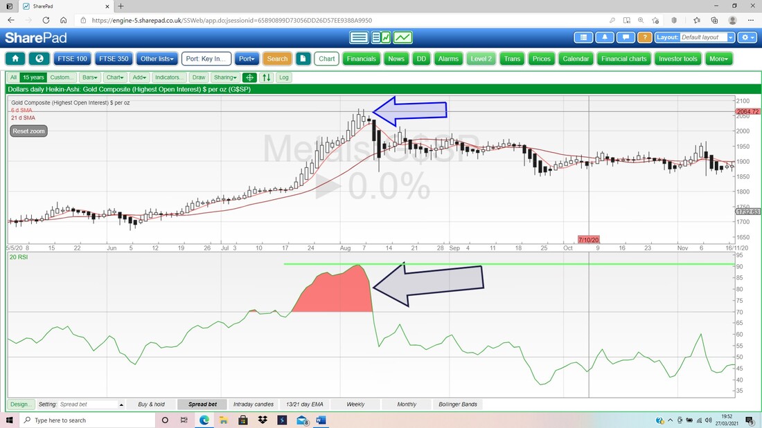
And we have sort of had a similar thing playing out with US Tech in the form of the Nasdaq 100 below (this is the one I have a tiny Short Spreadbet on).
If you look towards the left of the Screen below at the RSI Readings for the Nasdaq 100 Daily in the bottom window; then you should see my Black Arrow pointing to the Red shaded Peak which is marking an extended RSI level up at RSI 82. If you then look up at the top window, you should see that the Price did a Peak and then dropped back. So in that instance, a High and Overbought RSI, led to Price falls. Things are a bit different as we get nearer to today though. In the bottom window where my Blue Arrow is, we have an RSI Reading of RSI 72 which is a bit Overbought but not much. That led to a bit of a Pullback but nothing much and the Nasdaq 100 went on to further Highs. However, look at the Black Sloping Line in my top window and note how it is sloping upwards. If you now look at the same chunk of time in the bottom window, then you should see that my corresponding Red Line is sloping downwards. This is what is know as a ‘Bearish RSI Divergence’ and in this case a falling RSI was predicting a drop in the Price of the Nasdaq 100. Clever, innit? 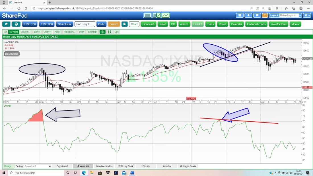
In a similar way, Oversold Readings of RSI like when it gets down to RSI 20 or something (RSI 30 is generally seen as Oversold), are excellent predictors of a Bounce.
Another Learning Point I was ‘chatting’ (ok, TXTing) with my mate Martin who I used to go to college with (@InvestingMartin on the Tweets), and he made the following comments: “Realised my biggest short coming with SharePad is not my ability to read a chart or understand them, but the lack of support and resistance lines I draw. Making a real conscious effort to write more notes on charts and draw more trend lines, support, resistance, coloured arrows at turning points etc.” I totally agree with this. I suspect that these days I don’t do it as much as I used to but certainly when I first got drawn into the murky world of Charting I used to do this all the time. It most likely helps build ‘muscle memory’ when it comes to ‘seeing’ particular Chart patterns and after many years of training my brain in this way, I am certain it pays off. Martin also makes the important point that these annotations he puts on the Charts are there next time he logs into SharePad and in that vein I think as a general principle it is useful to extend your Lines into the future (there is an Option to do this); although of course in some cases you don’t need to do this, and you can always turn the ‘extend’ aspect on and off. Nasdaq 100 I am starting with this one because I have that little Short and I want to know what to do next with it !! My first Chart is the Monthly Candles for the Nasdaq 100 and the first thing to note is that the Candle for March is not yet valid, because of course we still have 3 days to go. However, being this near the end of the month, it does give us some clues as to what is most likely to play out and I will now look at that. My Blue Arrow is pointing to a nasty looking ‘Bearish Shooting Star’ for February and this follows a ‘Long Tails Doji’ from January, so already the Bulls were getting a lot of challenge from the Bears. The way the Candle for March is playing out, at the moment this looks mildly Bearish as the Peak from February could be a ‘Turning Point’ downwards. Really it looks like a tussle between Support at 12208 and Resistance from the ATH at 13880. 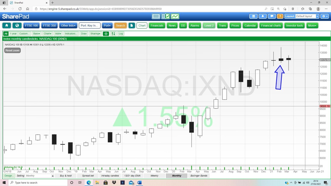
Next the weekly Candles for the Nasdaq 100. My Red Arrow is pointing to a Long Tails Doji from last week and this just shows indecision (this is about context – if we had seen a big run up, or a big drop down before, then a Long Tails Doji could be a Turning Point. In this case the Nasdaq 100 has been sideways).
My Blue Arrow is pointing to the Candle from the week before, and this is a ‘Bearish Shooting Star’ and really again we are talking about a tussle between Support and Resistance. The Peak where my Blue Arrow is was at 13297 and down below we are talking about Support at 12208 again. If the latter level fails, then expect more falls. 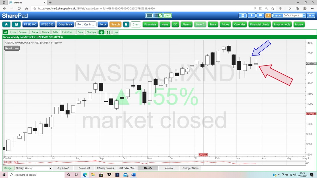
My Chart below has the Daily Candles for the Nasdaq 100, but we are really looking at the Black 13 Day EMA Line (Exponential Moving Average) and the Red 21 Day EMA Line. My Blue Arrow is pointing to a ‘Bear Cross’ between these 2 Lines and this means we are in ‘Bear Mode’ and being Short is the best stance to take at the moment.
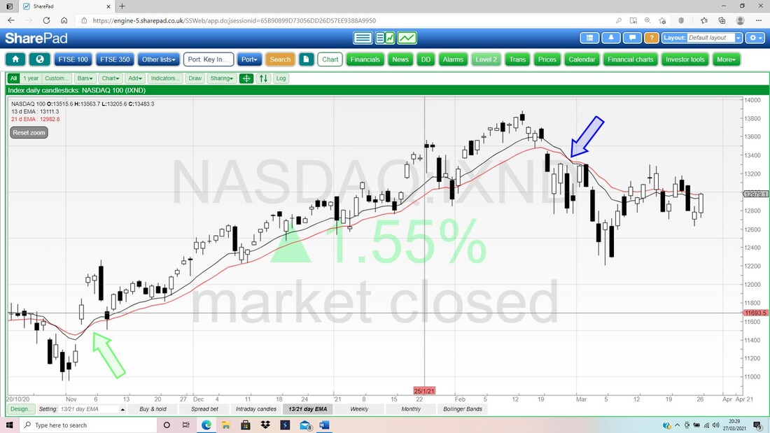
Finally for the Nasdaq 100 we have the Daily Candles with the Pink Zone marking the Upper and Lower Bollinger Bands. This is pretty sweet for Technical Analysis geeks because of how my Green Arrow is pointing to that big White Up Candle from Friday; but note how the push up halted bang on the Red Bollinger Band Midpoint Line (Red Arrow) and it is very possible that it turns down from here.
My Blue Arrow is pointing to a ‘Bearish Shooting Star’ and note how that predicted the move down. My Black Arrow is pointing to a Downtrend Resistance Line and the Nasdaq 100 needs to Breakout of this Line if the Bulls are going to get a grip again. I suspect that will be difficult. 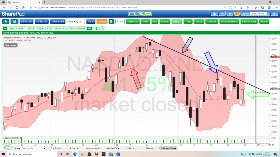
FTSE100
Normally I would look at Oil first but this time I fancy a change !! First up I want to see how the Monthly is shaping up. Yet again the Candle for March (my Blue Arrow) is not yet valid but it gives us a good idea of what is likely to play out and it also highlights what the FTSE100 needs to do over the next 3 days. I am liking this. My Red Arrow is pointing to a ‘Bearish Shooting Star’ Candle for January and we had the delights of a similar Candle in February. The most important thing here is that these Candles have not acted as ‘Turning Points Down’ and the fact we have risen up for most of March so far is very promising for Bulls. The important thing now is to at least maintain the achievement for March so far, or even better, to take out the High of January at 6903, which would bring 7000 into view. 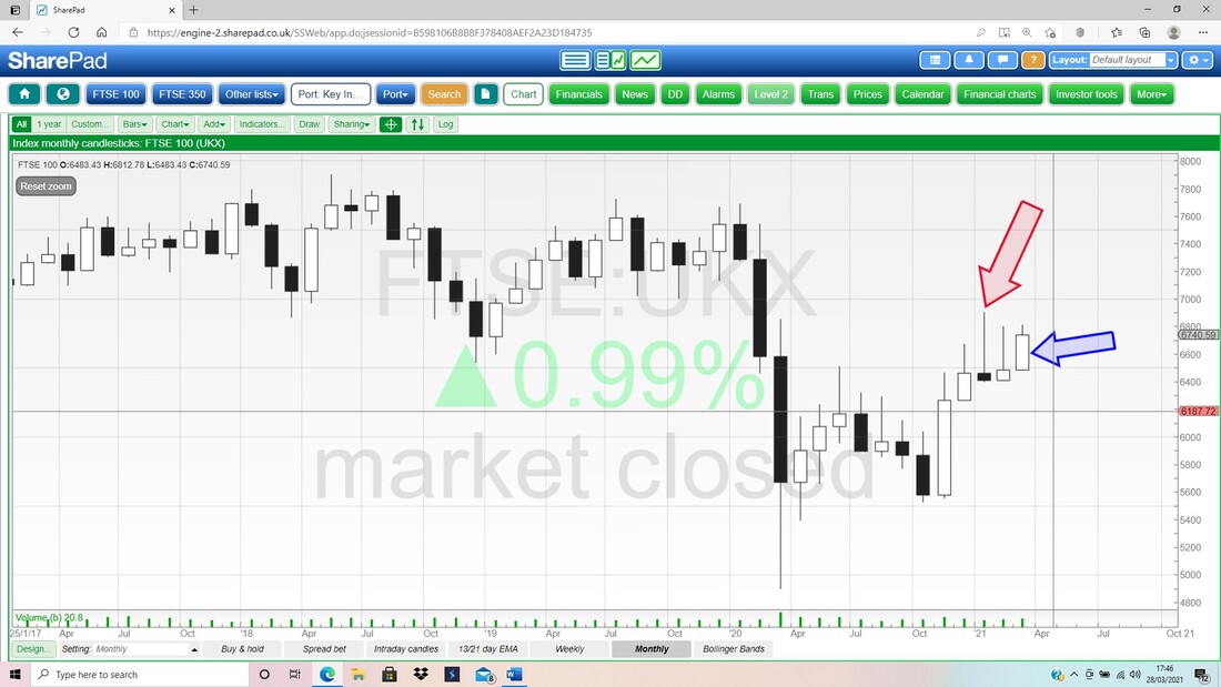
Next the Weekly for the FTSE100. There is quite a lot of important information encapsulated in this Chart – and that in itself highlights why an understanding of simple Technical Analysis is very helpful.
First up, my Blue Arrow is pointing to a sort of Hammer Candle where the FTSE100 recovered off its Lows for the Week, although in a context like this, where the FTSE100 has really been going sideways in a Range, it doesn’t mean all that much. The key really is to get above that Peak at 6903 where my Green Arrow is. I have drawn in a new Line that I didn’t have on last weekend’s Chart but it might have some validity. This is the Pinky/Purpley sort of Line (with the similar coloured Arrow) and it is intended to highlight a rising Support Line, and hopefully this is forcing the Price upwards. Down below we have my Black Ellipse which indicates good Support if the Markets do go a bit squirrelly. Up above in the Top Left-Hand Corner there is a Big Black Box that I actually put on this Chart many, many months ago (this comes back to what Martin was saying !!) and this shows a big Zone of Resistance between about 7000 and 7700. 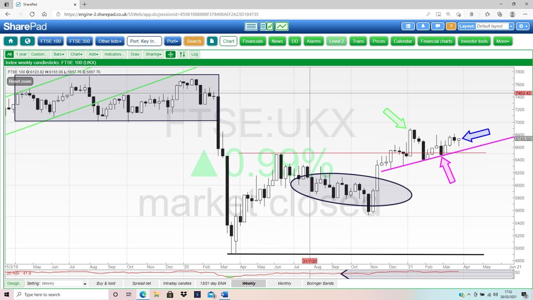
This Chart has the Daily Waxy Light Providers with String in them that you light with a Match for the FTSE100, but I am really looking at the Black 13 Day EMA Line and the Red 21 Day EMA Line. My Green Arrow is marking a ‘Bull Cross’ between these Lines and that is still in force.
If you remember, I had a small Short on the FTSE100 and these Lines made me very uncomfortable so I Closed it. Looks like that was a wise decision !! 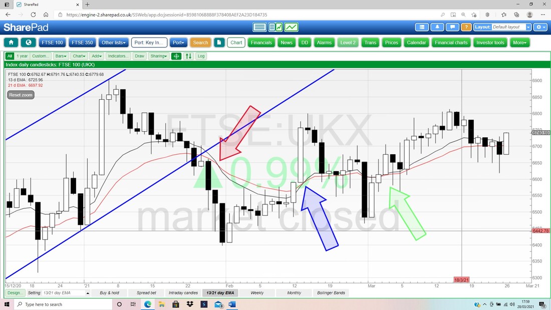
I won’t show the RSI because when you have a Sideways Market that is not doing much, like is the case with the FTSE100 now, then it is obvious the RSI will be around Neutral. If you think about it, we only get High and Extreme RSI Readings when a Market has charged up a lot, and we get Low and Extreme RSI Readings when a Market is terrifying !!
Last up for the FTSE100, the Dailies and the Bollies. My Blue Arrow is pointing to a nice Up Candle from Friday, but look how it pretty much stopped (Closed) at the Red Bollinger Midpoint Line (Red Arrow). However, note how the Candle from Friday turned up off a Hammer shape from Thursday (although not a great context) but also it is promising that the High from Friday was above anything the FTSE100 achieved in the previous 5 Days. The Low from Thursday at 6618 should be pretty good Support in the short term. 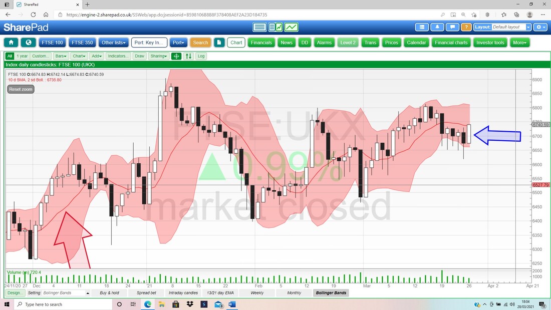
Brent Oil Composite
Obviously things can move really fast with regards to Oil, especially when we have a big blockage in the Suez Canal (and a little JCB trying to dig it out), so even though the March Candle is just a few days from completion, what I am going to say now could be wiped out really quickly. My Blue Arrow is pointing to a pretty dodgy looking ‘Long Tails Doji’ and this could be a Turning Point Down after the strength in previous Months. The High so far in March has been $71.39 and clearly this is now strong Resistance, and up above that where my Green Arrow is, we have another very strong Resistance Level at $86.7. My Black Ellipse is marking an area of Congestion where Brent Oil Comp has struggled before. To the downside, there should be decent Support around $60, $55, $50. 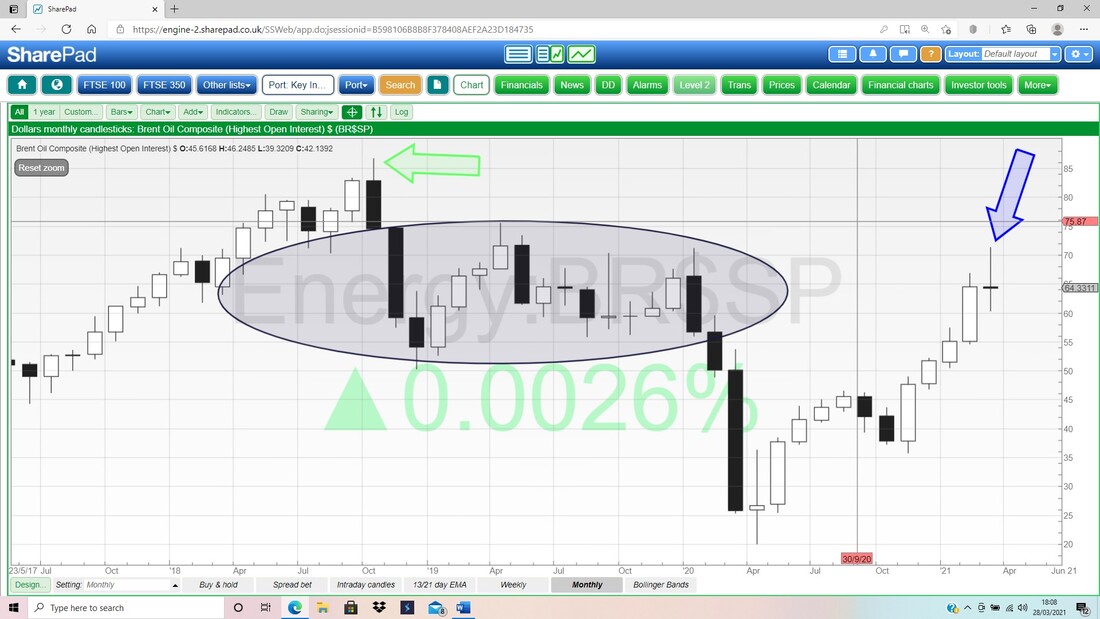
In line with what I was saying about the Predictive Power of the RSI, this Chart in the bottom window has the RSI on the Daily for Brent Oil Comp and look how the area of high RSI Readings (in the Red Shaded bit where my Black Arrow is pointing), predicted the falls we are now seeing. At the highest point, the RSI was 85 which is clearly very extreme.
Currently the RSI is 54 so it is around Neutral. 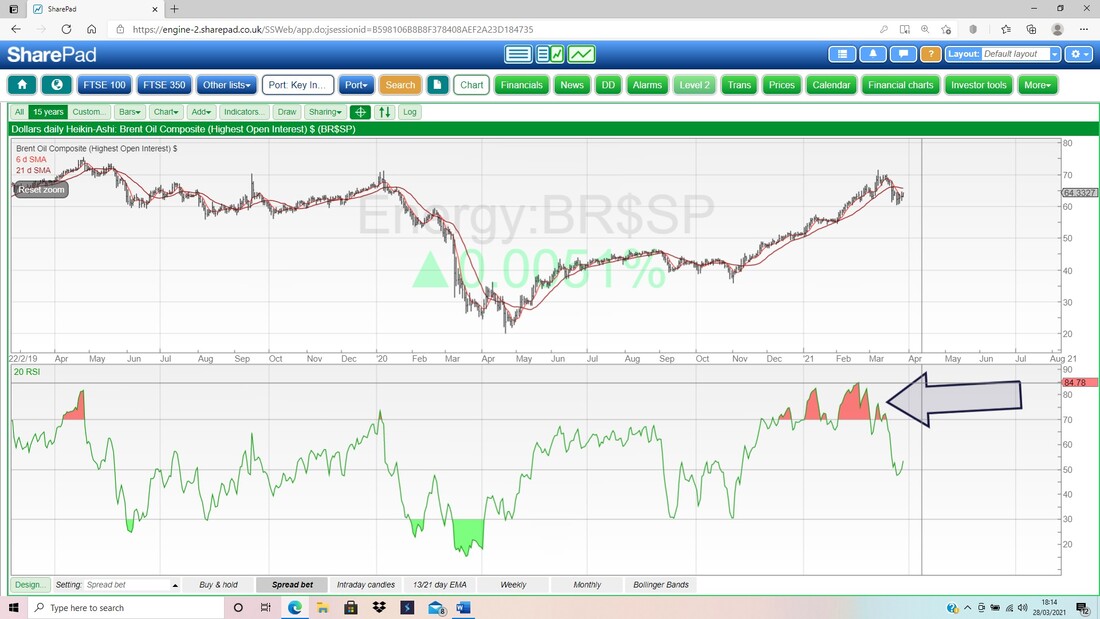
There is an intriguing situation on the 13 and 21 Day EMA Lines. A ‘Bull Cross’ has been in force for many Months after my Black Arrow but where my Green Arrow is we just had a ‘Bear Cross’.
However, you need to zoom in close to see it and I will let you play around with that, but it only happened 2 days ago and with the Lines so close together, we could easily get a Bull Cross again and there would be less to be concerned about. But of course, a Sideways and Choppy Market can give loads of False Signals on this otherwise superb Indicator. 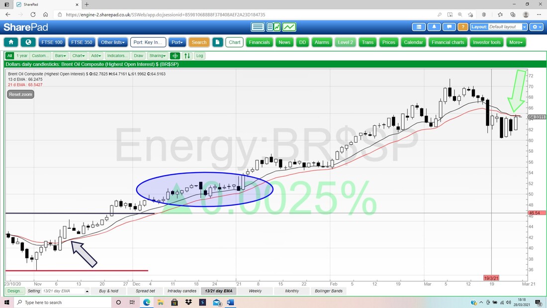
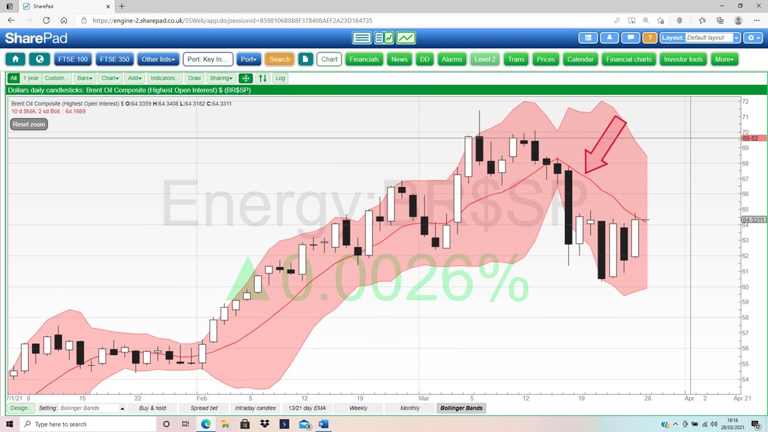
Last up for Brent Oil Comp, here are the Daily Candles and the Bollingers. Look how the Price has moved up to the Red Midpoint Line (Red Arrow) and it really must get above this.
Monthlies
I really want to finish this Blog off but I keep thinking of stuff to shove in. I will just throw in a few Monthly Charts – but remember there are still 3 days to go to make the Candles valid. DOW This looks beautiful. I particularly like how the Candle for March so far, has got above the High of the Candle from February. 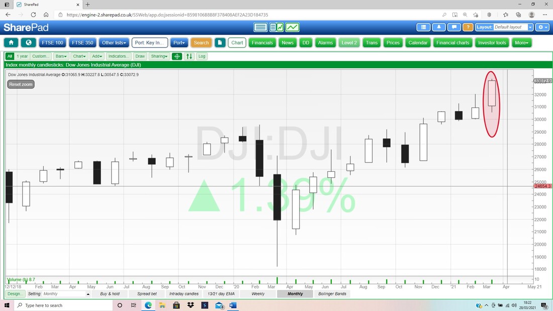
S&P500
Similar to the DOW, nothing to worry about. 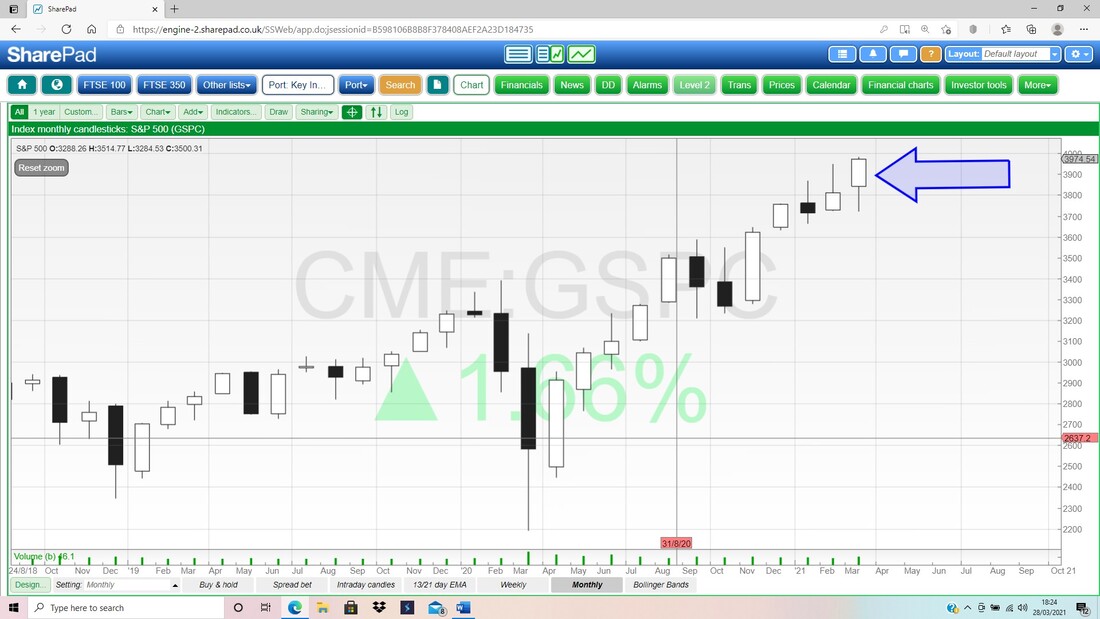
DAX
Another nice one. 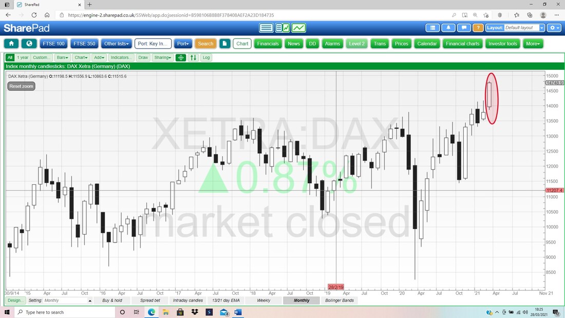
NIKKEI 225
More troublesome with a potential ‘Long Tails Doji’ which could be a Turning Point Down. This follows a bit of a ‘Bearish Shooting Star’ from February which isn’t a great context. 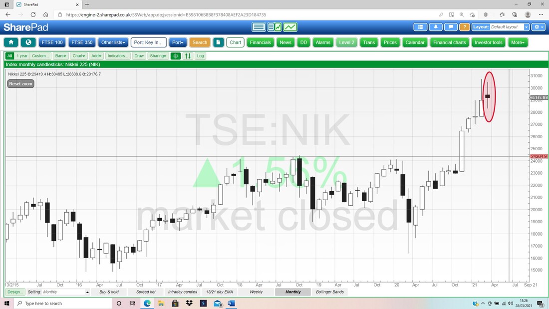
FTSE250
This is good in that it built on February’s Candle, but I wouldn’t want any weakness in the next few days, because it could easily become a Bearish Shooting Star. 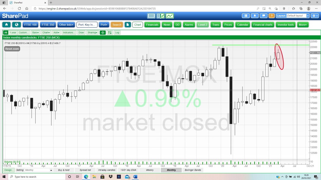
Gold Composite
Could be good news for Gold Bugs here. It looks like a Hammer Reversal is possible for March and that would be quite promising in the context of previous falls. OK, that’s it for this week. Good luck for the coming days and make the most of the lighter evenings !! Regards, WD. 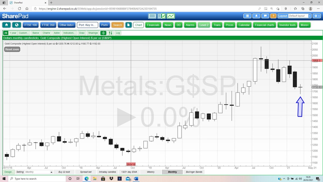
2 Comments
Kevin S
3/28/2021 02:29:33 pm
Hi Pete, great update as usual - plenty to think about and makes me realise I still haven't finished reading "charting for dummies".
Gold Finger
4/4/2021 05:54:05 am
Potiental double bottom on Gold. Could fly. I suspect i will end up going sideways rather than up. May be we can look at the chart this or next week? Leave a Reply. |

Stocks & Markets WheelieBlogsThese tend to be more Markets and Stocks related and timely - the Blog Page on the Main WheelieDealer Website has the 'Educational' stuff (well that's the theory anyway !!). Archives
October 2021
Categories
All
|
