

|
stocks & Markets blog |
|
I don’t intend this to be a long blog because I am still in a sort of relaxing festive mood and trying to do as little ‘work’ as possible and anything I am working on I am trying to make effortless and totally untaxing on my meagre supplies of brain power.
The main reason for bashing out this blog is to just look at the Index Charts to see how they are shaping up because it is pretty obvious that they are looking a bit stretched after such a gorgeous ‘Santa Rally’, where Stocks have just seemed to steadily drift up in the days around Xmas and as we come to New Year. On top of that I want to outline where I am with the blog pipeline as I have been doing some stuff in recent days and I have the next few weeks nicely planned out.
I have been working on a blog about ‘How to hold for the Long-term’ which really looks at the technicalities and probably more importantly the mindset/psychology of sticking with great quality stocks and letting them run, and this has morphed into two fairly sizeable parts of which the first should appear later this coming week. Then I expect to start work on the ‘Scores on the Doors 2019’ blog which will give the full breakdown on how my Accounts have done and I expect some very insightful observations to come out of this exercise. I have already pretty much worked out my Personal Spending for 2019 and it is a fraction up on 2018 but still pretty low and there are quite a few ‘one-offs’ which I have splashed out on. Details of that all will be included in the blog.
That should keep me busy for a few weeks and after these I might start thinking about another Stock for my Income Portfolio as I would like to increase my Holdings in that Account. At the moment it is 12 and ultimately I would like to take it up to 15 but I am in no particular rush. My loose plan is to do some blogs about the hunt for potential candidates. About a week ago we released a Twin Petes Investing Podcast and if you go to the ‘Podcasts’ page on WD2 then you should be able to find a link to it. If you are on Apple and/or Audioboom then if you go to the ‘Conkers Corner’ channel then you should find it there. We also recorded another Podcast at the same time and that one should appear soon – so keep your eyes and ears and noses open. Last night I put out a ‘Non-Finance Book Review’ of an Autobiography by Isle of Man TT Legend John McGuinness and bike fans may find that a good read. OK, let’s see what state those Charts are in now - particularly because an over-stretched market in December could easily mean a weaker one in January or at least some sideways movement. S&P500 As always the Charts I show are from the excellent SharePad software that I subscribe to and if you click on the images they should grow larger so you can see more details. I suggest you look at them on a big screen rather than on a tiny Smartfone because it is hard to see the detail on such small representations. I have a small Long Spreadbet on the S&P500 and I considered showing the Monthly Candlesticks because we are nearly at the end of December but seeing as we are not quite there I decided not to show it. As things stand unless we have a big collapse in the next couple of days (this is of course possible !!), then the Monthly Candles look pretty bullish. The Chart below has the Weekly Candles for the S&P500 and my Blue Arrow is pointing to a fairly Small Up Candle for last week and on its own this is Bullish really but does have a tinge of ‘Doji’ (it is quite small and bit like a Cotton Reel in shape) about it and could be a turning point from which we pullback a bit. Look at the run of Up Candles over recent weeks and you can see it has been some very impressive rally. A Key Support Level is that 3070 that I have marked with the Black Horizontal Line. 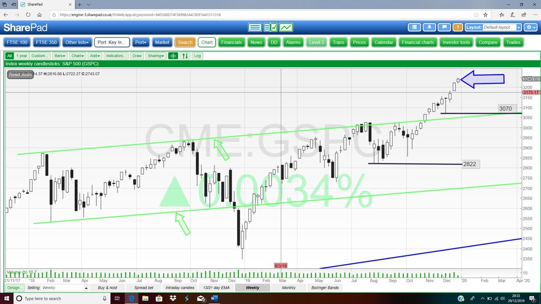
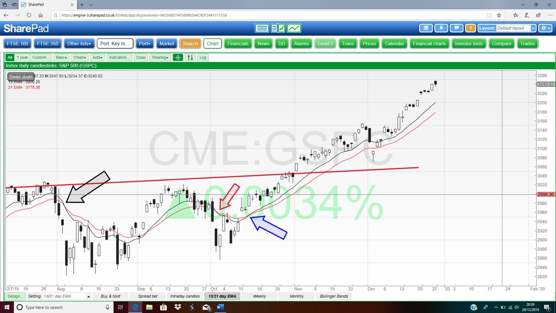
Next we have the Daily Candles on the S&P500 but I am interested in the interaction between the Black Wavy 13 Day Exponential Moving Average and the Red Wavy 21 Day EMA. At the moment we are in Bull Mode because back where my Blue Arrow is we had a lovely ‘Bull Cross’ and at the moment there is no sign from this Signal that things are turning Bearish. As an aside, just think if you had gone Long on the S&P500 when that Bull Cross Signal was given…….
When I say that something is “Stretched” or “Overbought” what I really have in mind is the RSI (Relative Strength Index) although there are a few other Indicators which help to ascertain the situation. Anyway, the next Chart in the bottom window has the RSI for the S&P500 Daily and where my Black Arrow is we are on a Reading of RSI 75 which is very high but note that even in the recent past it went as high as RSI 89. That was exceptional though and I would expect this Index to either turn down soon (I expect nothing dramatic, just a gentle Pullback) or it might go Sideways which would unwind the Overbought condition.
Remember, a Chart can unwind an Overbought situation by either Price or by Time. For Price it means it drops and for Time it means it goes sideways. The opposite is true also – if a Chart is Oversold, then it can correct that by the Price rising or by going Sideways. 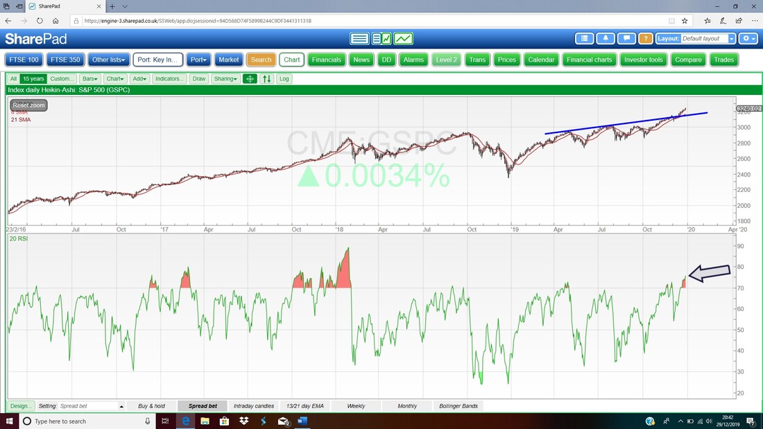
Lastly for the S&P500 we have the Daily Candles with the Pink Zone marking the Upper and Lower Bollinger Bands. My Black Arrow is pointing to a Small Black Down Candle from Friday and this is actually a lot more ‘exciting’ to the Candlestick Geeks amongst us because if you combine this Candle with the one from the previous day, then we have a 2-day ‘Bullish Neck Lines’ pattern which is actually quite rare (in my fairly old copy of ‘Candlestick Charting for Dummies’ it is on page 150 and it is very similar to the ‘Bullish Thrusting Lines’. I fully recommend this book and you can get a copy in ‘Wheelie’s Bookshop’ – it is a rare book that I actually use almost every day as a source of reference).
Note that the Candle from Friday is quite near the Upper Bollinger Band but there is room to go higher. But of course it is worth remembering that RSI 75 that we saw on the previous Chart is in fact very overbought. 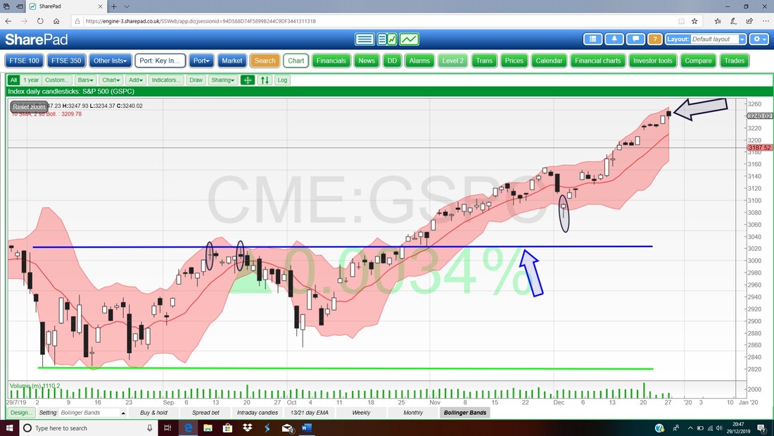
Nasdaq Composite
I wasn’t intending to show the Nasdaq but I had a quick look and this is quite interesting. Where I have put the Blue Ellipse we have a ‘Bullish Thrusting Lines’ 2 Day Candle pattern like what I just talked about – so you can see the difference now. I really spoil you lot with so many treats !! On the RSI Chart for the Daily, the Nasdaq is on RSI 77 which is very overbought like on the S&P500. 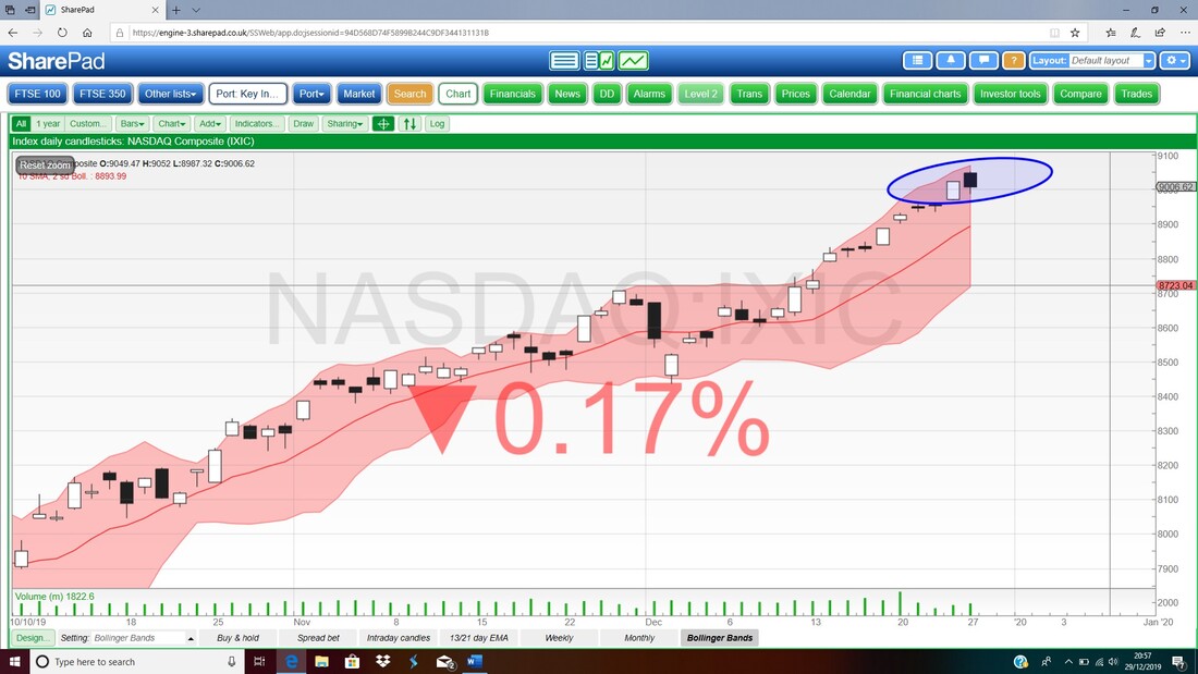
Dow Jones Industrial Average
I wasn’t intending to show this either but on the Chart below of the Daily Candles for the DOW, my Blue Arrow is pointing at a more defined ‘Spinning Top’ sort of shape Doji Candle – this could be a Turning Point from which a Pullback starts. The DOW is not as Over-bought on the RSI on a reading of RSI 71. 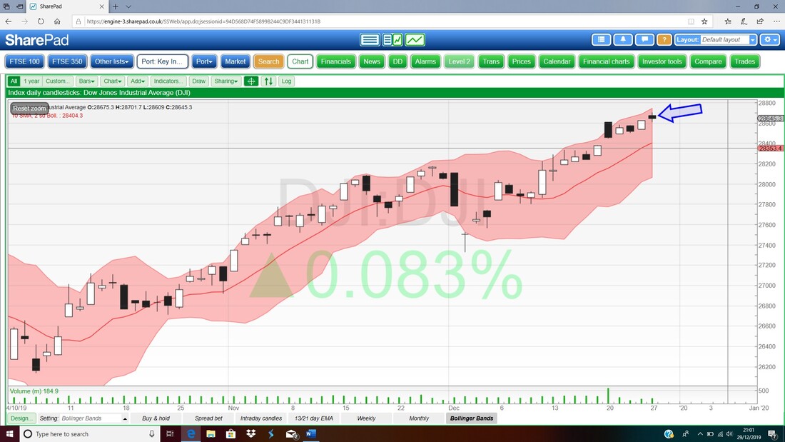
Pound vs US Dollar
This Forex cross is obviously very interesting because since the EU Referendum 300 years ago, it has had a significant impact on the moves of UK Stocks in both the FTSE100 and the smaller Indexes. On the Chart below my Blue Arrow is pointing to where we might be about to narrowly miss a ‘Bear Cross’ between the Black Wavy 13 Day EMA Line and the Red Wavy 21 Day EMA Line. This means that the Pound is likely to keep rising but it is at a key point where it needs to keep moving up because any weakness now will see a ‘Bear Cross’ trigger. As an aside, a beauty of the 13/21 Day EMA Crosses is that they work on a wide range of Assets – not just on Shares and Indexes. 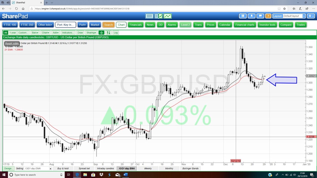
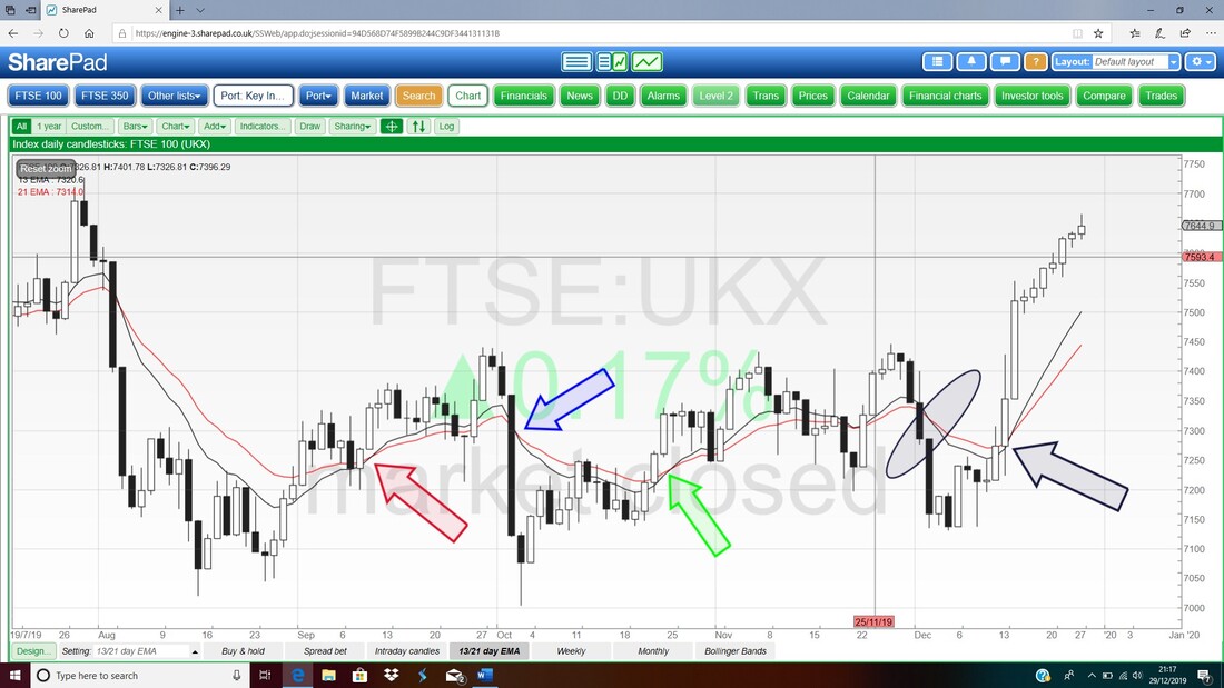
FTSE100
First up we have the Weekly Candles and my Blue Arrow is pointing to a nice White Up Candle from last Week and this looks Bullish really. My Black Arrow is pointing to a ‘High’ at about 7727 which is Resistance and needs to be cracked and if the FTSE100 can do this, then we set up 7800 and ultimately the All Time High which is pretty much 7900. A Breakout of the ATH is obviously extremely Bullish and it would not surprise me if we see that in early 2020. The Red Curve marked by my Red Arrow was an attempt to point out a possible ‘Bearish Rolling Top’ but with the recent strength I think we will avoid this and more upside is far more likely even if we get a small pullback in early January. 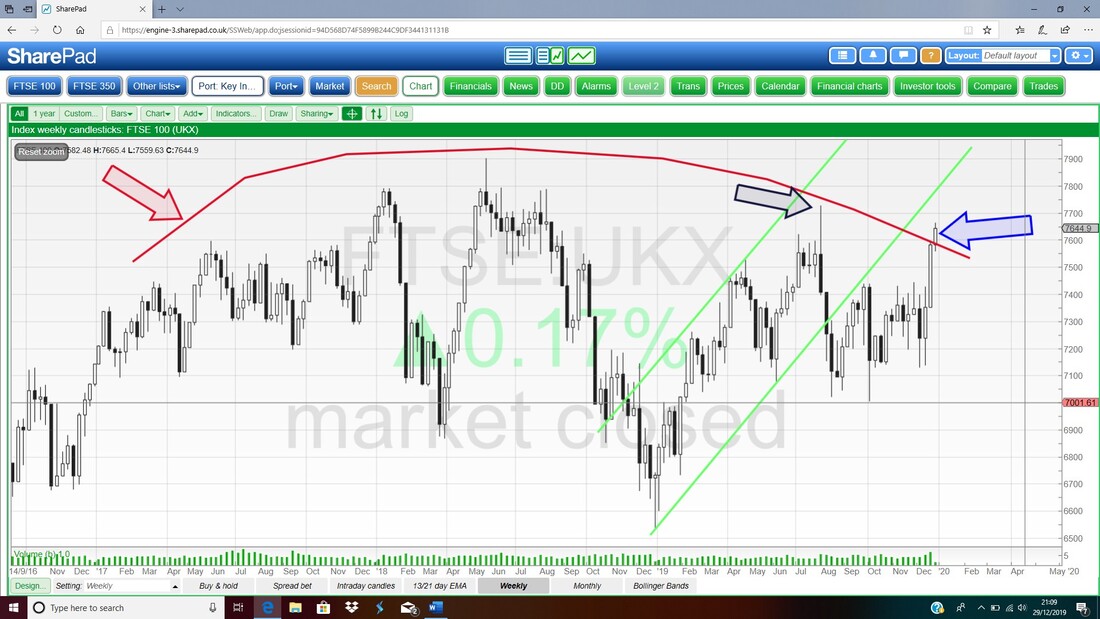
Next up it’s the Daily Candles but I am interested in the 13 and 21 Day EMA Lines. My Black Arrow marks a Bull Cross and this is still in force.
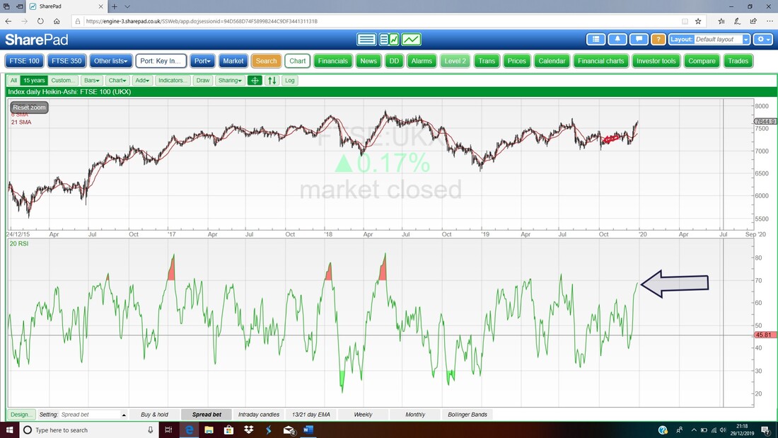
In the bottom window on the ScreenShot below we have the RSI for the FTSE100 Daily. On a Reading of RSI 69 where my Black Arrow is the FTSE100 is quite stretched but not crazy. It can go a little higher but not much.
Now we are talking Daily Candles and Bollie Bands for the FTSE100 and my Blue Arrow is pointing to a bit of a Bearish ‘Shooting Star’ sort of shaped Candle from Friday. The High on Friday was 7665 and clearly this is the target that needs to be broken over soon. It is very likely we get a bit of a Pullback off of this Candle.
I won’t show it but the FTSE250 looks a bit better although on an RSI of 74 it is quite stretched as well. Anyway, I want to watch the Top Gear Special so I will end it there. Have a great New Year celebration and all the best for 2020 !! Cheers, WD. 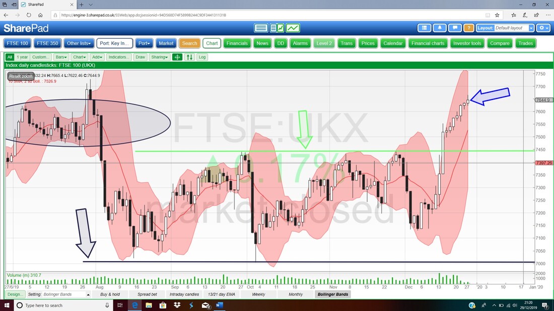
0 Comments
Leave a Reply. |

Stocks & Markets WheelieBlogsThese tend to be more Markets and Stocks related and timely - the Blog Page on the Main WheelieDealer Website has the 'Educational' stuff (well that's the theory anyway !!). Archives
October 2021
Categories
All
|
