

|
stocks & Markets blog |
|
I’m hoping I can complete this Blog but there is a real possibility I will have to abandon it partly written !! Sadly I am still suffering from these tedious health problems and what I believed was caused by a Bladder Infection seems to be continuing despite the Infection being cleared up with Antibiotics. I have no idea what is wrong and unless I have a miracle recovery tomorrow (I am typing this on Saturday Night), I will be talking to my GP again on Monday with regards to what can be done next and I suspect a Blood Test is needed and maybe that will highlight a problem.
Anyway, I will do what I can, but it is very awkward trying to sit at my desk and type and if it gets too uncomfortable, then I will have to abandon it. I will try to keep this short and get it done as fast as I can with a focus on updating the usual ‘admin’ type stuff and hopefully looking quickly at some Charts.
Last Week
Well, after a miserable 2020 it is so sweet to blast out of the traps and put in an extremely strong week to start 2021 off on the right footing. My Portfolio gained 4.1% (this is on the exposure, not the Capital used. On the latter basis it would be even higher), and it is quite possibly the best week I have ever had on my Stocks. Obviously, I am really chuffed with this but I do get the sense that it is all a bit too easy and although I am not seeing signs in Index Charts that a drop is coming, it is highly likely that a Pullback will arrive in coming weeks. Having said that, I would not expect anything too dramatic. I have been buying a few things as you can see on my ‘Trades’ page and my Strategy is pretty much a follow on from 2021 where I am focusing on running my Quality Stocks and not over-trading or selling things unnecessarily. I am not far off 100% Invested and I am poised to Hedge via Spreadbet Shorts on an Index if I see the need, but as things stand there is not much that looks overly worrying. When I look at the Charts later in this blog, we might see some signs of overboughtness, but these can unwind reasonably quickly if the Markets ease back for a couple of days. I still have some Cash to invest in my Income Portfolio (this is reinvestment of Dividends mostly) and I am sniffing around a few potential buys to take the number of Stocks up to 15. I haven’t totally decided yet and might just buy more of something I already have. Latest Podcast TPI 39 Despite my health aggravation, I have been able to work with Peter C3 to keep the ‘Twin Petes Investing’ Podcasts coming out every 2 weeks and the response continues to grow and grow and we are super pleased by how many Listeners are now regularly tuning in. If you go to the ‘Twin Petes Investing Podcast’ page on WD2, then you can find Widget things to play all the Podcasts that have been released, and the latest one is TPI 39. You can find them on loads of Podcast Platforms now including Apple, Youtube, Spotify, Audioboom, Overcast, Google+, and probably others, and you need to go to the ‘Conkers Corner’ Channel where you should find TPI 39. We will be recording TPI 40 later this week and I have loads of ideas for interesting topics that we can cover in it, but in the meantime you can find TPI 39 on Soundcloud at this link: https://soundcloud.com/user-479955511/conkers3-wheeliedealer-39-2064-profit-aph-clin-merc-pdd-axs-som-itm-adm-swg-vle-ai DIY Investor Magazine Article You may have seen this already as I put a link to it in my ‘New Year’s Message’ blog, but that Article I was on about for a Magazine emerged a few weeks ago and you can find it at the link below. The Editor was going to chop it a lot because it was very long but on reading it I don’t think he has changed it all that much and I am very pleased with the text that went out – see what you think: https://www.diyinvestormagazine.com/#p=38 You want page 38 and I think that link takes you to it. The plan is to issue this as an Educational Blog on my website in a few months’ time. Blog Slate I am struggling to make progress on blogs although I have made a decent start on the ‘Scores on the Doors 2020’ although there is loads to do. At least I have done the challenging bit of filling out my Spreadsheets and working out the numbers but I need to get that into words that Readers can actually decipher in a meaningful way. It might take some time to get the SOTD blog finished but once that is done I intend to start on a Stock blog which is likely to be BAR or LOK which I bought recently (see my ‘Trades’ page for some details on these). I have loads of ideas for blogs but progress is extremely slow. In addition, I need to sort out the ‘Monthly Performance’ page and my plan here is to get that complete for 2020 and then to move it down to the bottom of the page and to do this for each upcoming year, so that we have a good historical record and any monthly patterns should start to show themselves. That should be interesting but clearly we need several years before a meaningful pattern can be identified. So don’t hold your breath. I need to update the ‘Little Black Book’ on WD2 and I will try to do that when I can. Digging in the Archives All the Blogs I have written over the last 6 years or whatever it is, can be found via the ‘Blog Index List’ page which sits on WD2. There are links to all the Educational ones and many of the newer Charts ones have links as well. The blog I bring you below was one of the first ones I ever wrote. I actually remember writing it which is a bit weird – especially because I look at some of my old blogs and think “Did I write that? I can’t recall doing it……….” https://wheeliedealer.weebly.com/educational-blogs/what-is-your-edge Let’s have a look at some Charts then. S&P500 As is always the case, the Charts I show are taken from the excellent SharePad Software that I use and if you click on the images they should get a bit bigger and clearer for you to see some detail. If you fancy using SharePad yourself, then have a look around my Websites and you should find loads of small banners which include a Deal where you get 1 month of data for free. If you sign up, I get a small commission so that helps to build the Wheelie Beer Fund – cheers !!! I am starting off with a Chart of the Weekly Candlesticks on the S&P500 going back to about 2015. First up look at my Green Line (Green Arrow) which suggests a long-term Support Line but it is pretty low down at around 2400 which has a positive in that it might suggest where there is some very strong Support, but on the flipside it is a flippin’ long way down from the current 3824. Next look at my Red Line marked by the Red Arrow. I have done a bit of ‘Line Fitting’ here and you could argue that the Line should be a bit lower or that it should be a bit higher. If it should be lower, then maybe the S&P500 has got ahead of itself a bit and if it should be higher, then perhaps we are right at the top of a Range and this Resistance Line could show where it needs to turn down from. It is open to interpretation and I am not taking much from this Chart, although it does show that the S&P500 is looking pretty extended. 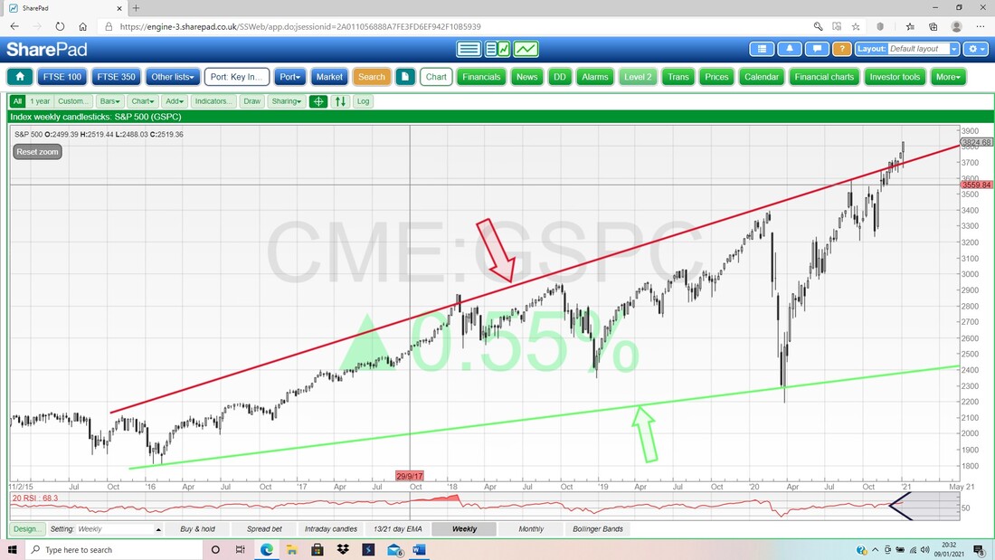
Next up I have taken the Weekly Candlestick Chart again, and I have reduced the timescale a lot so that we are going back to about February of 2020. My Black Arrow is pointing to the Top Resistance Line of an Uptrend Channel (you should see a pretty much parallel Bottom Support Line on the Chart below it) and this Channel suggests that the Price can move up a fair bit more.
My Blue Ellipse is marking a sort of Hammer shape Candle from last week and in the context of some steady rises (bit of a ‘melt up’), this looks to me like a continuation of the bullish moves. 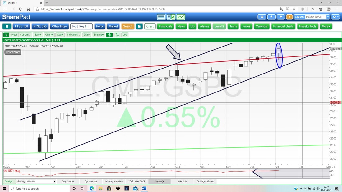
The Chart below has the Monthly Candlesticks. First up, where my Blue Arrow is, this is not yet valid because it is the Candle for January forming up, and is not useful until January is over.
On that basis, look at the Candle just before which is obviously for December and is marked by my Green Arrow. This is a really nice clean White Up Candle and suggests more gains. 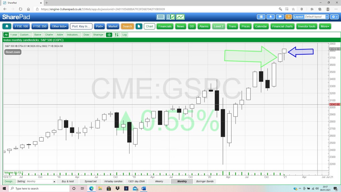
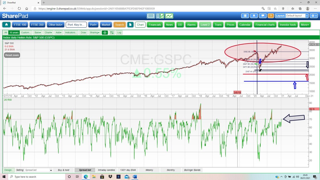
On the next screen, in the bottom window we have the Daily RSI (Relative Strength Index) for the S&P500 and where my Black Arrow is we are on a Reading of RSI 70 which is ‘Overbought’, but if you look to the left you can see the S&P500 has gone higher quite a few times in the recent past, and it has often been up around RSI 80 and even RSI 89 at the extreme. This suggests we might see a little more upside in coming days.
I almost didn’t show the next Chart, because when a Market is so bullish, you can assume the 13/21 Day EMAs will be in ‘Bull Mode’ as well.
Anyway, my Green Arrow below shows where the Black 13 Day EMA Line (Exponential Moving Average) crossed the Red 21 Day EMA from underneath and this then put the S&P500 into Bull Mode. This is probably my favourite signal and it is extremely useful. Please ignore the Blue Lines on this Chart. 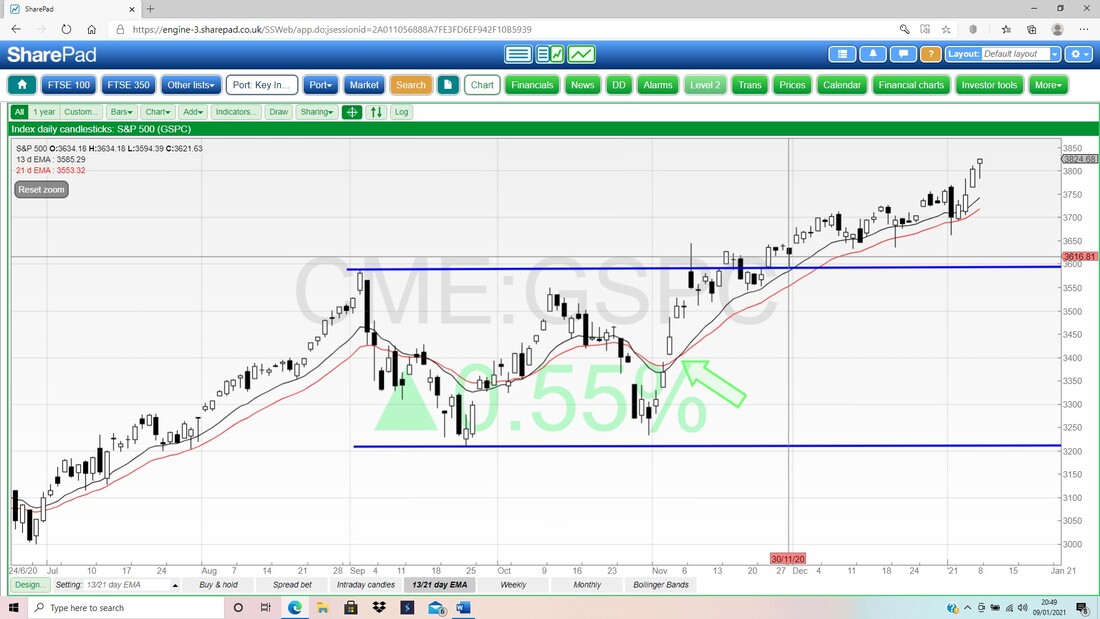
On the next Chart we have the Daily Candles for the S&P500 with the Pink Zone marking the Upper and Lower Bollinger Bands. My Blue Arrow is pointing to another Hammer shaped Candle from Friday and note how this is up at the Top Bollinger Band. This suggests to me that we either get an ease back from here, or we go sideways for a bit. With the RSI up at 70 and overbought as we saw on an earlier Screen, this would be consistent with what the Chart below is suggesting.
It doesn’t mean we will not see more gains, it just suggests that the most likely path is for a bit of a Consolidation move to calm things down a bit. 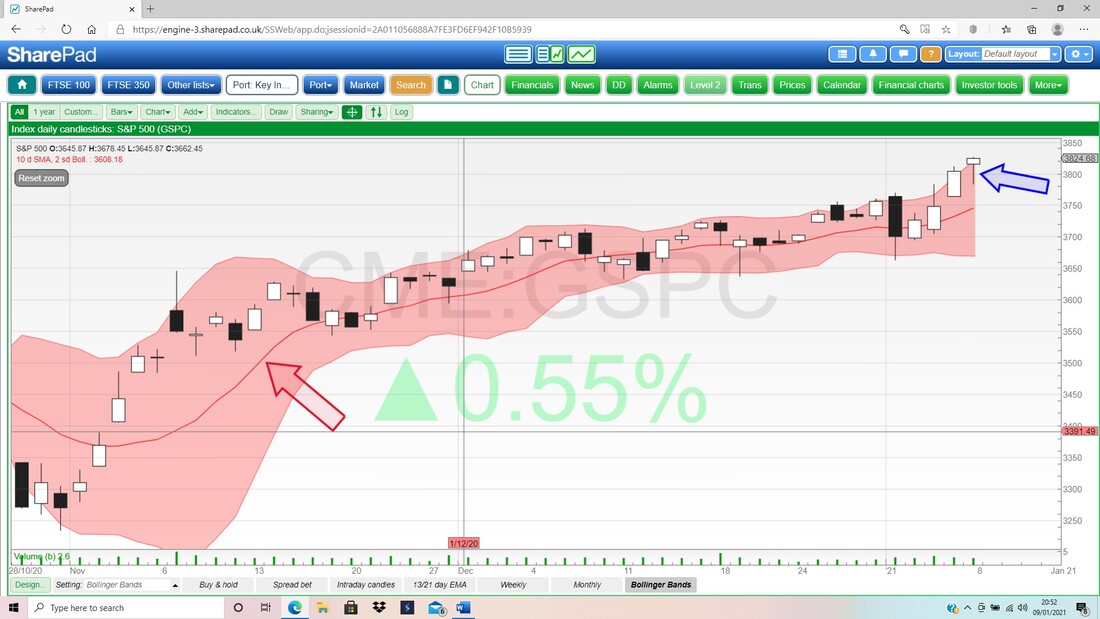
Brent Oil Composite
My Chart below has the Weekly Candles and first up please focus your peepers on the Red Line marked by my Red Arrow which is a Resistance Line which could cap the Brent Oil Comp price up at about $60. Next my Blue Ellipse is highlighting a Zone of Resistance between about $55 and $75 and I would be stunned if we see the Price above $75 in coming months. That Zone might be difficult to wade through. My Green Arrow is marking a nice big Up Candle for last week and this looks Bullish. 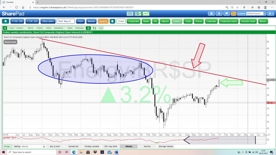
In the bottom window on the Screen below we have the RSI for the Daily Brent Oil Comp Price and on a Reading of RSI 80 where my Black Arrow is, this looks extremely overbought and if you look to the left, you should see that the RSI is pretty much at the highest it has been.
This doesn’t mean Brent Oil Comp has to drop, but it could lead to a sideways consolidation move to take the ‘heat’ out of the market. 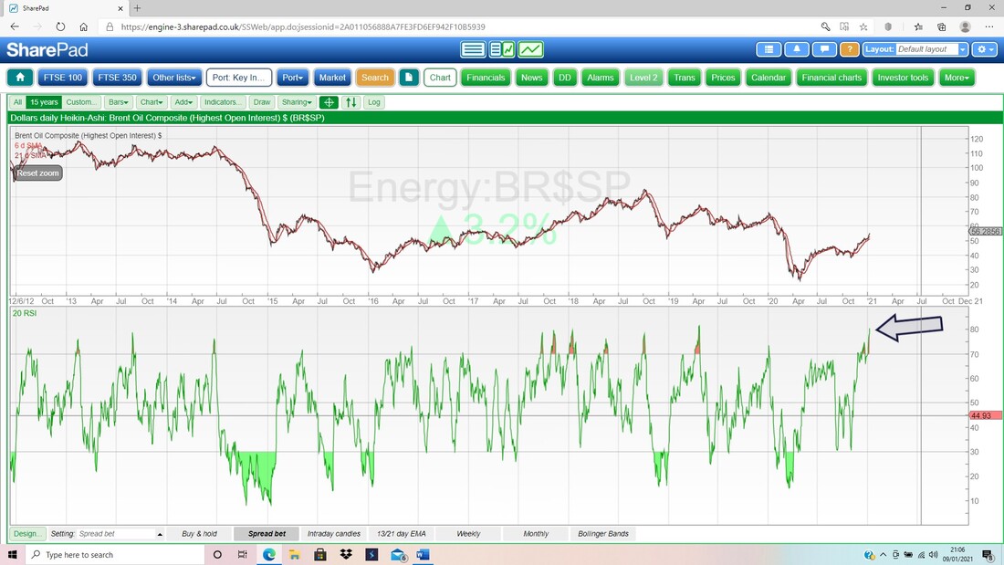
My Blue Arrow on the Chart below is showing a Big White Up Candle from Friday and this in itself is Bullish; but note it is up at the Top Bollinger Band and although it can rise more, with the RSI up high as we saw on the previous Screen, this may go sideways or ease back a little.
It is important to realise that Charting (Technical Analysis) is never 100% spot on. It is a useful tool which enables you to see if Markets are overbought or oversold and where Support and Resistance sits. Charting tells you what is ‘most likely’ to happen next, not what ‘will definitely’ happen next. 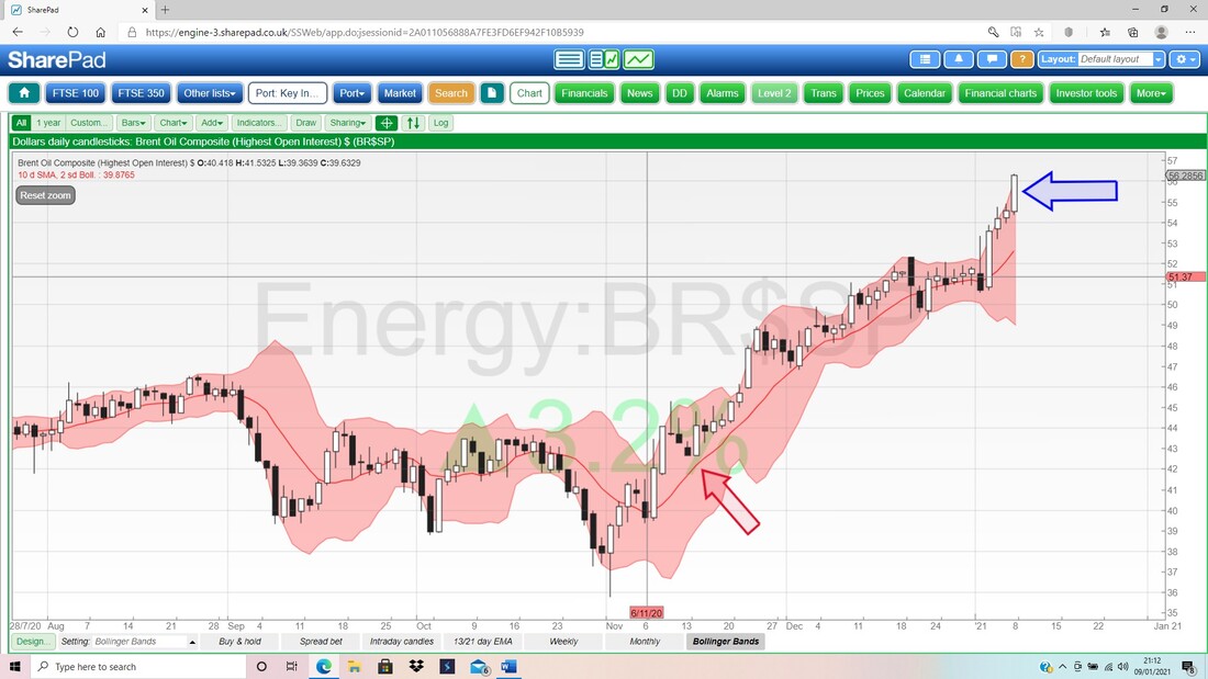
FTSE100
In keeping with Charting ‘Best Practice’, I will start with the big picture and the Chart below goes back 15 years on the FTSE100. What of course stands out is the huge Range between the Uptrend Channel Lines that I have drawn in blue. As it stands, we are rising up the Range and if the FTSE100 can crawl its way back to the Top Line of the Channel (very possible), then that could mean something like 8300 and would surpass the current All Time High (ATH) which is at about 7900. There is quite a bit of ‘Congestion’ between about 7000 and 7900 and it might be quite tough going to wade through that Zone of Resistance. 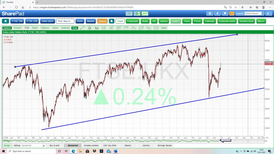
On the next Chart I have taken the previous one and just reduced the timeframe to a much more interesting situation that pertains in the near term.
My Red Lines suggest a shallow Uptrend Channel and I have drawn my Top Line as a parallel one to the Bottom Line. My Red Arrow is marking this Top Line and showing that there is a bit of room up to that Resistance Line, but it might curtail immediate gains on the FTSE100 once it gets here. That could mean a pullback or perhaps some sideways movement. It looks like there is a bit of space up to about 7100 and in that area. However, if the FTSE100 can Breakout above that Top Line, then it would suggest we see some pretty quick upside towards maybe 7400/7500 or so. Don’t get hung up on the Candlesticks here. They are actually Heiken Ashi Candles which are of some use but not amazing. They are looking Bullish though. 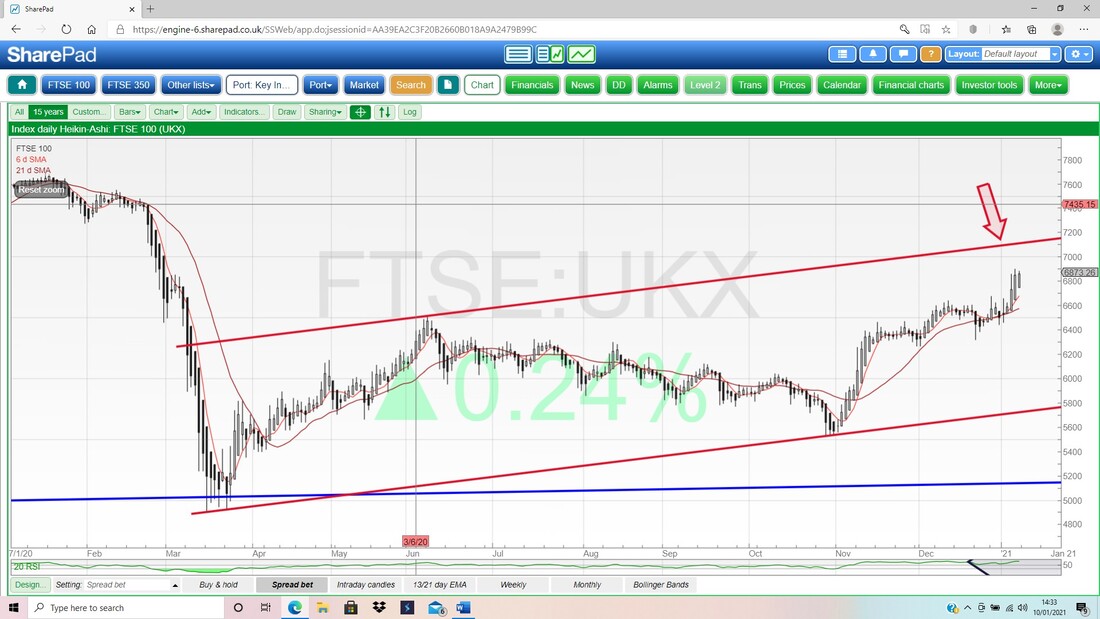
Next we have Monthly Candles. You must ignore the one pointed at rudely by my Red Arrow as that is for January and not valid yet.
My Blue Arrow is pointing at the December Candle and that is sort of Bullish with a nice White Up Body but note it fell back from the High and there is a Long Wick upwards. However, despite what I said about ignoring January’s Candle, there is some use to what has happened in the last week. In isolation, the Long Wick on the December Candle could be interpreted as a bit Bearish, but because we are already higher than this Candle, we can assume the Bearish Scenario is not playing out and the December Candle is not acting as a Pivot Point Down. 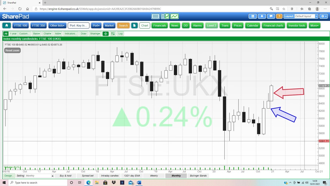
Now the Weeklies. My Blue Arrow points to a beautiful Big White Up Candle for last week and note how it broke-out of the Red Resistance Line (marked by my Red Arrow) and such a breakout is very Bullish behaviour.
My Black Shaded Box in the Top Left shows where there is a Zone of Resistance. This is the ‘Congestion’ I was talking about earlier. 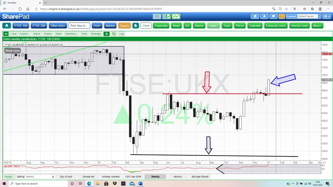
Plenty of interesting material on my next Chart. First up look at my Black Arrow down the bottom and this marks a ‘Bull Cross’ between the Black 13 Day EMA Line and the Red 21 Day EMA Line. This is one of my favourite Indicators and if you follow the Lines up, you should see we have not had a Bear Cross and this keeps the FTSE100 in Bull Mode.
Next look at my Red Arrow and my Blue Ellipse. I think we are seeing another Bull Flag here. My Red Arrow is pointing at the Flagpole and my Blue Ellipse is marking where the Flag (the cloth bit) is blowing in the breeze. I might be wrong as I am calling this early, but it looks to me like we had the Breakout and Jump up, and now we are seeing a Sideways Consolidation for a bit, before another Jump up. In theory, any Jump would be the size of the Height of the Flagpole so it could mean a move of about 250 Points (roughly 6850 minus 6600) on top of the Flag which would take us to 7150. 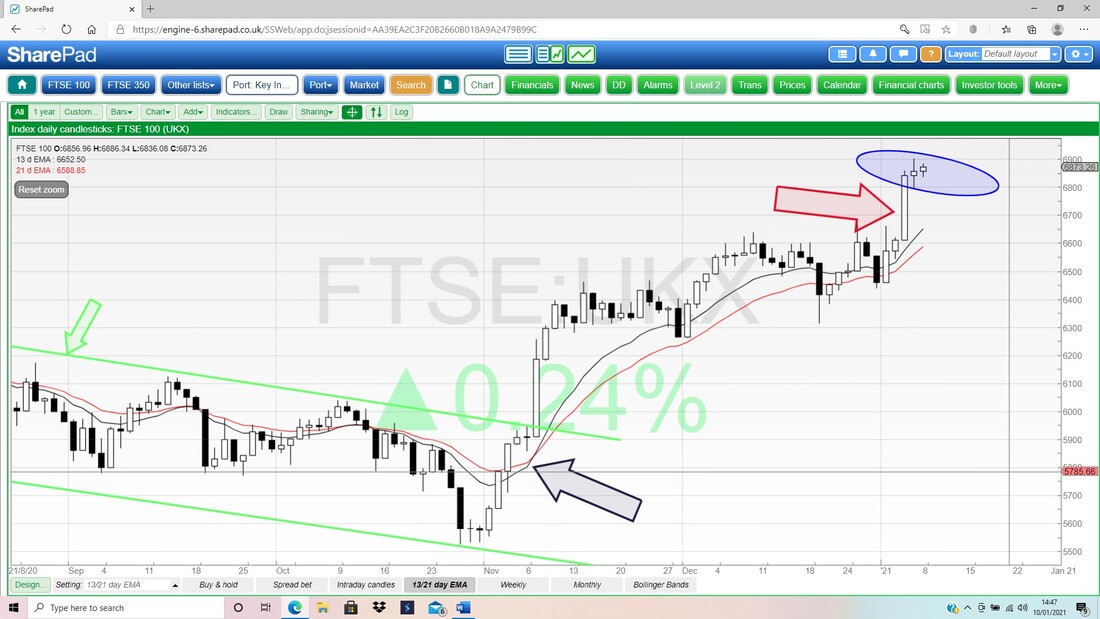
In the bottom window on my Chart below we have a very precise reason as to why we need the Flag Consolidation period. This shows an RSI Reading of RSI 72 and that is very high. If you look to the left then you should see that the RSI has been a bit higher a few times, and as much as RSI 83 at the extreme. It might get up here again, but I suspect some Sideways wobbling more likely and that will ease the RSI back again to maybe RSI 64 or something.
OK, I will leave it there. I hope you had a good Xmas and New Year (well, as good as you could in the circumstances) and Good Luck for the coming week, Cheers, WD. 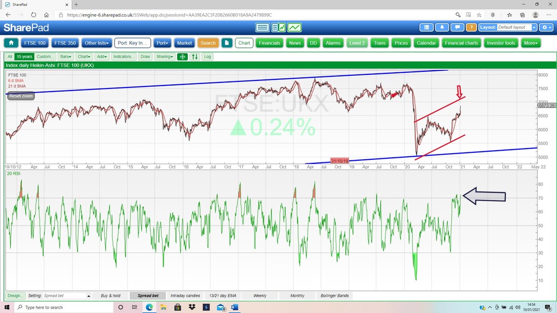
2 Comments
Kevin S
1/10/2021 09:36:22 am
Thanks Pete. Good to have some confirmation that we might be in for a period of consolidation. Some commentators are beginning to say the market is peaking and looking like the 2000 peak.
Steve ROGERS
1/10/2021 01:52:49 pm
Pete you are doing an amazing job, love listening to the Podcast and I really hope your health improves over the next few months Leave a Reply. |

Stocks & Markets WheelieBlogsThese tend to be more Markets and Stocks related and timely - the Blog Page on the Main WheelieDealer Website has the 'Educational' stuff (well that's the theory anyway !!). Archives
October 2021
Categories
All
|
