

|
stocks & Markets blog |
|
What a painful time October turned out to be. 2018 so far has been a really difficult (and tedious !!) Year and I had just about crawled into Positive territory for my Portfolio only to be whacked hard as the Markets fell off a cliff. At the time of writing my Overall Portfolio of everything (including my Income Portfolio) is down about 4% after a nice start to November but there is obviously a Risk that things could get worse. I am on standby for more Shorting if I need to in an attempt to Hedge my Portfolio but other than that I am not doing much at all.
In the immediate Week ahead we have the US Midterm Elections and I would guess that a poor Result for Trump would be taken negatively by the Markets because they like the way he has juiced the US Economy with Tax Cuts and Deregulation and suchlike. The Vote is on Tuesday and I am assuming we will know the Results on Wednesday by the time the Markets in Europe Open and this could cause some silliness. From what I am hearing there is a lot of talk that the Democrats might take over Congress but the Republicans will hold onto the Senate. If Trump was to lose the Senate, that sets up the possibility that the Democrats might move to Impeach The Orange One so the Markets would probably not like this. In favour of Trump the US Economy is rampant and this is highly likely to encourage many People to hold their Noses and punch out the ‘Chad’ for Republican Candidates.
Then of course we have the Brexit Talks and the Parliament Vote and stuff which is always messy. My own expectation is that T May and the EU will cobble together some warm Fudge and this will be put to Parliament as a ‘Fudge Deal or No Deal’ choice and with time pressures squeezing down I think we would find it extremely difficult for any MP to vote for the No Deal option - and it is very unrealistic to send T May back to Brussels to try and get a different Deal - this is a fantasy. I think the Brexit nonsense will have much more clarity once we get past mid-December at the latest but we need to be cautious up until then I think.
Blog Slate You have probably noticed that I had some Health Issues over the last few Weeks (it is very frustrating that this happened whilst the Markets were tanking as I would have loved to have written my Weekend Blogs whilst we were in the thick of it but I did Tweet out a lot and hopefully this helped Readers find their way through), and this has meant I am well behind where I would like to be and I do not have much of a Backlog of Draft Blogs that need working on. In addition, I am under pressure in my ‘Real Life’ because I had put off loads of tasks and I need to catch up with that sort of stuff. This has not been helped by my new Seat Leon Cupra 300 at last being ‘Born’ in Barcelona and finally turning up in Tunbridge Wells but as always with such things this has turned out to be problematic with organising the Hand Controls and that has taken a lot of Phone Calls and sorting things out. I think I will see the Car for the very first time next Monday 12th November but I won’t actually be able to drive it then and we are taking it up to High Wycombe to have the ‘proper’ Hand Controls fitted and this could realistically be another 3 Weeks……..ugh….. So I am chasing my tail at the moment but I will do my best to catch up and get the WD Website sorted out and up to date. In terms of Blogs I have one pretty much finished which I should be able to issue later this Week which is quite relevant as it talks about how I have had to adapt my Style in 2018. Then I have a Draft of the final Part of the ‘Stock Buy Checklists’ to finish off and I have been working on a Blog which will probably be in several parts which is concerned with ‘Moving into Cash’ and whether or not this is worth doing if you foresee trouble ahead in the Markets. This one has proved quite an Eye-opener and I am enjoying writing it but I keep thinking of new bits to add !! Oh, and I promised to write an Interview type thing for another Website which I think Readers will find interesting - but that is some Weeks away. And don’t worry I have not forgotten about the Podcast - that is nudging forwards so keep your eyes and ears peeled. I need to update the ‘Weekly Performance’ Numbers etc. and I will try to do this ASAP - I will do September and October together because I am well behind !! On Friday I updated the ‘Little Black Book’ with some Ideas for further Research - you can find this on WD2. I also have a couple of Book Reviews pretty much finished for Non-Finance Books which are both excellent Reads and of course Christmas is coming……. It’s also in my mind that I would really like to create Links on all of the Educational Blogs that are listed on the ‘Blog Index List’ - I have done a few but it takes quite a while to do but I think this would have huge value for Readers. Perhaps around Xmas when the Markets are shut I can donate some time to it. A Trip in the Time Machine I have talked a lot recently about Shorting Indexes to ‘Hedge’ my Portfolio and I think this is an extremely useful technique. Many Readers (especially those who have not been reading my nonsense for all that long) will perhaps be utterly confused by this so I am chucking in this Blog to help you get a grip of what I am bleating on about: http://wheeliedealer.weebly.com/educational-blogs/topiary-time-aka-all-you-ever-wanted-to-know-about-hedging-but-were-afraid-to-ask Charts I’m really keen to get on with checking out the Index Charts this Week because the recent Spanking handed out to Stocks (and sadly our Portfolios !!), has been pretty severe and arguably the worst since 2009 and I am wondering what damage has been done to the Long Term ‘Big Picture’. Whilst I had my period of ‘Sofa hugging’ due to my damaged Hip, I was forced to use SharePad via my 10” Tablet and although it is not ideal when you are not on a much bigger Screen, it made me realise that it really is a superb Tool and I am now seriously considering ditching ShareScope and moving entirely to SharePad - this would save me a few Quid a year as well. My truly ancient Netbook (seriously, I think it is around 10 years old or more and runs XP for heavens sake !!) has been really sluggish lately so I did some ‘Housekeeping’ where I deleted a lot of stuff from the Hard Drive and I moved ShareScope from the C:/ Drive to the D:/ Drive and frankly I have no clue what I am doing and I have screwed the whole thing up. I had a go at fixing it last night but had no idea where to even start so I am taking this as another Signal from the Market Gods that I should forget about ShareScope and move to ‘Pad. Recently there have been some improvements to ‘Pad and it is now much more like ShareScope (for example you can now whack the Space Bar to move down through a list of Charts, just like on ShareScope) and I have set up my Charts just like they are on ShareScope so I think I could transition over quite easily. So tonight I don’t have much choice but to use SharePad to produce my Charts and this will be another test of whether or not I could actually make the switch. One huge advantage SharePad has is that it is instantaneous and I don’t need to wait until 10pm at night to do the Daily Update of the Full Data Base and it means I can look at the UK and European Charts pretty much as the Markets Close and I can then do the US Charts after 9pm (or 8pm at the moment due to the Clock Change). The Fundamentals on SharePad are far better and the Technical Analysis stuff is good enough for my basic and simple requirements - perhaps the only drawback compared to ShareScope is that you can use ShareScope when Offline (provided that you have updated the Database obviously) - although in reality I very rarely do this and with modern Connectivity such as a 4G Fone (I can set this up as a ’Hotspot’ and couple my Tablet to it) I can pretty much ensure I have a Connection at all times and it is only if SharePad is unavailable that I would have a problem. This does happen but it is pretty rare. If you fancy getting SharePad yourself there is a Link on the Homepage I think where you get a Free Month of Data and I get Free Data as well so I am sure we would both be happy !! S&P500 First off here is a Long Term Chart going back to the 2009 Lows and my Blue Line marked by the Blue Arrow is the Long Term Support that must hold if we are to avoid big trouble ahead. This means that a Drop down to around 2300-2400 would be something that perhaps the S&P500 could bounce back up off and we would have dodged a Bullet. Ignore the other stuff on this Chart for now. As always, if you click on the Images they should grow bigger in your Browser Screen thing so you can see more detail. 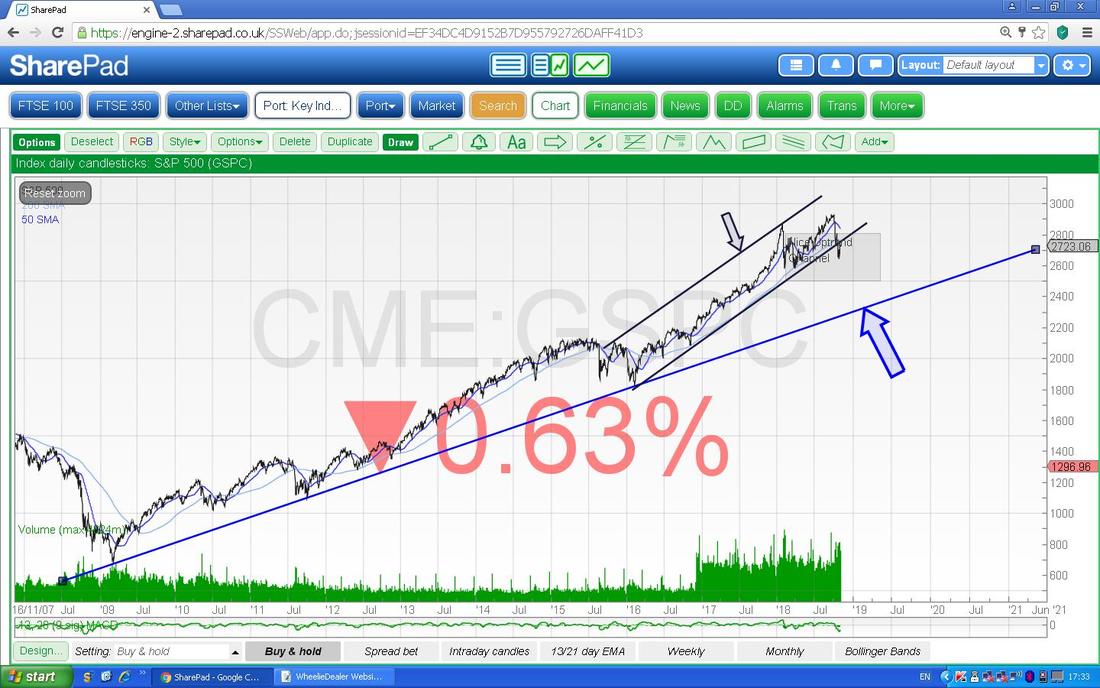
Next up we have the Monthly Candlesticks for the S&P500 and my Blue Arrow (I haven’t yet figured out how to do a ‘solid’ Arrow !!) is pointing to a Big Black Down Candle from October and note how this turned down off the Narrow Doji Candle from September. Look at how the October Candle has a Long ‘Tail’ going down and how it found Support at around 2600 - this is now extremely important Support and a drop below this would be a concern and I would be going Short on one or other Index I suspect.
We need some sort of Reversal Candle or Pattern now like a Bullish Harami 2-Day Pattern or a Hammer or Doji or something - as things stand this could easily turn into more Falls and the vital thing is that 2600 Holds. However, note down the bottom that the Volume went up a lot in October and that suggests some sort of Capitulation was going on and of course History is in our favour because October is often a difficult Month (it certainly was in 2018 !!) and November tends to be an OK Month and December is historically the Strongest Month of the Year. 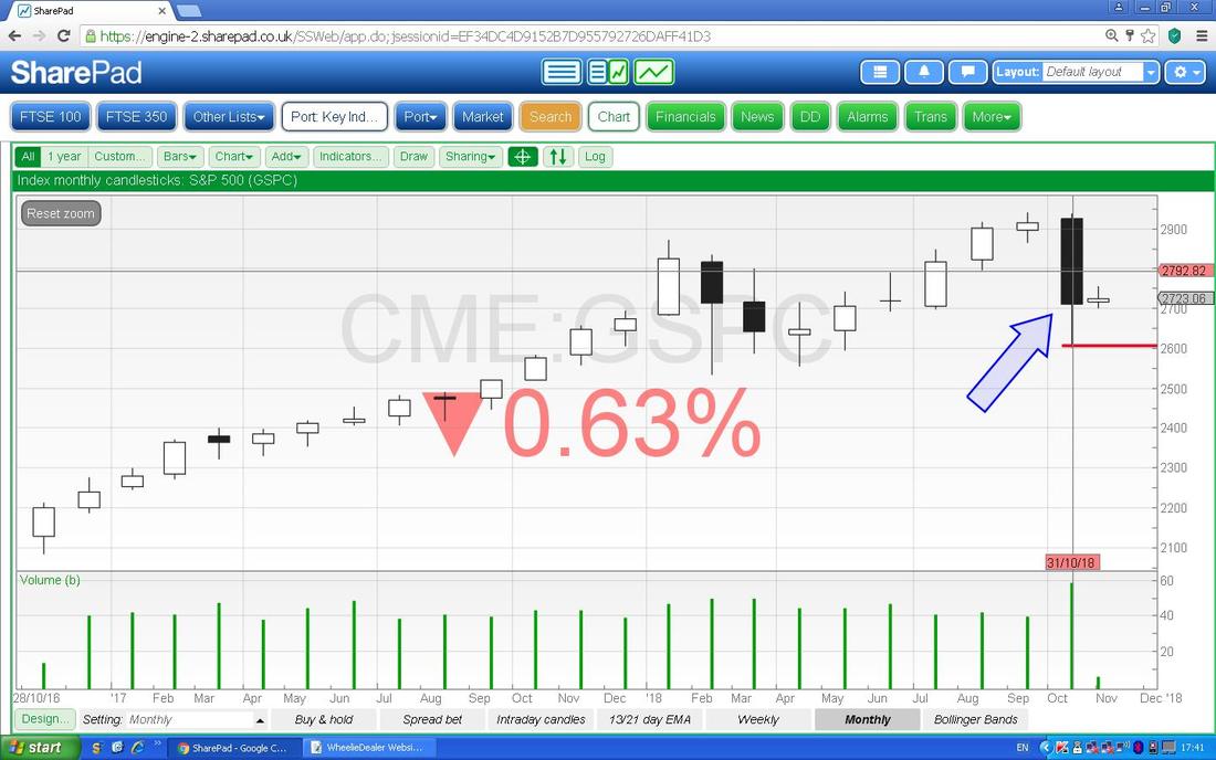
I am loving this next Chart because it has some ‘interesting’ Candlestick stuff happening and it suggests to me that we could be due to turn up again (remember, this is a Weekly Candle Chart and obviously such a Chart is ‘faster’ than a Monthly Chart so we can see a Turn happen earlier on this Chart than we will see on the Monthly - that will reflect any developments once November is completed obviously).
I will take this through the Stages in time because it is a good Learning exercise on how Candles work. If you look first at the very Small Doji Candle that my Red Arrow is pointing to and note how this is ‘Inside’ the White Up Candle that was put in the Week before - therefore at that point in time we had 2 Candles and we needed a 3rd to complete the Pattern and it would be either a ‘3 Inside Up’ or a ‘3 Inside Down’ and in the event once another Week had gone by we got a ‘3 Inside Down’ and this signalled that the S&P500 was turning Down and that is exactly what then happened !! We then got a Huge Down Week (strewth, that one was painful !!) and note how on the Following Week we got a Doji Candle with a Narrow Body (my Green Arrow is pointing at it) and this was telling us that the force of the move Down was weakening and that the Market could turn up at some point soon. As it happened the S&P500 then had another Big Down Week but then just Last Week where my Blue Arrow is we have some sort of Hammer Reversal sort of thing and I would expect the S&P500 to rise off of this or at least go Sideways. Note how the Candle from Last Week hit Support around 2600 where my Red Line is and also that the Volume down at the bottom was higher than usual - more Capitulation signs. If you want to learn more about Candles then in ‘Wheelie’s Bookshop’ you should find ‘Candlestick Charting for Dummies’ which is by far the best Book on the subject I have found - it is very simple with lots and lots of examples and I use it all the time for reference when I see a Pattern I recognise but I have forgotten its likely significance. 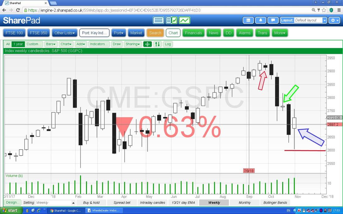
Next we have some Daily Candles but at this Scale you can’t really see them - don’t worry, I will zoom in in a tad. My Blue Arrow (blimey, what a daft size that is !!) is the one from the first Chart I showed and really we can ignore it here. Next please look at my Red Arrow which is pointing to the Bottom Line of an Uptrend Channel which has been in place for some time and note how the Price has dropped below that Line - this is a concern and we will look at this closer in a mo.
Note the Lighter Blue Wiggly Line which is the 200 Day Moving Average has been broken down through which is not so good but of course some positivity in the Price could soon get it back up above the 200 Day MA. Note the Darker Blue Wiggly Line which is the 50 Day Moving Average has dipped down towards the 200 Day MA but again a bit of Bullish behaviour by the Price could soon get this turning up again. Obviously what we could do with avoiding here is a Bearish ‘Death Cross’ where the 50 Day MA drops down through the 200 Day MA. 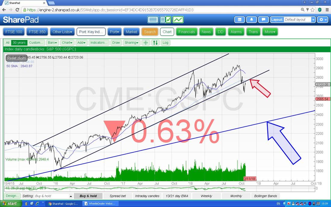
Now I have zoomed in and there is a lot going on here - as always it is very much about Support and Resistance and whether or not either gets breached. My Blue Arrow is pointing to a Down Candle from Friday (bear in mind that Fridays can throw up anomalies so often the Candle is not all that valid) and note how this hit the Support Line (marked by my Red Arrow) that I mentioned in the previous Chart - it needs to get over this and back into the Uptrend Channel which was on the previous Chart.
During the Day on Friday it went down to 2700 where my Green Line is and if this Support fails then it is really important that 2600 holds as Support as I mentioned earlier. Note the Lighter Blue Wavy Line which is the 200 Day MA is also acting as Resistance. Also there is a bit of a ‘Gap’ down below now so it is possible that the Price drops down and ‘Fills the Gap’ and then turns up again. We shall see but whatever happens 2600 is the crucial Support which must hold. 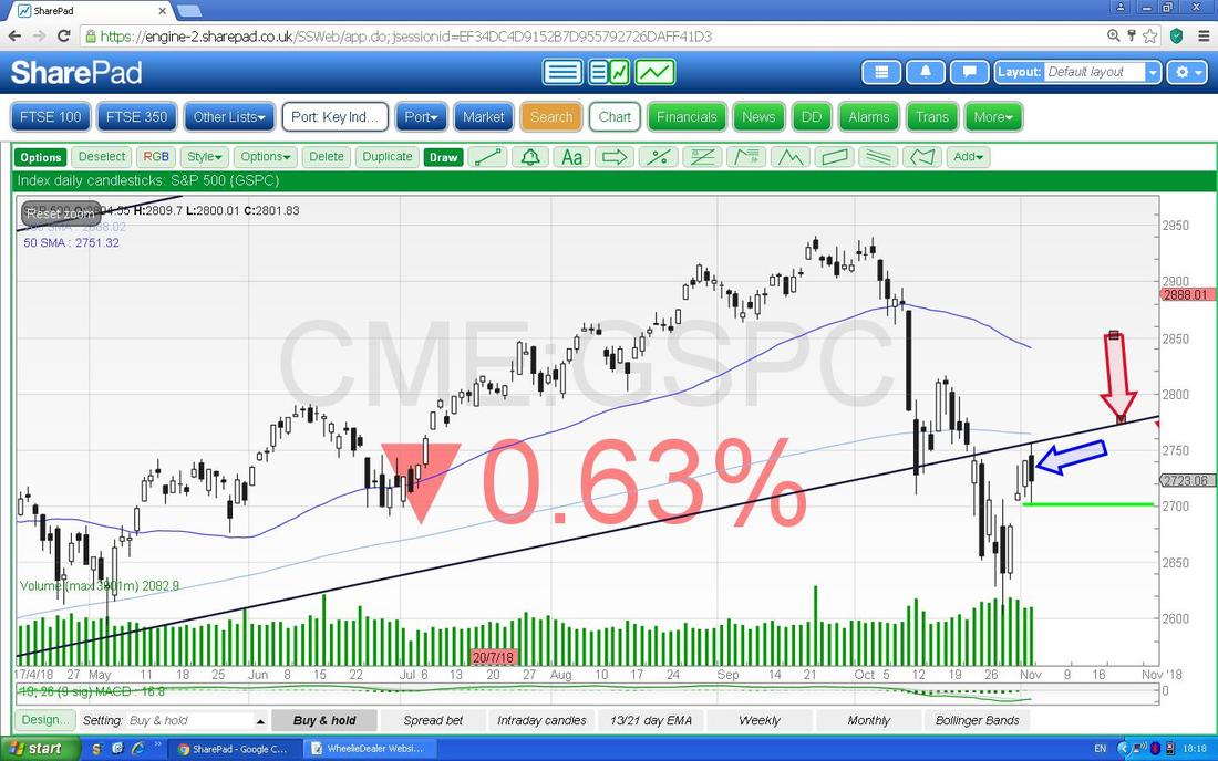
Next we have a very Short Term Indicator and to be honest it is not one of my favourites as I find it a bit unreliable but I will chuck it in anyway - Readers can set it up on their own Chart Systems and see how it plays out over time and decide whether or not they like it.
We have the same Chart that I just showed in the Upper Window but I have now dragged up the Bottom Window and we have the MACD in this one (Moving Average Convergence Divergence) and there are 2 formats - Signal Lines and Histogram Bars. It should be very easy to see that the Signal Lines have Crossed and this is Bullish and you can see that the Histogram Bars have gone from a sort of Dark Green ‘Hump’ over to a Light Green Up Bar (you will need to look very closely but I assure you it is there) - this is a ‘Bullish MACD Cross’ and should mean Gains in coming Days. 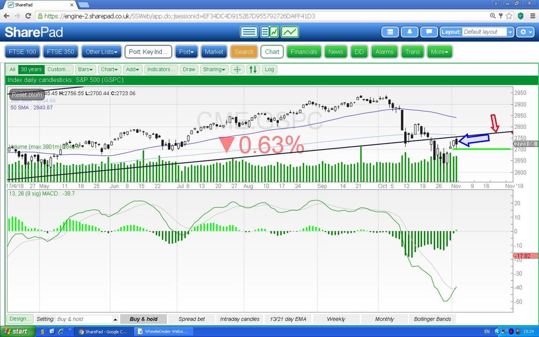
Now in the Bottom Window we have the RSI (Relative Strength Indicator) for the S&P500 Daily. This is one of my favourite Indicators and it was really useful just recently when we were having those horrible Weeks - I was tweeting out about this pretty much every Night with regard to how low the RSI had got - it went down to around RSI 24 which is a crazy low Level and was very predictive that we were going to bounce.
Note also that back at the end of 2017 and into early 2018 (actually it was the first Week I think) we had the Polar Opposite in that we had a ridiculously High RSI Reading and I remember writing in my Weekend Blogs that it was too high and a Drop was coming and I was also Tweeting furiously about this (go back on your own Charts and you will see this). Great Indicator - I love it. Now we are on RSI 40 and it is moving up. Of course there is nothing to stop it dropping back again but this is unlikely (remember, all Charting stuff is probabilistic and none of it is ever 100% correct but it gives us a good idea of what is most likely to happen next). 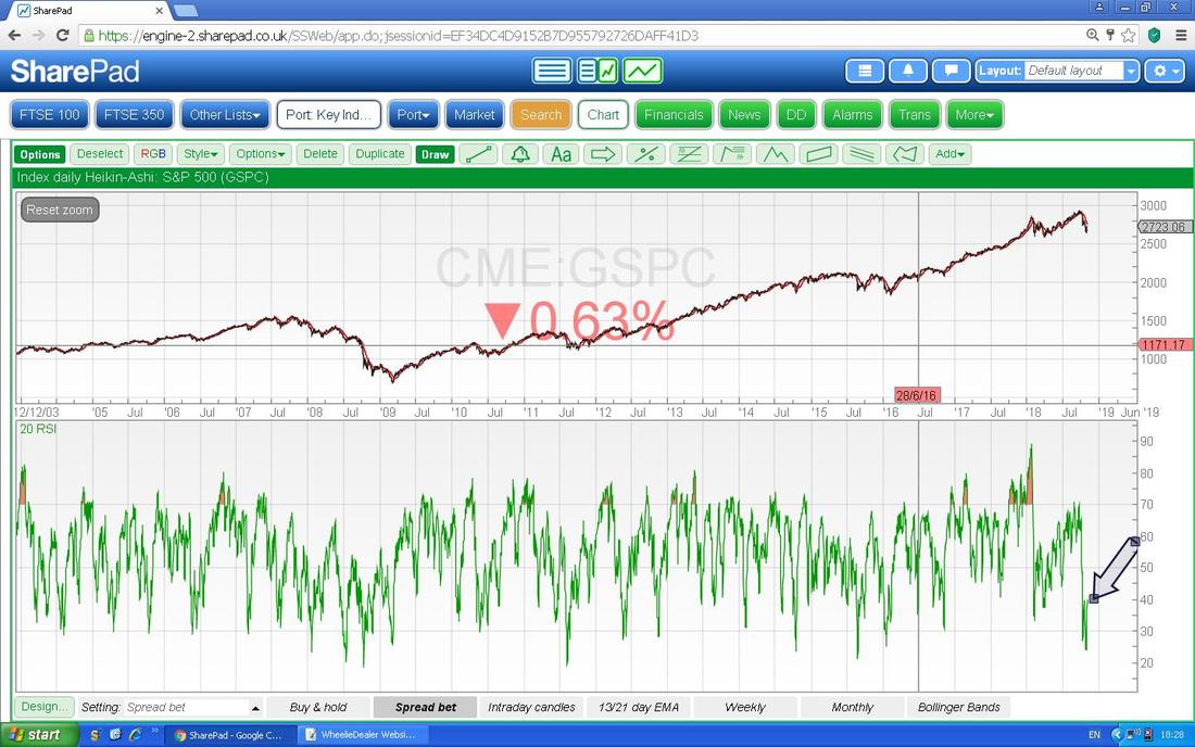
Now we have the Daily Heiken Ashi Candlesticks for the S&P500 and this is another of my favourite Technical Indictors and it is pretty reliable at telling where things are Turning but it needs to be realised that it is a ‘slow’ Indicator as the Candles form over 2 Days using the Averages of where it Opens, Closes, etc. My Big Black Arrow is showing where we now have Big White Up Candles and this suggests more gains. Note where my Red Arrow is that we had a Narrow Black Arrow after a series of Big Black Down Candles - this was telling us that a Turn was coming.
Heiken Ashi are totally different to ‘Normal’ Japanese Candlesticks but they give very clear and reliable Signals I find. 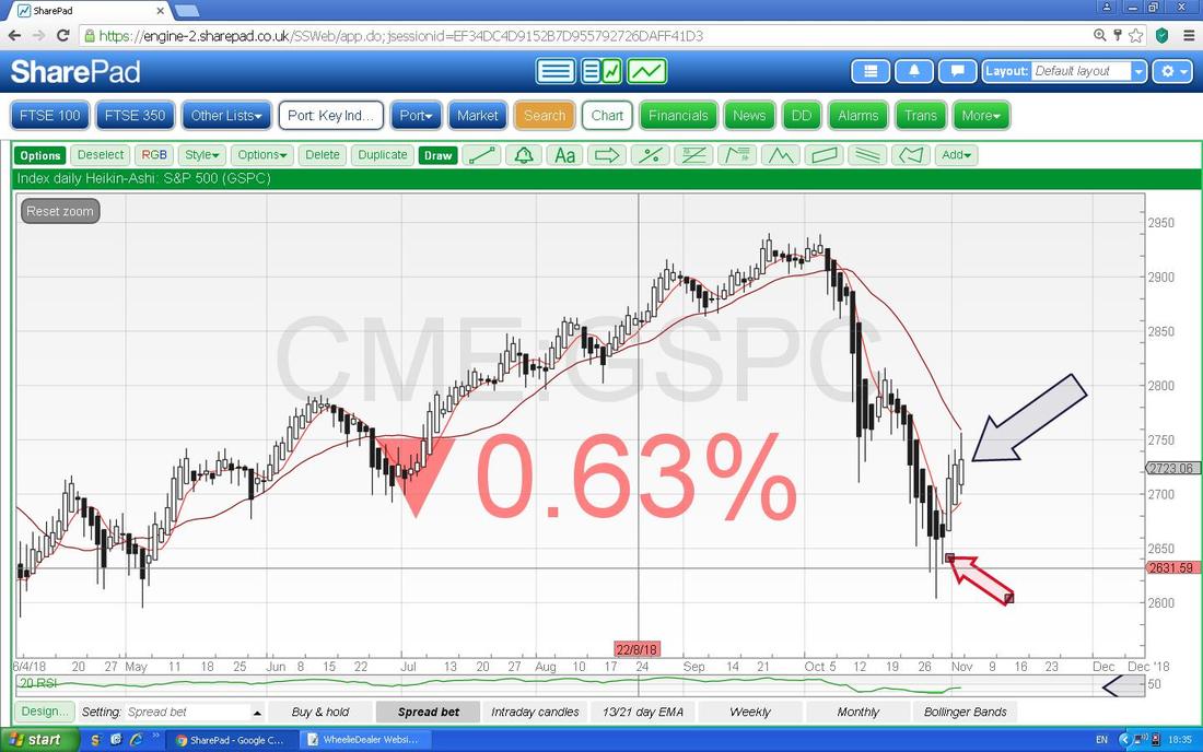
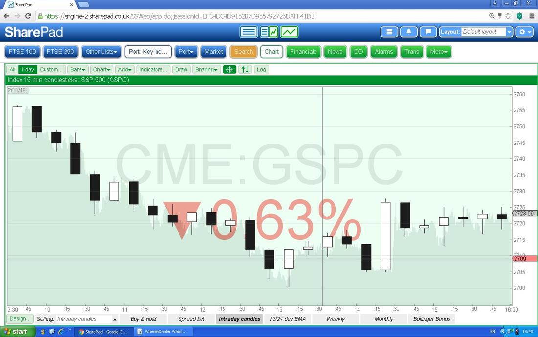
Next we have ‘Intraday Candles’ - I am not going to talk much about this but I thought Readers might be interested because this is something that SharePad has which ShareScope does not provide on the Daily Update Version. This one has 15 Minute Candles which is probably about as low as you should sensibly go but it is configurable for all sorts of time periods. I know many people swear by Level2 but I reckon you can gain similar information simply from using Intraday Candles.
Now we have possibly my ‘Top Contender’ for the ‘Best Charting Indicator in the World’ trophy - I love this one big time (I so so so want to Marry it !!). On the Chart below we have the Daily Candles for the S&P500 but I am not really interested in those here. What I am focused on is those Black and Red Wavy Lines which are the 13 Day EMA and the 21 Day EMA (Exponential Moving Averages - the 13 Day is the ‘faster’ one which is the Black Line). Where my Arrow is we had a ‘Bearish Cross’ between the 13 and 21 Day EMAs and now we need a reverse of that (obviously a ‘Bullish Cross’) which I find tends to be a very good Predictor of more Gains to come - try it yourself !!
At the moment the Black 13 Day EMA is curving round but we need a few more Days of positivity or at least Sideways to get a Bullish Cross. I am convinced a ‘System’ could be made where you Short on a Bearish Cross and you go Long on a Bullish Cross…….. 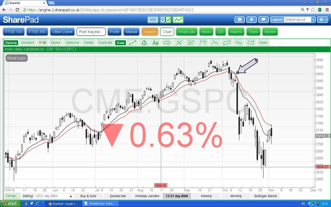
I won’t show the Nasdaq Composite because it is pretty much the same as the S&P500 as is the DOW.
FTSE100 This is probably the Index I am most interested in because it is the one I am most likely to use for Shorting and Hedging if I see trouble ahead. It is not ideal as the behaviour of this one can be a bit difficult at times but with the new Spreadbetting Margin Rules being a pain in the Butt, I find this is the best one to use - although the Major US Indexes like the S&P500 are ok. The FTSE250 is nice in terms of how it ‘matches’ my Portfolio but the Margin Requirements are ridiculous now. Stupid Regulators - in an effort to avoid People losing money they have actually made it harder to Hedge which is a Risk reducer - arghhhhhhh !!! As with the S&P500 I want to look at the ‘Big Piccie’ first. This Chart goes back to 2009 and you should be able to see a pretty nice Uptrend Channel which has been in force all that time - very tasty. My Red Arrow is pointing to the Bottom Line of the Uptrend Channel and it is important that this holds if we do get into trouble - this means Support around 6500 ish is very important. However, it does mean we could drop down to these kind of Levels but still be ok - we would still be within the Major Uptrend Channel (the time to worry is when we drop below the Channel !!). 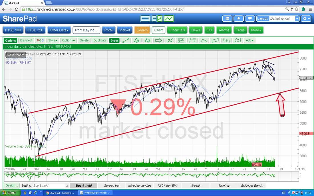
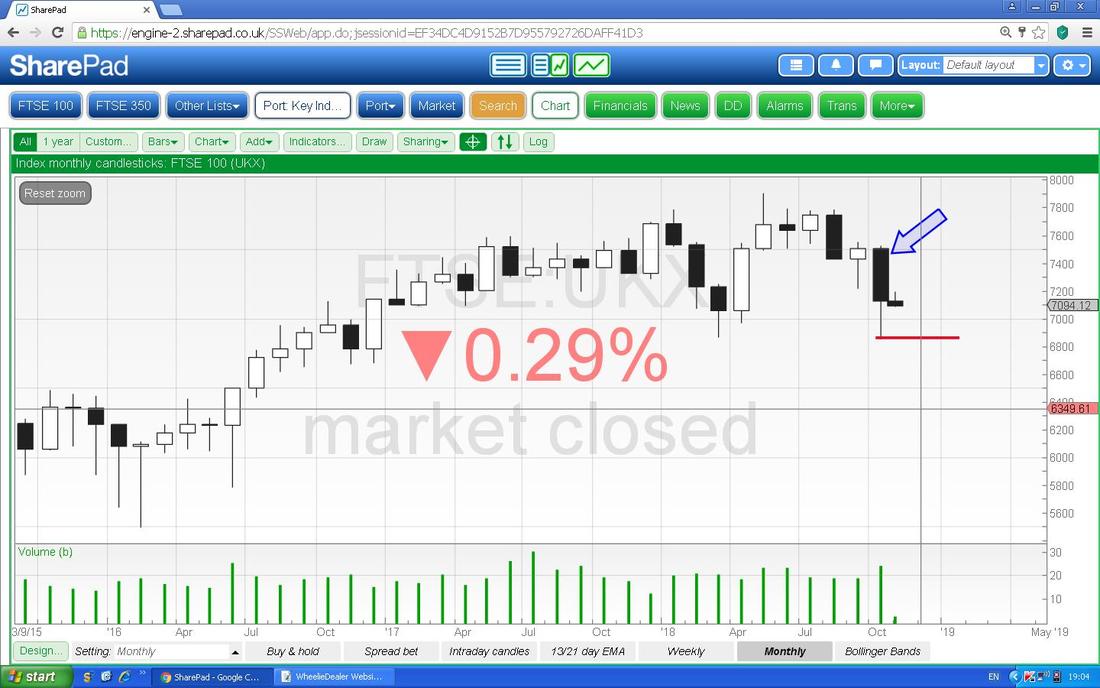
Next up we have the Monthly Candles and my Blue Arrow is pointing to the Big Black Down Candle from October and like with the US Indexes it managed to recover off the Low of the Month which is down around 6850 where my Red Line is which must act as Support. Ignore the small Candle after October - this is for November and has no true validity until it is fully formed up. Down the bottom you can see the Volume was pretty high in October although not an extremely high level.
We now have the Weekly Candles for the FTSE100. My Arrow is pointing to the Up Candle from Last Week but note it was unable to hold the High up at around 7200 where my Red Line is. This is a great Trading situation now - if the Price moves up above the Red Line at 7200 then you go Long and it it drops below the Support where my Blue Line is at 6850 then you go Short. Simples !!
For myself I would prefer End of Day Closes either above or below these Lines as my Signals, but of course more aggressive Traders could pounce on a Breakout either way Intraday. We could perhaps wiggle around inside this Range for a bit now. 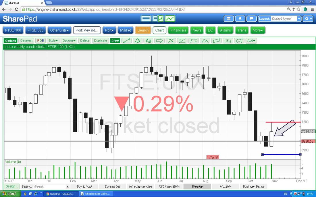
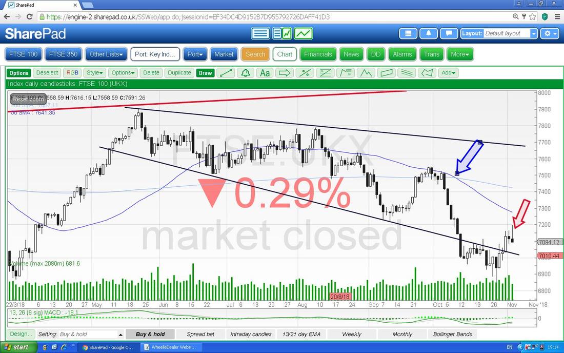
Now we have Daily Candles. My Red Arrow is pointing to an Inverted Hammer from Friday and this suggests a drop ahead - which is consistent with the idea of the Range which I just mentioned. My Blue Arrow is showing a ‘Death Cross’ between the 50 and 200 Day Moving Averages - this is obviously not good and unless we get some positive bullish behaviour from the Price soon, then this could mean Weeks and Months of falls ahead.
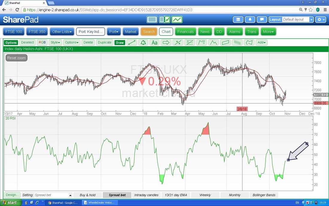
In the bottom Window below we have the RSI for the FTSE100 Daily. My Arrow is pointing to where we are with an RSI around 43 which is still pretty low and it is rising. Note again that the extremely low Readings predicted the move up back in October.
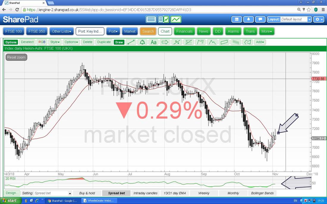
Now we have the Daily Heiken Ashi Candles. My Arrow is pointing to nice Big White Up Candles and this suggests more gains - however, remember these are ‘slow’ and do not reflect the negative signal given by that Inverted Hammer on the normal Candles.
Now we have the Daily Candles with the 13 and 21 Day EMA Lines - note where my Red Arrow is we had a Bearish Cross which is still ‘in force’ and look how the faster Black 13 Day EMA Line is curving up towards the slower Red 21 Day EMA Line - we need these to Cross to give a Bullish Cross.
Sorry about all the lines and text and stuff - these are from where I put some Shorts on recently - see the ‘Trades’ page. 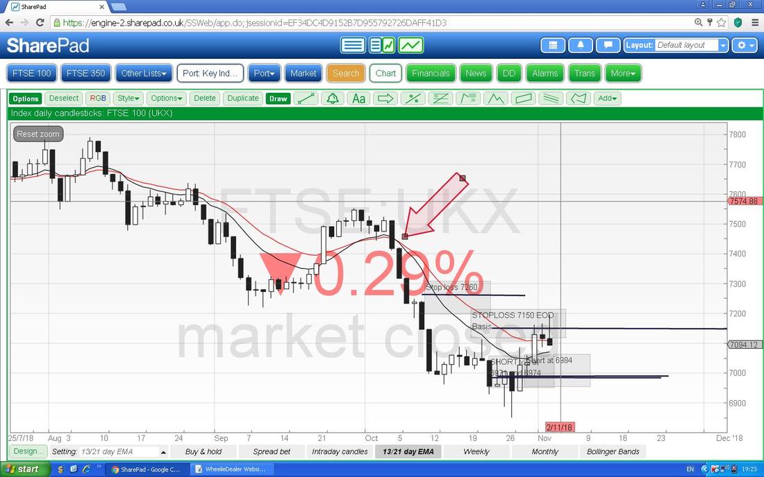
Next up is the Daily Price Candles with the Red/Pink Zone being the Bollinger Bands. Where my Arrow is note how the Price got above the Upper Bollinger Band on Friday but then dropped back inside - it is very possible and likely that the Price drops down now towards the Lower Band around 6900.
For time reasons I will leave it there and not show any more Indexes. However, if you follow me on Twitter I am sure I will be lobbing Tweets out tomorrow night (Monday 5th) which will cover a lot more Indexes. If you don’t have a Twitter Account, then you can find a copy of my Twitter Feed on the Homepage of the Main WD Website and also there is a Tab for the Twitter Feed on WD2. These are crazy times so be careful, but all the best for the coming Week, Cheers, WD. 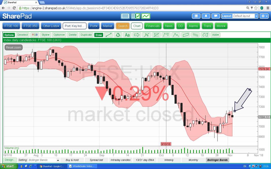
1 Comment
Paul Hunt
11/5/2018 01:14:47 am
WD, I reckon save the car for the spring! Leave a Reply. |

Stocks & Markets WheelieBlogsThese tend to be more Markets and Stocks related and timely - the Blog Page on the Main WheelieDealer Website has the 'Educational' stuff (well that's the theory anyway !!). Archives
October 2021
Categories
All
|
