
|
stocks & Markets blog |
|
I’m typing this first chunk of text on Saturday Night, and from what I am hearing it looks like Grandpa Biden will be the New President and with any luck the craziness of the Trump Administration will now go away. Although of course, none of the division within the Country will be resolved and it is remarkable how the US is split 50/50 down the middle, in a similar way to how the UK was over the Brexit Vote.
Of course nobody can know what the next 4 years will bring, although what we do know is that the American Public have somehow managed to orchestrate a Political Machine that will be pretty powerless and unable to get almost anything done. With the Republicans still holding power in the Upper House, then it will be quite a challenge for the Democrats to get much new Legislation through and on the plus side for Markets, it should mean that the more extreme Left-wing policies should hit the buffers.
The animosity between the two sides of recent years makes it extremely unlikely that the Republicans will cooperate with the Biden Regime, especially because their Voter base is now very Trumpian. It is quite a stretch to think you can try to impeach a Republican President on some pretty weak accusations, and then expect the Republicans to suddenly work with you.
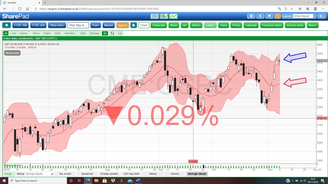
I can’t see this changing much on the ground though and the discontent with the corrupt Washington political system is most likely going to grow and the Culture Wars are unlikely to get any calmer. Having said that, a big positive might be that the President is unlikely to stir things up in the way that Trump did, although 4 years is just a flicker in time and Jo Biden won’t be doing a second term which means it won’t be long before new potential Presidents start positioning themselves and building their political bases. Hopefully before then we get a reasonable period of political stability but goodness only knows if that will play out. It appears that Biden will be more friendly towards the big Political Global bodies like the WHO and UN and suchlike – although the distrust of China seems common to both the Democrats and the Republicans, so we might not see much change in the animosity between the 2 true Superpowers. Something the Markets have big hopes for is more Stimulus for the American Economy but perhaps this is more difficult with the Republicans blocking anything Biden and the Democrats want to push through. It is one thing to make out that Biden can build bridges across the house, but after the sheer hatred of recent years, it might be politically difficult for Republicans to be seen to be dancing with the Enemy – and in many ways it is in the interest of the Republicans to make life hard for Biden. Another potential challenge arises from C19 where Biden might be much more hawkish on such questionable Policies as widespread Lockdowns – that is likely to cause more strife if it does get traction and of course it is very damaging for the US Economy. In terms of the Markets though, perhaps we have a big source of uncertainty out of the way now in that we actually know who the new President is – and that could be positive. The Brexit Talks are still going on as far as I know, but that is another worry that has been lingering over the fringes of the Markets. It seems accurate to observe that any Economic damage caused by Brexit is miniscule compared to the Armageddon situation inflicted by Government Policy regarding C19, and perhaps with this in mind, we might find that even a ‘No Deal’ situation has little impact. Anyway, I will be just reading the Charts and doing what they tell me to do. The rebound in the US in recent days is positive although it looks to me like they could be Topping out again and I will look at that later in this blog. For the FTSE100, we seem to be at the top of the Downtrend Channel that has been running for months now, and it is only once we breakout to the upside from that Channel that we can be more confident UK Shares are going to rise. At the moment I have fairly large Shorts on the FTSE100 and I am mulling over reducing them a bit – but I have not yet decided and I will no doubt mention this later when we look at the Charts. I get the idea that the Uncertainties are reduced a bit now that the Presidential Election is settled, and we are coming into the time of year when Stocks tend to do well – so it makes sense to be getting near 100% Long. On Friday we released the latest Twin Petes Podcast and you can find it here on Soundcloud. If you use Apple, Spotify, Overcast, Audioboom etc., then go to the ‘Conkers Corner’ Channel and you want Podcast number TPI 35: https://soundcloud.com/user-479955511/conkers3-wheeliedealer-35-takeovers-500-lockdown-winner-lid-ao-hzd-dddd-crst-lid-fan Last Week I endured some fair swings on my Portfolio through last week and was pleasantly surprised at the close on Friday to be up 0.4% and now my Portfolio is up 2% since January 1st 2020, and it still astonishes me that I can possibly be up on the year when the UK and Global Economies are so knackered. As I mentioned above, I am 50% Hedged via Short Spreadbets on the FTSE100 and my slant now is towards reducing those if the Charts confirm this stance. In the week just gone that stance went against me with the FTSE100 rising quite strongly, but of course that is the nature of Hedging and I do it to reduce overall Market Downside Risk, which was very real not many days ago but I sense it is reducing a bit. In terms of buying new Shares or Topping up, I am in no rush and I am building Cash where possible to make sure I am nicely cushioned in these troublesome times. I have several Takeover situations playing out and hopefully they will free up some Slots in my Portfolio and provide a nice chunk of Cash; once I feel my Cash resources are high enough, I will be looking to start buying selectively again, although I won’t be going crazy. With the UK Government having no strategy with regards to how it gets ahead of the C19 Fiasco, I think we could have a difficult Winter and that may make things tough for Stocks – if not in the next few weeks of 2020, then into January 2021 we might see Stocks coming under pressure again. That is a common pattern we see in many years after a strong rise at the tail end of December. Blog Slate After really dragging it out, I finally got that Educational Blog about Volatility of a Portfolio published on Friday Night and hopefully you will find that an interesting and insightful read. I am pretty happy with it although like anything, on reflection there are bits I would have ideally included but it is quite lengthy. Something I mentioned in the Heading but not at all in the Blog is the concept of ‘Consistency’ – hopefully you will get my drift though. As a result of writing that one, I realised I have not written a specific Blog about what a ‘Quality Stock’ actually is; this is something that gets talked about all the time but I am sure for many Readers, especially for less experienced people, then the term is fairly undefined. I will try to write a Blog that corrects this glaring omission and with luck I should be able to write that reasonably quickly – although it might not appear in the coming week (especially because I haven’t even started it yet and I am intending to take Monday Night watching the Mello stuff). I did however manage to update the ‘Monthly Performance’ page which sits on WD1 with the numbers for October and some discussion around my Strategy etc. It is crazy how fast 2020 has whizzed by really, although with all the C19 nonsense and the various Health aggravation I have endured, I don’t think I will be all that upset when 2020 finally ticks over into 2021….. Winged Ducks from the Blog Archives In that Blog about Volatility of a Portfolio I put in loads of Links to previous Blogs that you might find useful (especially if you are new to the WD rubbish dump). If you go to the ‘Blog Index List’ page on WD2 then you should find the full List of all the Blogs I have ever written (there’s a lot !!) and all the Educational ones have Links on them so you can find them quite easily. From that List I bring you this old effort which you might find a helpful read: https://wheeliedealer.weebly.com/educational-blogs/a-simple-framework-to-model-growth-featuring-boo I’d forgotten writing that one but I am pleased to have rediscovered it because it is a concept I use all the time, but I suspect few Readers have figured this out and yet it is quite easy to use. Right, let’s see some Charts !! S&P500 As always the Charts I show are taken from the excellent SharePad Software that I use and if you click on the Images they should grow larger so you can see more detail. First up my Chart below has the Daily Candles for the S&P500 and my Green Arrow is pointing to a ‘Bull Cross’ between the Black 13 Day EMA (Exponential Moving Average) and the Red 21 Day EMA – and clearly this is a positive Signal. However, the Bull Cross has only just happened and I find it better to let such Signals get “cemented” which I interpret as meaning the Candles in the days following and perhaps some other Indicators, line up to suggest this is a valid Signal. The danger is that when a Market is choppy and moving Sideways, the 13/21 Day EMA Crosses do not work as reliably. And that brings me onto an important point about the S&P500 (and I suspect this applies to the Nasdaq Comp as well) in that it could be stuck now in a Sideways Range as marked by my Upper Blue Line at the All Time High (ATH) of 3588 (on the recent Podcast TPI 35 I think I erroneously said this was 3400 but really we should call it 3600), and then the Bottom Blue Line down at 3209. So, in simple terms, if the S&P500 Breaks out above 3600 then that is good news for Bulls and if it Breaks down below 3200 then that is bad news for Bulls. In recent weeks I have been flagging the latest Peaks as marked by my Black Ellipse and my Red Ellipse. Note that if we turn down now from where my Blue Ellipse is, then we have a string of progressively lower Highs which is not great although they are quite close together so it might just be lining up with the idea of a Sideways Range really – and now we might be at the top of that Range. If you look inside my Blue Ellipse, then you should see that on Friday we were treated to a Doji Candle with quite a Long Tail downwards and judging by what happened on the Nasdaq Comp, where we got a pretty good example of a ‘Bearish Hanging Man’ Candle, then it could easily drop back from here. 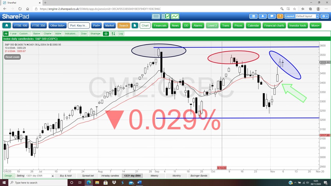
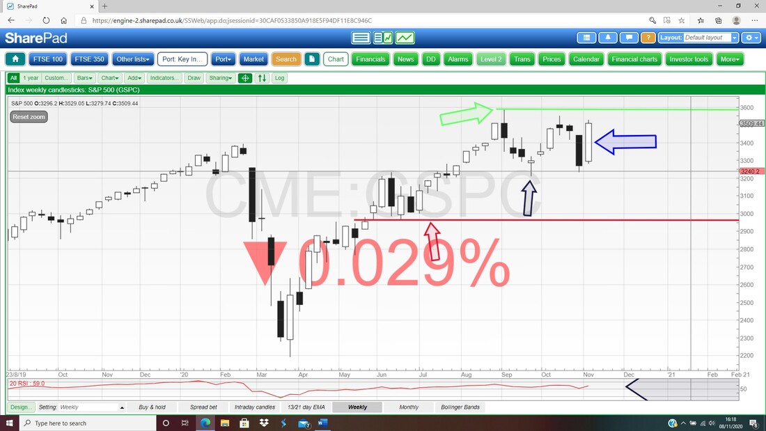
Next up the Weekly Candlesticks for the S&P500. Again we have the Sideways Range which was something I pointed out last weekend, and my Blue Arrow is pointing to a Big White Up Candle for Last Week which is Bullish in itself, but as I mentioned above, we could turn down from here.
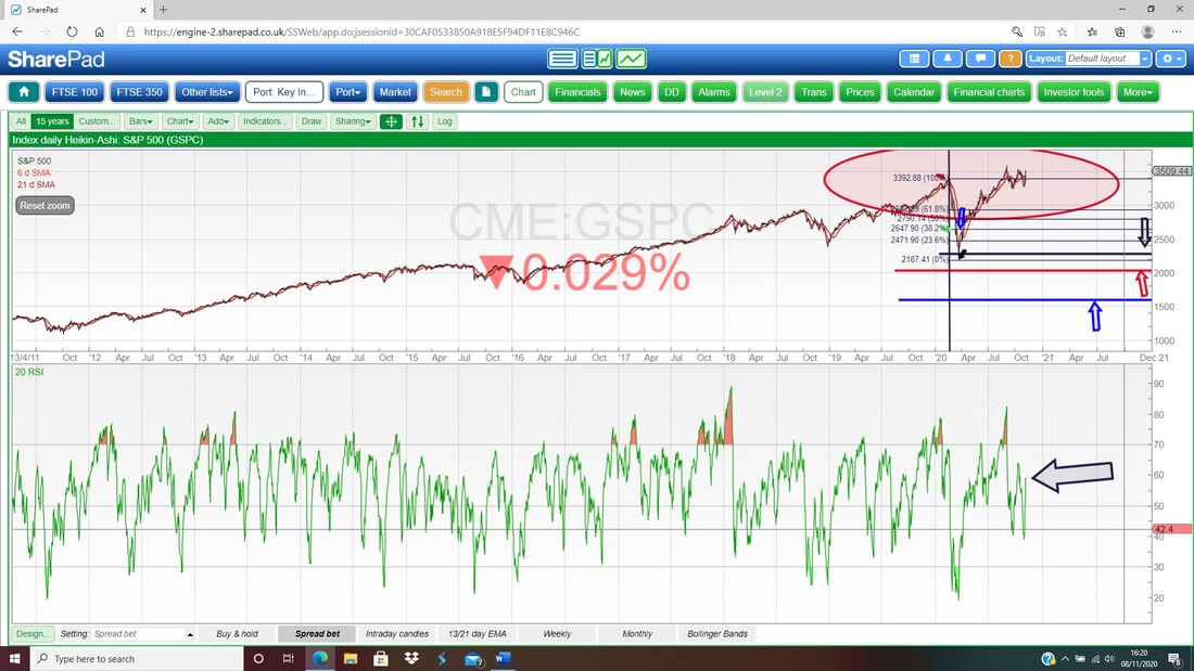
In the bottom window below we have the RSI (Relative Strength Index) for the S&P500 Daily. On a Reading of RSI 59 this is not at all over-bought and can rise a lot more if it is in the mood.
My final Chart for the S&P500 has the Daily Candles with the Pink Zone marking the Upper and Lower Bollinger Bands. My Blue Arrow is pointing to how the S&P500 Price Level has moved away from the Upper Band and if it does fall from here, then there could be Support from the Bollinger Midpoint Line which is the Red Line marked by my Red Arrow at about 3380.
Nasdaq Composite Index
I won’t dwell on this because it is so similar to the S&P500 anyway (Big Tech makes up a large proportion of the S&P500 so it is bound to be impacted by how the Nasdaq moves) but my Green Arrow below is pointing at the ‘Bearish Hanging Man’ from Friday. Note also that between Tuesday and Wednesday we got a big Gap and between Wednesday and Thursday we got another big Gap. That is pretty unusual and to be honest I cannot recall ever seeing this on an Index Chart (it is rare on normal Stocks even on illiquid stuff). If the Hanging Man is predicting a Turn down accurately, then we might see these Gaps filled very quickly which would mean a significant drop, probably back to the bottom of the big Sideways Range. 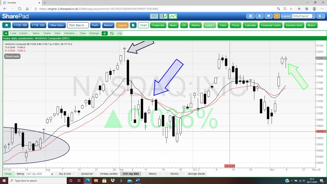
Brent Oil Composite
I always check on Oil because I regularly use the FTSE100 to Short or go Long on an Index and we all know Oil impacts the FTSE100 a fair bit. My Chart below is rather busy but it does make Oil look a bit weak. First off my Green Arrow is showing that there was a Bull Cross between the Black 13 Day EMA Line and the Red 21 Day EMA Line which quickly got reversed and did a Bear Cross (so this is an example of a False Signal as I was mentioning in my section on the S&P500 above) and we are now in ‘Bear Mode’ on this extremely useful Indicator. Next I have introduced a Black Line (marked by my Black Arrow) at the top and this looks like defining the Top Line of a Downtrend Channel. My Blue Ellipse is capturing a ‘Long Tails Doji’ from Thursday (which showed indecision and can often mark a Turning Point), and on Friday we got what looks a bit like a ‘Bearish Shooting Star’ Candle. If the Brent Oil Comp price does fall, then Support comes in at about $38, then $37.26 and then $35.8 which is where my Red Horizontal Line (Red Arrow) is. If that Red Line fails as Support, then that is pretty bad news and it could bring as low as $30 into play. 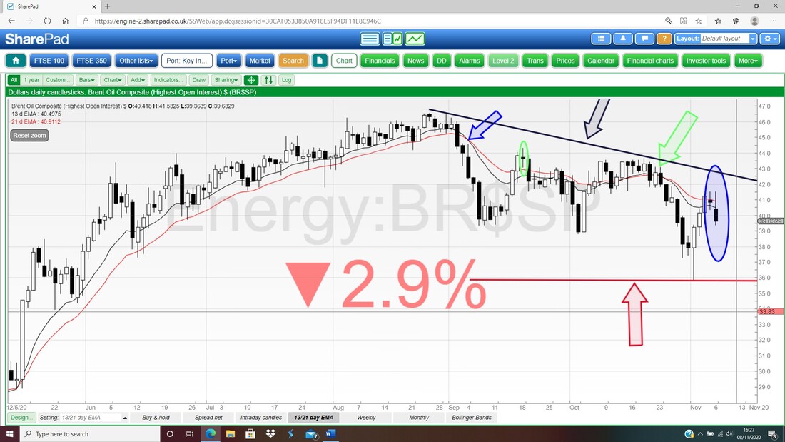
Royal Dutch Shell RDSB
I have been looking at this one using the excellent ADVFN App on my Fone for a while now but of course with such a small Screen (and such old and shagged out eyesight !!) it is not really clear to me what is going on, so I wanted to have a look at the Chart using SharePad and I thought I might as well treat Readers to it as well because I am sure it is held by many folk. To be honest, this Chart is just as baffling once I can see it properly !! First up we seem to have a Wide Range between my Red Line (Red Arrow) at the bottom around 874p which must hold as Support; and then the Black Line at the Top (marked by my Black Arrow) at about 1380p. Then I have cheated and done some ‘Line Fitting’ which is my best guess of what is happening now. To do this I drew in the Green Support Line firstly (Green Arrow) and this had around 3 ‘Touch Points’ so it is almost valid and can act as a base to try to figure out where the Downtrend Channel is running. Next I went for a pretty much parallel Line to this and drew in my Blue Resistance Line (Blue Arrow) which is at about 1002p which is also the High that was hit a couple of days last week. Now this is just guesswork by me because there is a lack of ‘Touch Points’ but if the Price of RDSB drops in the coming Days, then it will show that my hunch is correct. To the upside, RDSB must Breakout over 1002p and if it can push up and take out 1211p, which is where my Red Ellipse is, then that would be good news for Bulls. To the Downside, I find the ‘Downwards Pointing Triangle’ between the Red Line at the bottom and the Blue Line above which is squeezing down a bit problematic. In essence, if 874p fails as Support, then there is big trouble. 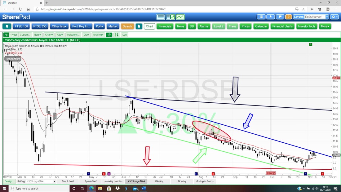
There are a couple of bits of hope for Bulls on RDSB though. Firstly, my Black Arrow on the Chart below marks a ‘Bull Cross’ which happened between the Black 13 Day EMA and the Red 21 Day EMA about a day ago. That is still very early and could be a False Signal but if it plays out well, then this could be the first proper sign that the mood is changing towards RDSB.
However, later this week RDSB goes Ex Dividend which you can see in the bottom right-hand corner where the Red Box is. If you set SharePad up appropriately, then it will put a little Red Square Box at the bottom with a White ‘X’ in it. If you click on this, then it will come up with the details as shown but obviously it is a bit small on this view. Anyway, on Thursday RDSB goes ExDiv for 12.67p a Share, which might add some Support to the Price for a few days but after Thursday perhaps it will fall away if the Oil Price is weak. 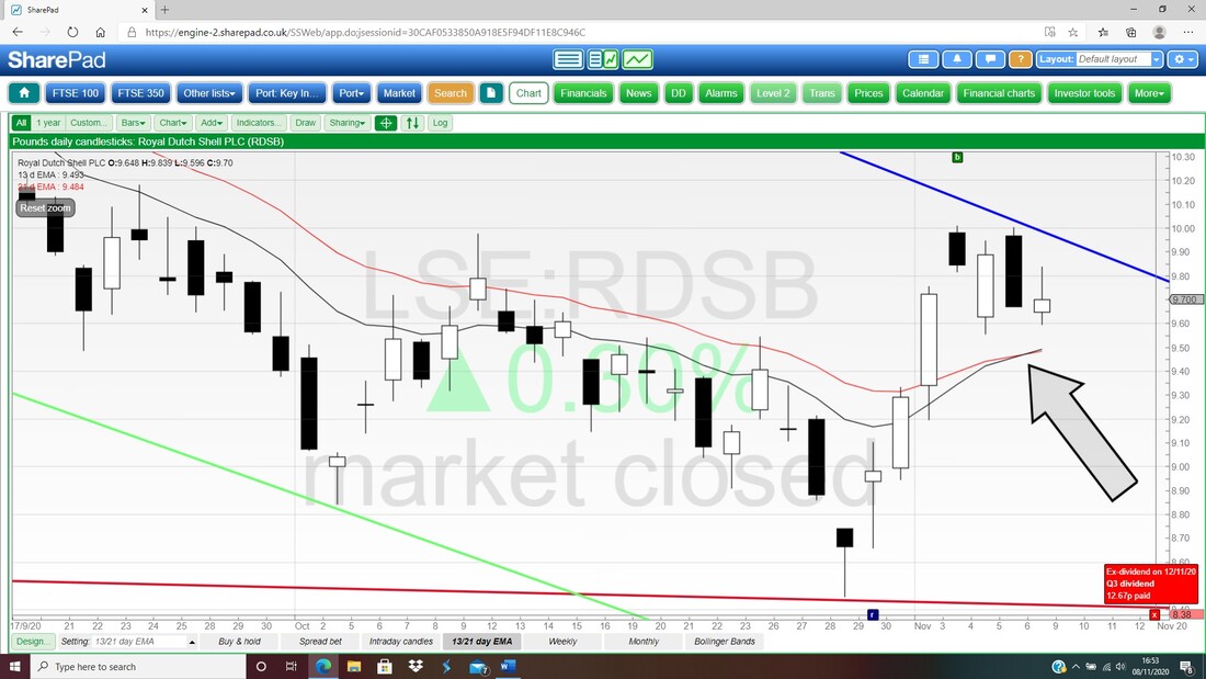
FTSE100
With a pretty chunky Short Position on the FTSE100, I am no doubt very fixated on the Charts here and desperate to see what they have to tell me. I tend not to stress about the Macro News all that much and I am more driven by the Signals that the Charts tell me. Well, they are telling me to keep those Shorts running !! On my Chart below with the Daily Candles, the first thing to notice is that Downtrend Channel marked by my Upper and Lower Green Lines. Next look at my Red Ellipse which is capturing a ‘Long Tails Doji’ Candle from Friday with a High of 5950 and on Thursday we had a ‘Bearish Shooting Star’ sort of shaped Candle. This suggests to me that we are at the Top of the Downtrend Channel and if we are going to rise from here, first we need to see Resistance at 5950 taken out and then you just follow the Peaks up the Downtrend Channel – so that is 6040, 6123, 6297. To the downside we are looking at Support from 5711, then 5654, then 5525 and the latter one is critical and must hold. You should be able to see that the Black 13 Day EMA Line and the Red 21 Day EMA Line are in ‘Bear Mode’ still. This Downtrend Channel is a great example of when the 13/21 Day EMAs lose their predictive power and give many False Signals. As long as you understand this limitation, the 13/21 Day EMAs are still one of the best Signals you can get. 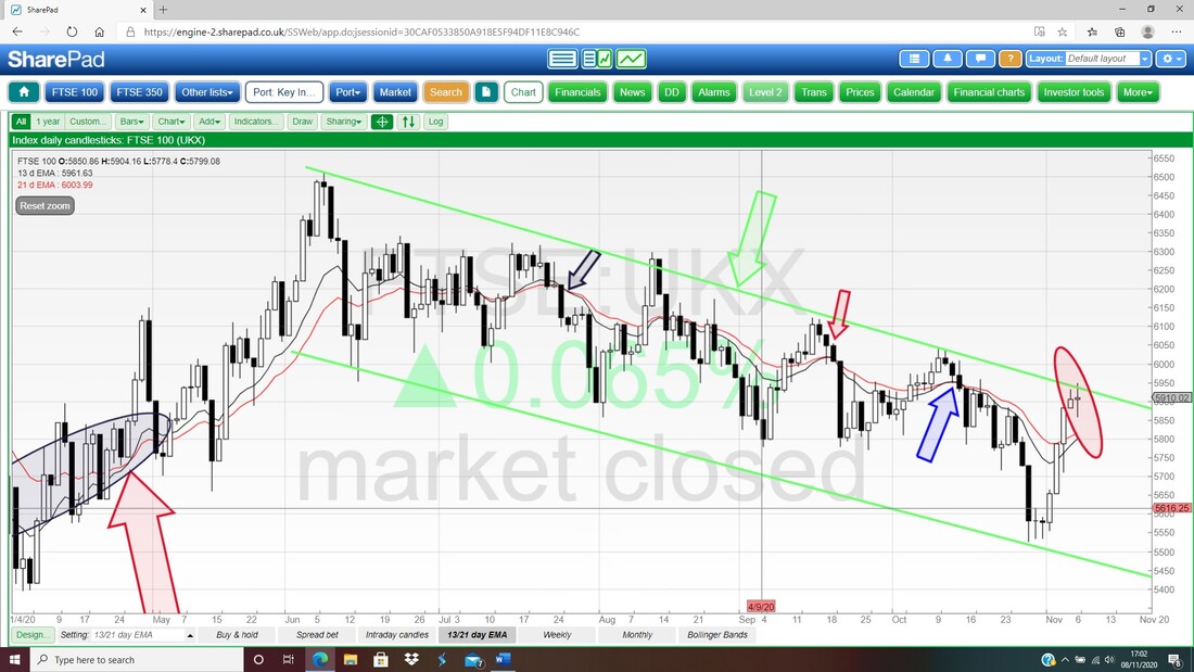
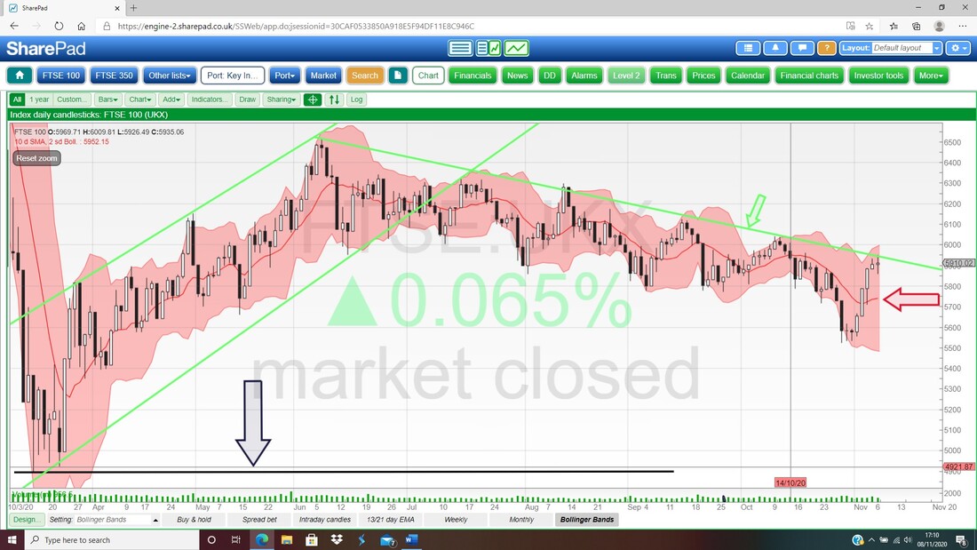
The Bollinger Bands illustrate the Downtrend Channel admirably. My Red Arrow is pointing to the Red Midpoint Line at about 5740 which might be Support if the FTSE100 does drop back.
At last something more Bullish !! On the Weekly Candles below for the FTSE100, my Blue Arrow is pointing to a nice White Up Candle – this could be the start of something good – although if the Downtrend continues then it could likely prove a False Signal.
I just had a quick look at the RSI for the FTSE100 Daily and it is reading RSI 53 which is just off Neutral (RSI 50) and tells me little useful, so I won’t show it. OK, that’s it for this weekend – have fun and keep your wits about you, Good Luck, WD. 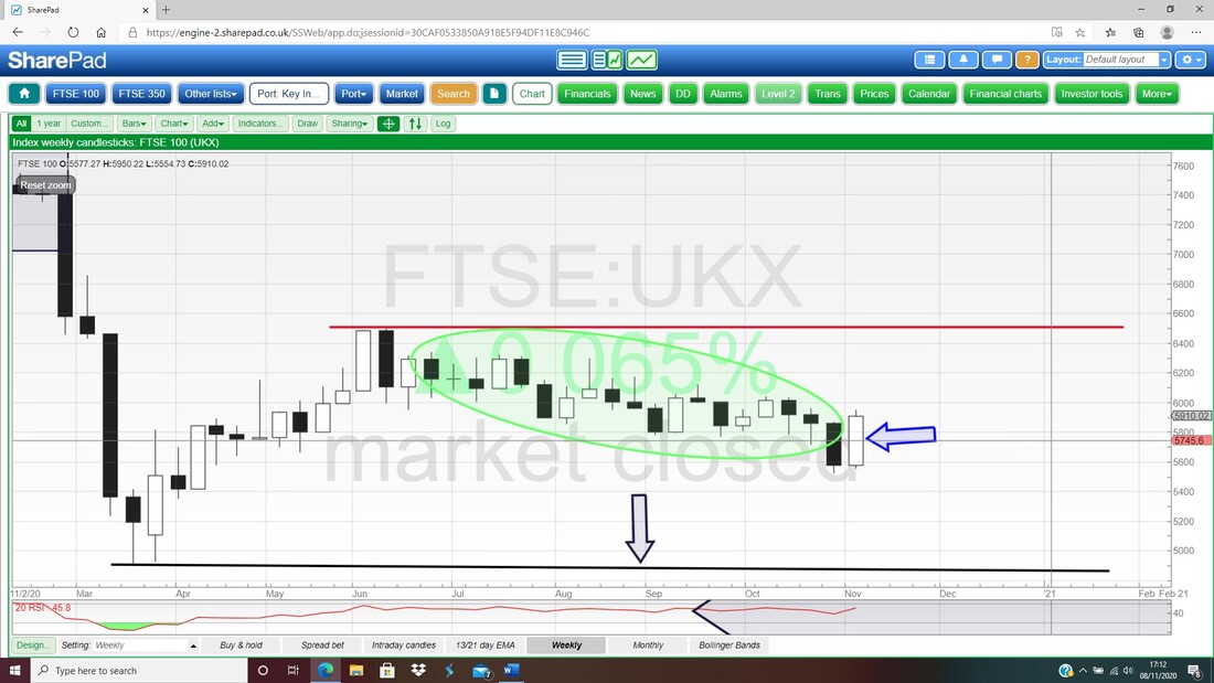
2 Comments
Kevin S
11/8/2020 02:35:13 pm
Hi Pete, I hope you are well.
WheelieDealer
11/15/2020 12:49:01 pm
Hi Kevin, Leave a Reply. |

Stocks & Markets WheelieBlogsThese tend to be more Markets and Stocks related and timely - the Blog Page on the Main WheelieDealer Website has the 'Educational' stuff (well that's the theory anyway !!). Archives
October 2021
Categories
All
|
