
|
stocks & Markets blog |
|
Here I am on Saturday night working on this blog and seeing as it is my birthday, it is not really how I would have liked to pass the hours. But in Lockdown Windsor on a miserable wet evening, this is pretty much as exciting as it gets……..
Obviously I don’t want to spend ages on this and I am really eager to get looking at the Charts because the Markets were pretty truculent last week and I want to get a good sense of where we are most likely to go next. I put some Shorts on the FTSE100 to hedge my Portfolio at the end of the week and hopefully this puts me in a good position to ride out any more rocky waters (see my ‘Trades’ page on WD1 for the details).
Before I forget, we released the latest Podcast TPI 41 on Friday and you can find that on Soundcloud at the link below. If you use Apple, Audioboom, Spotify, Overcast, Youtube and some others, then go to the ‘Conkers Corner’ Channel and you should find all the Twin Petes Podcasts there.
https://soundcloud.com/user-479955511/conkers3-wheeliedealer-41-gamestop-gme-tsla-msft-ai-spe-boo-gtc-itrk-hwg-prsr-bgo Oh, please note I c*cked up with a TIDM Code on this one – I meant to say SUPR for Supermarket REIT but got confused with PRSR which is PRS REIT (you can probably sense my befuddlement during the call). Last Week Well, like most people I suspect, last week was a bit rough with my Portfolio giving back 2.8%. Surprisingly I am still just positive for the year but if we get more weakness then I am likely to drop back into the red. I put the Hedges on quite late although they did help me on Friday – and if we get more drops in the coming days, then the Hedges should reduce the hit and I might even add a little bit more Short. I am 20% Hedged at the moment and might take it up to 30% but no more than that, because I have learnt that over-sized Hedges can get a bit difficult to manage; particularly because any rallies tend to be hard and fast. Ah, while I think of it, on Friday I noticed when the Markets opened that they were down and after the Hammer Candle from Thursday, this was telling me that a bounce was not on and we were likely to fall more (the Bulls should have forced a gain straightaway if the Hammer was to be valid). I then watched the Intraday Chart on my ADVFN App and I was focused on the regular occurrence of a peak move being around 10am. As I kept looking back at the Chart, I noticed it get up to a level and then start to flatten out and start to drop back and this was around 9.30am, so I decided to go for it and I opened up the igIndex App on my Fone and placed a Short. I then placed another a few hours later when I saw things were getting weaker. In general I hate making decisions to place Trades during Market hours, but with Hedges they are a bit different because if I am ‘wrong’ then I can quickly close them and in the meantime my Long Positions (Spreadbets and normal Shares) will be gaining. I look at Hedges as an alternative to moving to Cash in order to reduce my Market Downside Risk on the Portfolio, rather than just Trades in their own right. With such a dubious backdrop, I am not likely to do much until things calm down a bit. I suspect we will need to see RSI (Relative Strength Index) Readings down around 30 on the major Indexes and we will need a proper ‘Capitulation’ day to clear the Market. This usually takes the form of a really scary and nasty day where my Stocks drop across the board and it all looks really bad (and we usually see higher Volumes). We had some days like that early in the 2020 big Sell-off but I am not expecting such a bad hit this time – but we might get a fair bit more downside yet. It is US Non-Farm Payroll Numbers on Friday afternoon (usually 1.30pm UK time) and that might spark a Rally or something. So, with the backdrop like that I will not be buying or selling any Stocks unless I get a sudden urge, and if anything I will just add to my Short Hedges and will be focused on looking to see when the Charts are telling me to close the Shorts. Blog Slate Rather disappointingly I have not made much progress on the ‘Stock Buy Rationale’ blog I am in the process of writing. I had planned to work on it last night but those health problems I have been enduring kicked in again yesterday and forced me to keep away from the keyboard. It is extremely frustrating and I am not really sure what has fired the problem up again as it seemed to be fixed. I am definitely better today so maybe it was an aberration. If I am ok, I will try to work on the blog next week and I really want to get it done. Having said that, with the mood of the Markets it is not a great time to be buying Stocks anyway so perhaps there isn’t a need to rush. We need to let the Market settle and clear before assuming we are at the bottom. I did manage to update the ‘Little Black Book’ a couple of days ago and this includes lots of Stock Ideas which you can take away and do more research and analysis on. There are some really interesting things in that list. From a previous Anniversary All the blogs I have scribbled over the last 6 or 7 years or whatever it is now, are listed on the ‘Blog Index List’ which sits on WD2 and all the Educational ones have links to them directly from the list. From that selection of previous creations, I bring you this one about Hedging, which came out a few days before my birthday back in 2016 but of course is spot on with the relevance at the moment: https://wheeliedealer.weebly.com/educational-blogs/topiary-time-aka-all-you-ever-wanted-to-know-about-hedging-but-were-afraid-to-ask Enough partying, let’s check them Charts out !! FTSE100 All the Charts I show are screen-grabs from the excellent SharePad software that I use and if you click on the images then they should get larger on your screen. I recommend you use a big screen rather than a silly little Fone screen as the detail is much clearer on the biggie. If you fancy using SharePad or ShareScope yourself, then there are ‘ads’ around my websites that show where you can click through and get 1 month’s worth of data for free. I get a small payment from Ionic Information who own the software and obviously that helps the Wheelie Beer Fund. For a change I am starting with the FTSE100 because that is the one I am Short on and I am ultra-eager to see what the Charts are saying. First up here is the Chart of the Monthly Candlesticks, and as I suggested last weekend (and I have mentioned on the Tweets), the Candlestick for January is now fully valid and we have a ‘Bearish Shooting Star’ which is pretty ugly looking (my Red Arrow is pointing at the offending article). 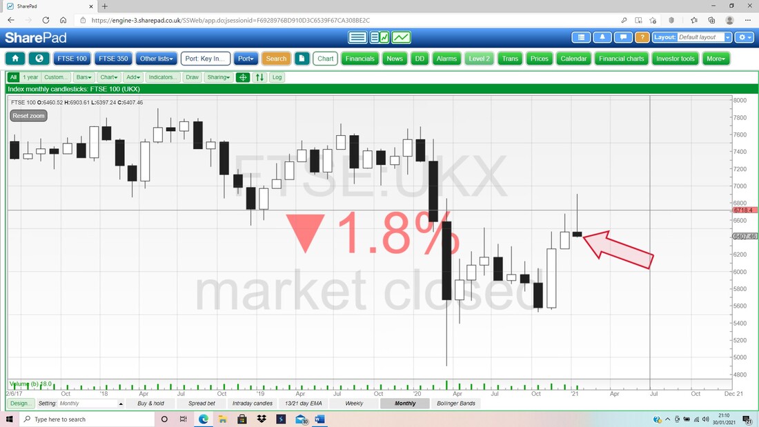
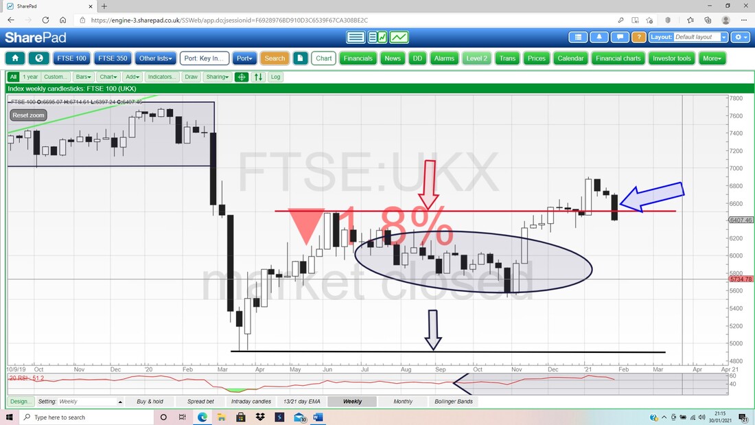
On my next Screen we have the Weekly Candles for the FTSE100 and my Blue Arrow is pointing to a Big Black Down Candle from last week – clearly that is not good. Down below we have Support at 6315 then 6263 and then my Black Ellipse is marking a Zone of Support which runs from about 6250 down to 5550 ish. I doubt we will go that low and around 6000 should be very strong Support.
On the next Chart we have the Daily Candles for the FTSE100 but what I am mainly focused on here is the ‘Bear Cross’ between the Black wobbly 13 Day Exponential Moving Average (EMA) Line and the Red 21 Day EMA Line. This Bear Cross is pointed at by my Red Arrow and it suggests weeks of falls ahead. Look how my Black Arrow marked a Bull Cross and then we had a long run of gains.
However, it is possible to avoid such an unpleasant scenario, but that requires some strength right away now and we need to see the Bear Cross converted into a Bull Cross within the next few days. My hunch (based on the strong run up before) is that we will not get such good news. My Blue Arrow is pointing to the Bottom Support Line of an Uptrend Channel which I have mentioned in previous Weekend Blogs. Note how the Price has dropped down out of this Channel which is clearly not good. 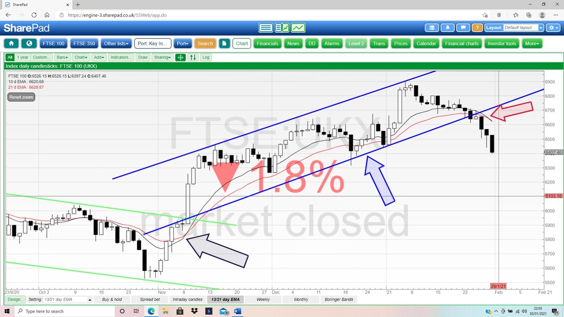
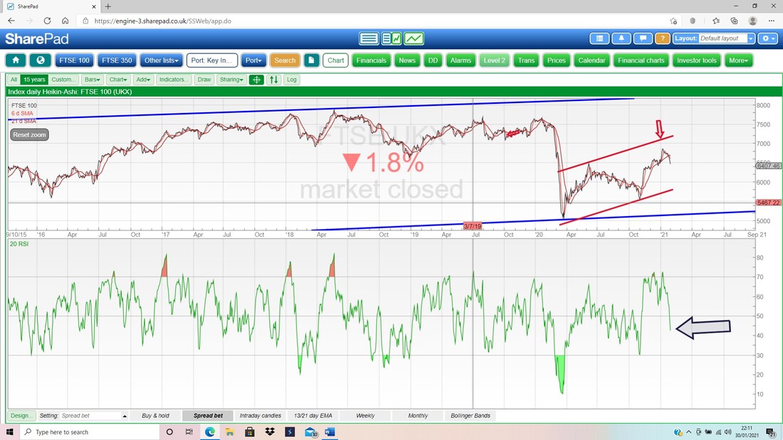
This next Screen is extremely important and will be useful for getting good clues on when we hit the bottom. In my lower Window we have the RSI (Relative Strength Index) for the FTSE100 Daily and my Black Arrow is pointing to a Reading of RSI 41 which has dropped through the Neutral RSI 50 level but clearly can go a lot lower. If we have a proper meaty sell-off, then I would expect to see RSI down around 30 to 25 to clear the Market.
On the next Chart, this is my ‘Working Screen’ and I am just showing this so you see the method I use for marking where my Positions are Opened etc. My Blue Arrow is pointing to 3 Horizontal Blue Lines which are where I opened the FTSE100 Shorts I have running and the Pink Arrow is pointing to the 2 Horizontal Pink Lines which mark where my Stoploss Levels are.
I operate my Stops on an End of Day (EOD) Close basis and I operate them manually if the Stops get hit. I do not use fixed Stops with my Broker because it is easy to get caught on an Intraday Spike. 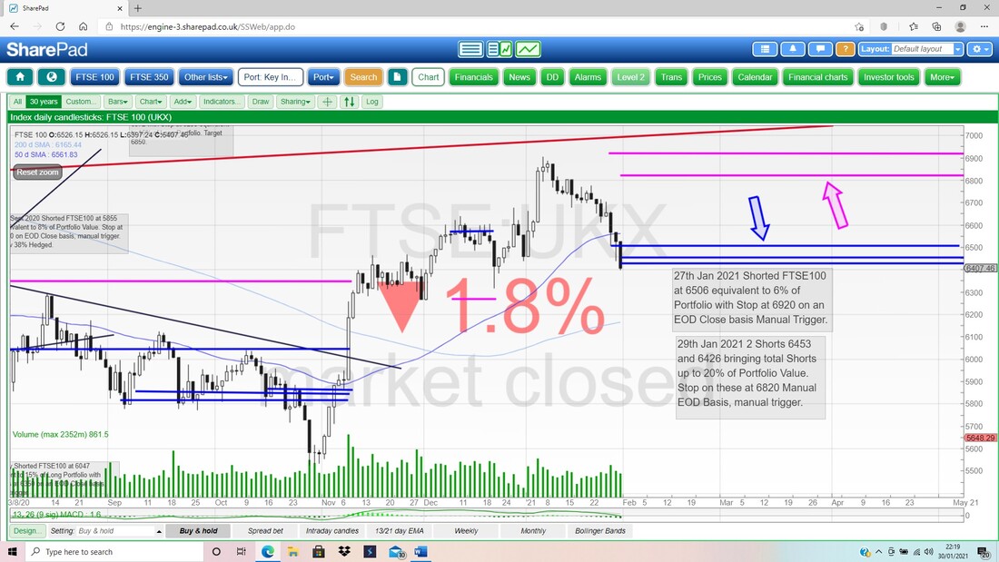
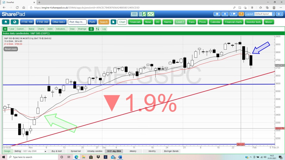
Finally for the FTSE100, we have the Daily Candles with the Pink Zone marking the Upper and Lower Bollinger Bands. My Blue Arrow is pointing to the Big Down Candle from Friday and look how it is ‘hugging’ the Band lower. Clearly this was quite a drop and we should see an attempt to move up; however, if the Bulls can’t even manage this, then that would be pretty negative and show how weak things are.
The Low from Friday is at pretty much 6400 and that should be Support, but below that we go back to where my Black Arrow is at 6315 and then the Red Arrow at 6263. 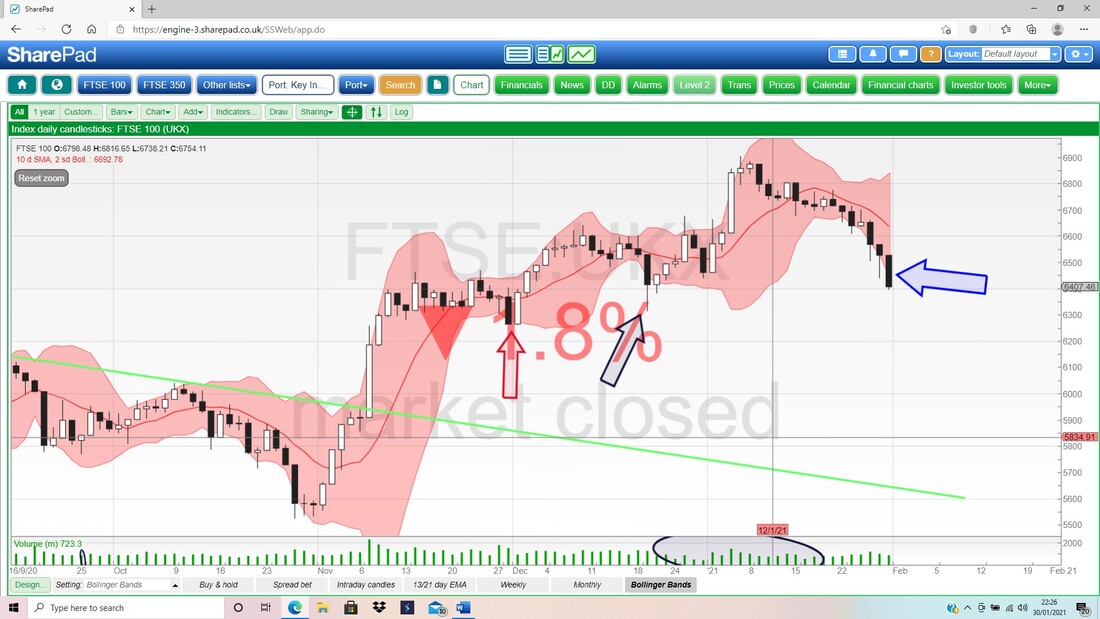
Brent Oil Composite
I don’t want to spend hours on this one but I will just chuck some Charts in because I am finding it intriguing. The thing that hits me is that despite quite hit to Major Indexes on Stocks last week, Oil actually held up pretty well, although did so some weakness. Normally they do tend to move together to a large extent. My Chart below has the Monthly Candles for Brent Oil Comp and my Blue Arrow is pointing to the White Up Candle for January and the only bearish tinge to this is the fairly long ‘Wick’ up above, but it is nowhere near as ugly looking as the January Candles on the Stock Indexes. My Black Ellipse is just highlighting that ‘Zone of Congestion’ which marks where there is quite a bit of Resistance to wade through if Brent Oil Comp can start moving up again. It is around $60 to $75 but even up to a shade over $85. 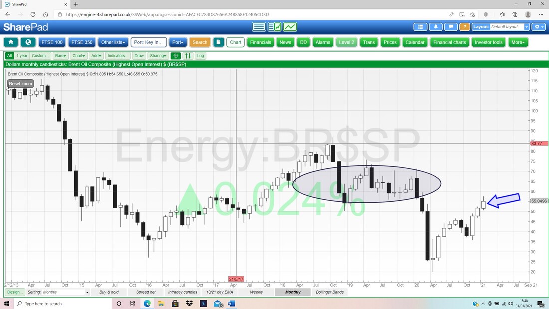
As ever, one of my most fave Indicators are the Signals given by the Crosses of 13 and 21 Day EMAs and on the Chart below, you should be able to see that there was a Bull Cross where my Black Arrow is, where the Black 13 Day EMA Line crossed the Red 21 Day EMA Line from below. This is still ‘in force’ and as long as a Bear Cross is dodged, then Oil looks pretty good.
My Green Arrow is pointing at the ‘Bearish Shooting Star’ or ‘Inverted Hammer’ shaped Candle from Friday and note how we had similar on Thursday but in this context they are not hugely Bearish. If we had had a clear run up of perhaps 5 Candles or something and the RSIs were looking very high, then a Candle like this would be a worry, but in the context of a sideways and quite orderly move, this just suggests that Bulls are struggling, but not a lot more. Down below my Blue Ellipse is highlighting a nice Zone of Support from about $52 to $48 and down to $47 or so. 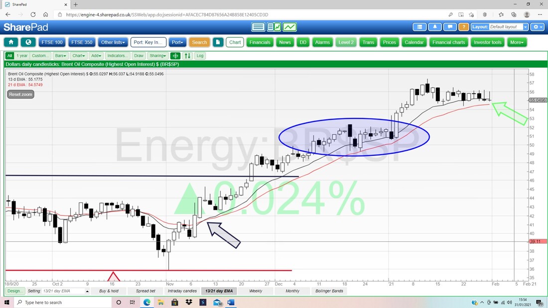
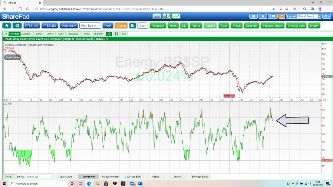
I wasn’t going to dwell on Oil but here is another one !! In the bottom window on the Screen below we have the RSI for Brent Oil Comp Daily and on a Reading of RSI 66 where my Black Arrow is, that is pretty high. This suggests we need more sideways moves on the Oil Price or perhaps more of a drop to unwind these high RSI levels.
S&P500
Please excuse the ‘mess’ on the next Chart but I didn’t want to set up a new Screen in SharePad as I want to crack on and get this blog finished; so I have used a Screen I use a lot to show other stuff. Anyway, on this Chart which goes back to about 2007 on the S&P500 (the widest of the US Indexes – i.e. it has more than the 30 Stocks of the DOW and it is not just Tech like the Nasdaq), I want to show something that I mentioned a couple of days ago on Twitter, and I will show it a bit more on the next Chart. Anyway, my point is that if you look at the Blue Long-Term Support Line (marked by the big Blue Arrow) then you should be able to see that we are a long way above that Line and if the worst comes to the worst (I don’t think it will – at least not yet), then there is Support around 2800/2900 or so. This is a big drop from where we are now around 3714 (nearly 25%) but at least it gives an idea of what is possible. I am not expecting this, and my next Chart should help show why. 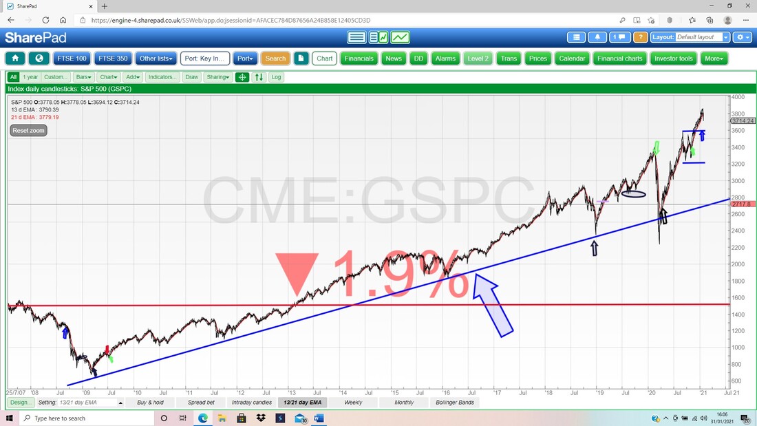
My next Chart zooms in and shows the Uptrend since the April 2020 Low and my Red Support Line (marked by the crazy large Red Arrow) is important because as long as this holds, then we should avoid big trouble. This means there should be good Support around 3650 which is not far from where we are now – so we might get a ‘Test’ of this Support Line very soon.
Down below that there is Support at 3600, 3550, 3500, so we will need to see how things play out but there is good Support especially down at 3209 which was the Low from last April – I cannot see that being Tested but you never know. I do know that there is a lot of over-exuberance and extreme valuations (especially on the Nasdaq) and this could drive a sizeable drop – so we need to be cautious. 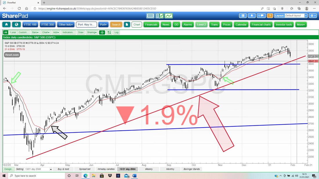
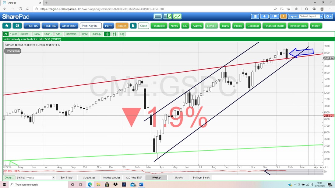
Because I was on this Screen, I might as well finish it off with the 13 and 21 Day EMA Lines and my Screen below shows that we had a Bull Cross back where my Green Arrow is (look how this predicted considerable gains), and my Blue Arrow is pointing to where this is still ‘in force’ but note we are getting near a Bear Cross, so we need to monitor the situation in the next couple of days and see if a Bear Cross gets triggered. That would be a bad thing if it gets ‘cemented’ because it means weeks of downside or at best a tedious, sideways, grind.
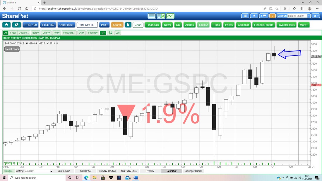
Next we have the Monthly Candles and it shows pretty much exactly what I was talking about on the ‘context’ point about where a ‘Bearish Shooting Star’ is only really strongly Bearish if it comes after a clear run up of White Candles. In this case, my Blue Arrow is pointing to a Bearish Shooting Star for January and after all the moves up, this is a nasty sign.
Next the Weekly Candles for the S&P500 and my Blue Arrow is pointing to a Big Black Bearish Candle.
In the bottom window below, we have the RSI for the S&P500 Daily and my Black Arrow is pointing to a Reading of pretty much RSI 50 and that is bang on Neutral. This means it is not Overbought or Oversold, but the direction of travel is down and that might persist.
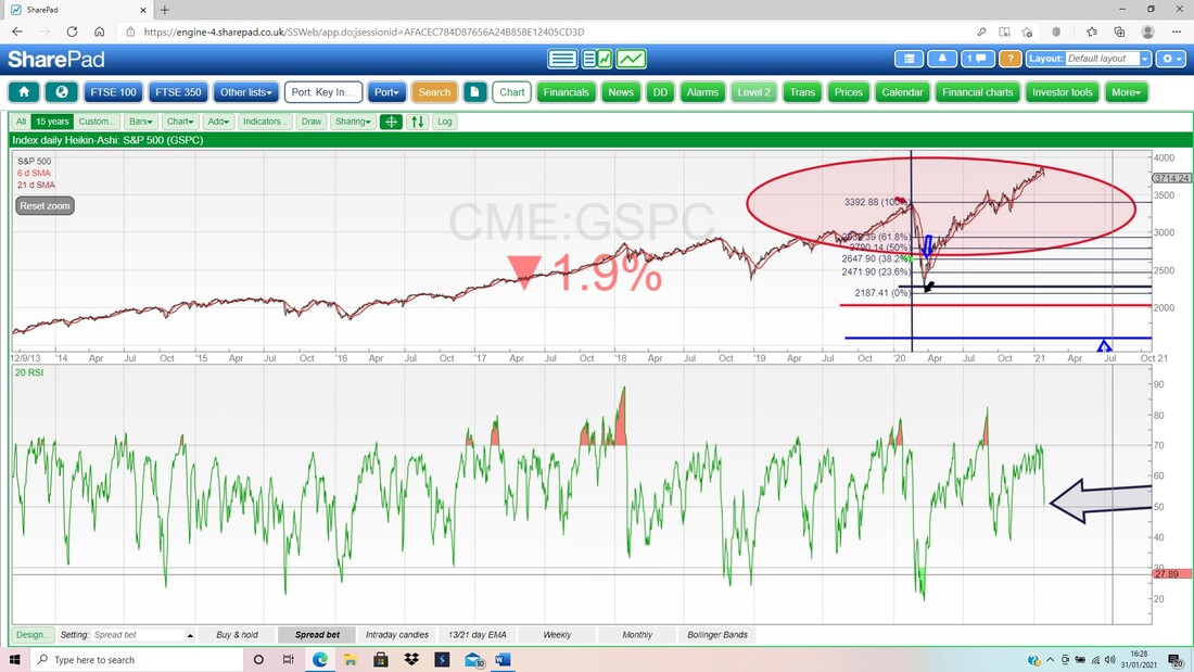
Next we have the Daily Heiken Ashi Candlesticks (I don’t often show these but they can be useful) and my Blue Arrow is pointing to where we have Big Black Down Candles. The way these things work is that in effect each HA Candle is created by the Open, Low, High, Close numbers from 2 Days, so they are a bit ‘slower’ than normal Japanese Candlesticks but they do give a good idea of the Trends.
When an HA Candle gets narrow, then the Trend might be about to change direction. If you look at Charts of HA Candles you should start to see how the patterns work. 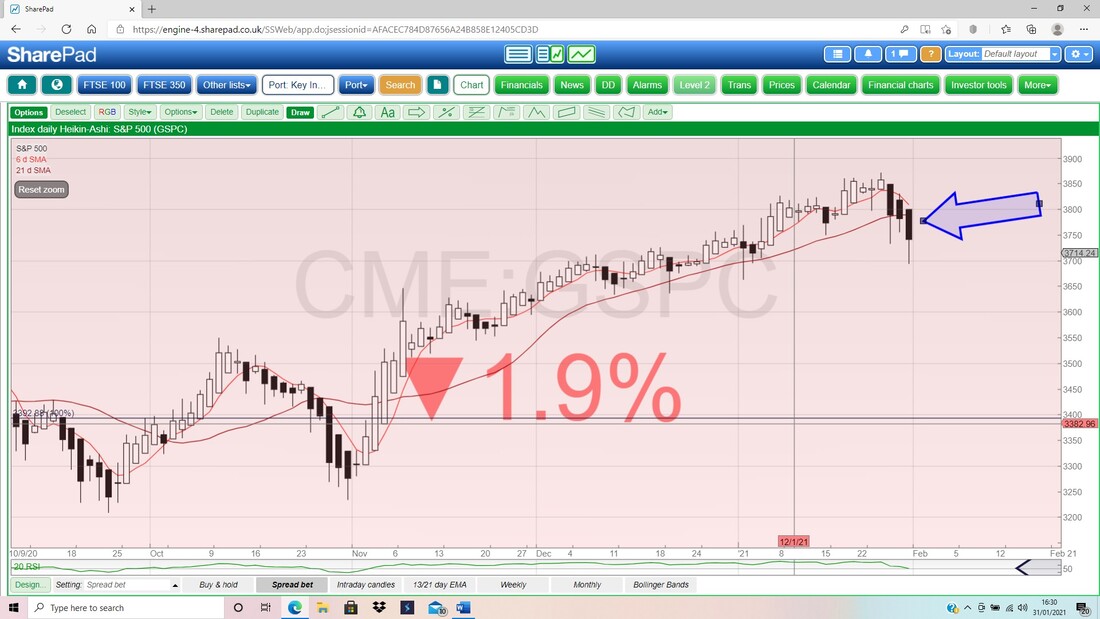
Finally we have the Daily Candles for the S&P500 with the Pink Zone showing the Upper and Lower Bollinger Bands. My Blue Arrow is pointing to where the Big Black Down Candle from Friday Closed right at the Bottom Band and it could bounce off this but when things get really moody, then it can ‘hug’ the Band downwards.
My Green Ellipse is trying to highlight a wide Zone of Support not far below. OK, that’s it for this week, go careful and be wary of coming days because it might be a bit too exciting !! Cheers, WD. 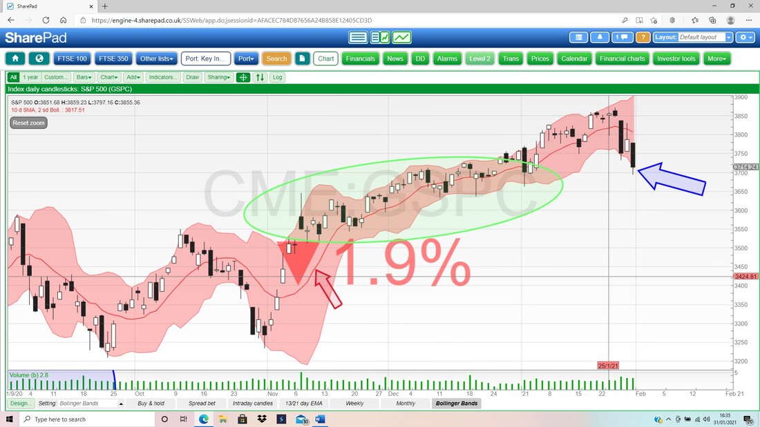
0 Comments
Leave a Reply. |

Stocks & Markets WheelieBlogsThese tend to be more Markets and Stocks related and timely - the Blog Page on the Main WheelieDealer Website has the 'Educational' stuff (well that's the theory anyway !!). Archives
October 2021
Categories
All
|
