

|
stocks & Markets blog |
|
I am starting this on Saturday Night, as is my tradition these days because it is easier to break the task of writing these blogs into two bits. I am utterly trashed because I thought I would take advantage of the pleasant weather and go for a long push around my locality. Of course, as is always my way, I never know what my limits are and I ended up going probably much further than I should have, and as a result my health problems are really irritating me and I feel utterly exhausted and drained.
With all this Lockdown stuff I have felt that I have had very little exercise and in recent weeks I have been getting out and pushing around to try to get my heart rate going and stuff. This is probably a good idea but I tend to make the error of coming to a particular road and thinking, “Oh, I wonder where that road leads to?” and of course I am far too stupid than to actually take my Fone with me and to use Google Maps (where’s the fun in that?).
The catch with all this adventuring is that my local streets are actually quite hilly in parts and being a Wheelchair user, it doesn’t take much of a slope to make it very hard work. If I was feeling 100% fit then it might be a different matter, but I think I have found the limit on how far I can go in my current state of disrepair. I guess I sort of enjoyed it though and it was nice to get out in the sunshine and to do something different.
Last Week The Market Gods are really being generous at the moment and I am so pleased to have clocked up another 2.8% gain on my Portfolio and that was almost as good as the week before. As a result I am having my best start to a year ever and I am of course really pleased with how things are going. It is also sweet because my Spreadbet Portfolio, which largely ‘mirrors’ my Normal Share Portfolio, is doing really nicely and this means that it is generating loads of Cash and I have been able to take even more out this week. Lovely. My plan is to discuss how I go about doing Spreadbets on the next ‘Twin Petes Investing Podcast’ which should be recorded mid-week and hopefully will appear in time for next weekend. I know a lot of Listeners/Readers/Followers/Aardvarks want to hear me talk about this and I will try to be as clear as I can be. It was significant that the FTSE100 managed to Close just above 7000 last week and of course it might now drop back a bit, but I think ultimately it is going higher. As we will see in the Charts in a while, there is a lot of Resistance now up to 7800 or so but I think the long-awaited ‘catch-up’ of the FTSE100 to all the other Major Global Indexes is at last starting. I hope this is the case because I still think loads of my Stocks are decent value and I named something like 8 of them on the last Podcast we did (TPI 46). As I mentioned on that Podcast, the usual pattern is for a dodgy Spring time around March/April and then for Summer to be flat and quite boring. Then we get a sell-off in the Autumn, around August/September. This time I think we might have got away with the Spring falls and we will likely get a tedious but ok Summer. I am concerned about the Autumn though because Valuations are ridiculous in so many areas, and it is very possible they get even worse over the Summer. We cannot know what will happen but this is the Roadmap I am following myself and I am planning my Strategy around this. Of course I am staying pretty much 100% Invested but I am poised to Hedge via Short Spreadbets if I see a need. Other than that I am really just keeping a close eye on my Long Spreadbet Exposure and I am about 10% away from my Limit, but if Stocks keep rising then I will be getting very near that Limit and I will need to trim. I have a couple of Spreadbet Positions that are very big in relative terms and I might need to trim them earlier. I am monitoring the situation closely because Leverage can bite hard and fast. Podcast TPI 46 This is the most recent Podcast and you can hear it on Soundcloud here: https://soundcloud.com/user-479955511/conkers3-wheeliedealer-46-ftse100-7000-aht-bdev-rio-resi-nnox-ihr-elco-dev-dvo-ai-ihr As always you can find the ‘Twin Petes Investing’ Podcasts on pretty much all the big platforms, and you will find them at the ‘Conkers Corner’ channel on the likes of Apple, Audioboom, Spotify, YouTube, Overcast, Google+ and probably a few others. You can shout at that Alexa thing as well to find it. You can also go to the ‘Twin Petes Investing Podcast’ page on my Website WD2 and there are all the details there and these sort of nifty ‘widget’ things which allow you to play the Podcasts directly from my Website page. Blog Slate Sadly nothing to report here. I am not getting anywhere with the LOK blog and it is extremely frustrating, but I can only do what my health allows. From the Archives If you go to the ‘Blog Index List’ page on WD2, then you should find the full list of all Blogs I have written over the many years and the Educational ones all have links so you can find the Blog easily. From that list I bring you this one which has a bit of a Sporting theme about it: https://wheeliedealer.weebly.com/educational-blogs/how-to-be-a-winner With what I said about my Spreadbet Account and the plan to discuss it on the next Podcast, I thought it makes sense to lob this in as well. There are links at the bottom to the earlier parts: https://wheeliedealer.weebly.com/educational-blogs/how-to-use-leverage-safely-and-successfully-spreadbetting-and-cfds-part-7-of-7 Better see what the Charts are telling us……. FTSE100 All the Charts I show are taken from the excellent SharePad software I use and if you click on the images then they should get a bit bigger on your screen (I recommend you read these Blogs on a big screen rather than just a Fone – there is a lot of detail to be seen). If you fancy using SharePad or ShareScope yourself, then you can get 1 month’s Free Data if you go to the ‘Subscribe’ page on their website and then select the Product you want, and then you should see a ‘Promo Code’ box and if you type ‘twinpetes’ into that box, then the discount will apply. You can also get this by clicking on the Adverts that are all over my websites. I get a small payment for introducing you, so thank you very much !! https://www.sharescope.co.uk/ I will start with the FTSE100 this time because of the Breakout and rise over 7000 which is pretty significant I suspect. My first Chart has the Weekly Candlesticks and my Blue Arrow is pointing to the lovely White Up Candle from last week and this is where it got over 7000 and it also cracked the Resistance at 6903 which comes from my Green Arrow (I am sure you will recall this from last week’s Charts I showed). My Black Box in the Top Left-Hand Corner highlights the Zone of Resistance which runs up to the All Time High (ATH) at 7903 and it might be a bit of a struggle at times to get through this Zone. However, if and when it does get through, if it can Breakout over the ATH and, in particular, above 8000, then that would be extremely Bullish. To the downside, there should be Support from my Purple/Pink/Mauve Line where the similar colour Arrow is, and this is at about 6620 or so. Below that, my Black Ellipse points out where there is good Support. I doubt we will drop back there for some time. 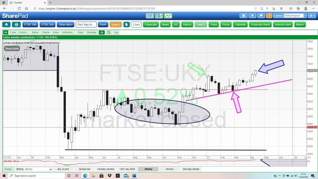
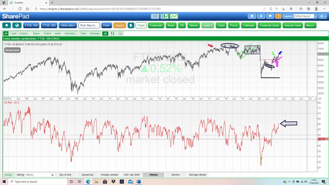
In the bottom window on my next Chart, we have the RSI (Relative Strength Index) for the FTSE100 Weekly. On a Reading of RSI 61 where my Black Arrow is, this is not Overbought and can rise a fair bit more. As with the RSI for the Daily, the conventional Overbought Level is up at RSI 70 although I do note here that the RSI seems to have often topped out around RSI 66 or so. However, even a rise up to RSI 66 would enable a lot of points to be gained on the FTSE100 Index value.
On the next Chart we have the Daily Candles for the FTSE100 but I am ignoring those. What attracts my leering gaze here are the Black 13 Day EMA Line and the Red 21 Day EMA Line (Exponential Moving Average – a Moving Average where more weight is given to more recent values in the sequence).
My Green Arrow is pointing to where there was a ‘Bull Cross’ with the 13 Day EMA crossing the 21 Day EMA from below, and this is still very much in force. I usually find it is a bad idea to trade in the opposite direction to what this Indicator is telling us. 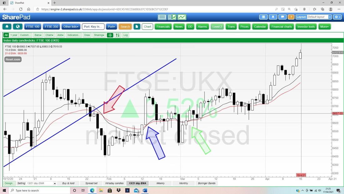
In the bottom window on my Screen below we have the RSI for the Daily FTSE100. On a Reading of RSI 71 where my Black Arrow is this is Overbought and it means we might get a Pullback of some sort quite soon. With there being one more week of April before we get to the last week, I suspect we might get a few more Up Days and then the last week of April might be a big soggy; which is the pattern we have seen in all of January, February and March.
Last up for the FTSE100 we have the Daily Candles with the Pink Zone marking the Upper and Lower Bollinger Bands. My Blue Arrow is pointing to the Up Candle from Friday and note it couldn’t quite hold the High of the day but this is not a Reversal Candle and we might get more gains early in the coming week.
The Top Bollinger Band is up at about 7060 and below there is Support from the Red Midpoint Line (Red Arrow) at about 6900. Down below there is Support at 6853 and then where my Blue Ellipse is, a Zone of Support starts at around 6800. This is a very well Supported Market. 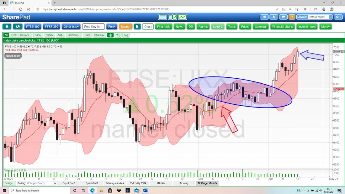
Brent Oil Composite
I won’t spend ages on this one. Below we have the Daily Candles for Brent Oil Comp and my Black Arrow is pointing to where we just had a ‘Bull Cross’ between the Black 13 Day EMA Line and the Red 21 Day EMA Line. We need this to get ‘cemented’ (a Sideways Market can have successive Bull Crosses and then Bear Crosses and back to Bull Crosses etc.), but it is a good sign for Bulls and, by extension, for the FTSE100 and other Indexes like the French CAC40, German DAX and US DOW, which have quite a weighting in Oil Stocks. On Friday we got a bit of a Reversal Candle as we could not hold the High at $67.43 – and we may pull back a bit more from this. Above that, there is Resistance at $70 and up to $71.39. A Breakout over $71.39 would be very Bullish. To the downside, there is Support at $60.33 in particular and my Green Ellipse marks good Support. 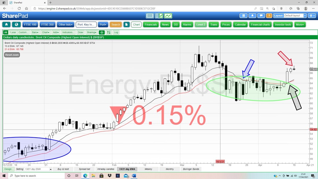
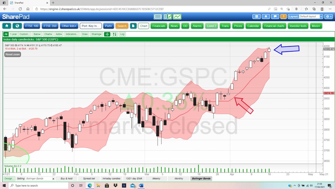
S&P500
First up the Weekly Candles. My Blue Arrow points to a nice White Up Candle (ok, it is not big) and it made a Fresh New ATH and this is Bullish. Note my Parallel Black Lines (Black Arrows) which mark the Uptrend Channel. We seem to be coming up off the Bottom Support Line and this suggests plenty more upside. 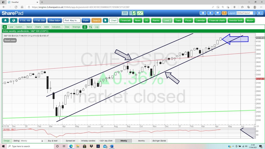
In the bottom window on my Screen below, we have the RSI for the Weekly S&P500. On a Reading of RSI 69 where my Black Arrow is, this is getting near Overbought and the upside in the near term must be getting limited. The Peak from January 2018 was up as high as RSI 86 but that is an outlier and I suspect we might top out around RSI 75 or so which is more normal. In other words, we should see a bit more upside but it lines up with my ideas of a quite flat Summer.
In the bottom window below we have the RSI for the Daily S&P500. My Black Arrow is marking a Reading of RSI 75 and that is very Overbought. We have seen Readings as high as RSI 83 and even RSI 89 recently, but these are freaks and we could easily turn down from here.
However, a small Pullback would not be a bad thing. The Weekly RSI is quite high as we saw before, and some weakness now would take some of the over-exuberance out and this would be healthy to enable the Market to calm down and set up more gains in time. 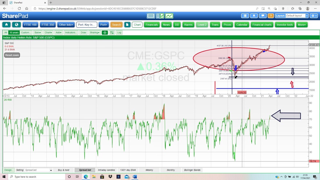
Finally for the S&P500 we have the Daily Candles with the Pink Zone showing the Bollingers. My Blue Arrow is pointing to a small Doji Candle from Friday and this is up near the Top Band at about 4200. We might see the S&P500 try to ease back from this Top Band and, if so, there should be Support at the Red Midpoint Line (Red Arrow) at about 4120 and below that there is very good Support down to 4000.
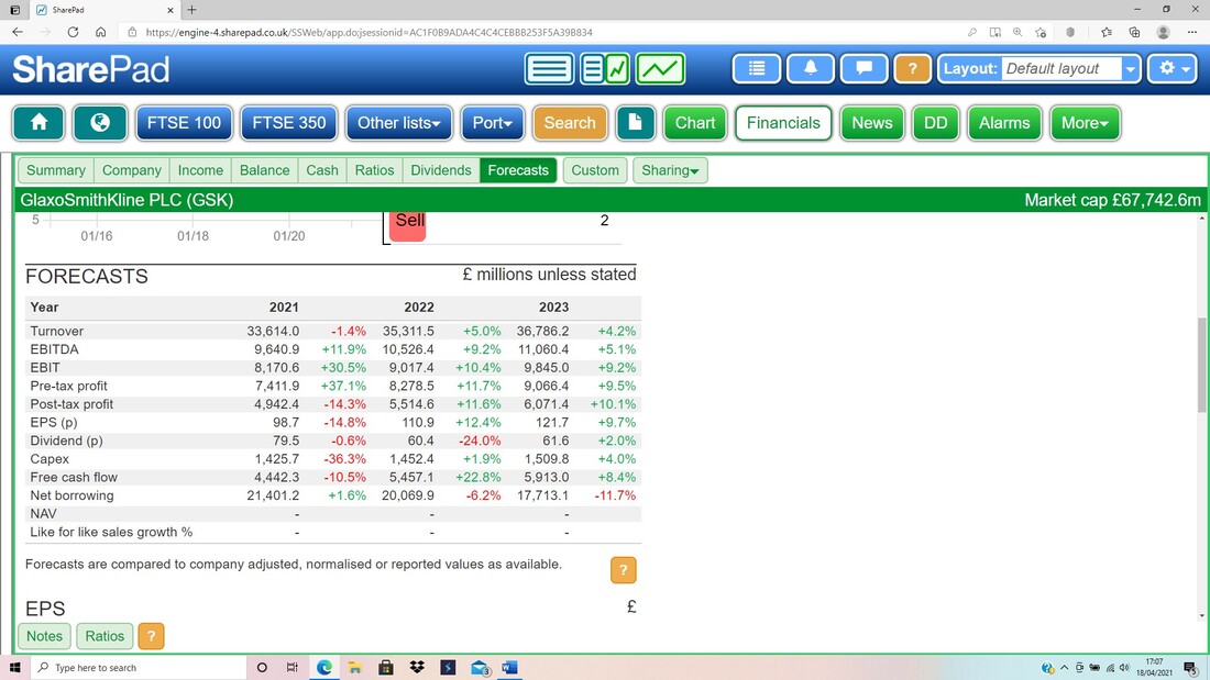
GlaxoSmithkline GSK
I am assuming that quite a few Readers hold GSK or at least are looking at it. Last week, where the Black Ellipse is on my Chart below, there was news that Activist Investor Elliott Partners are getting fruity over this one. As a result, the Shares jumped up and it is quite possible that the Downtrend Channel (see my Red Lines) that has been running for about a year, might be ending. Clearly we need a proper Breakout and I suspect we really need a move above about 1450p to be confident that the Downtrend is broken. That would obviously be a welcome development. However, it doesn’t mean GSK will shoot up now, but it might mean some Sideways movement in a Range prior to an Uptrend starting at some point. 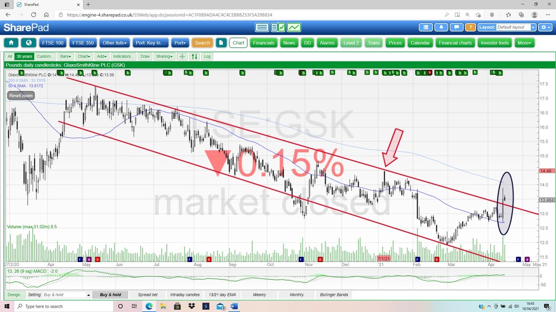
On the next image I have taken the SharePad ‘List’ Screen which I have setup as I like it (all the Columns are customisable and there are countless numbers of them) and this is to show the Forward P/E values and the Forward Dividend Yield. I increased the size of the numbers by using the ‘Ctrl and +’ keys.
This is a bit complicated by the imminent split out of the Healthcare bit but I am assuming these values are valid. I hold GSK in my Income Portfolio for the Dividend payments and the boring nature of Health stocks. 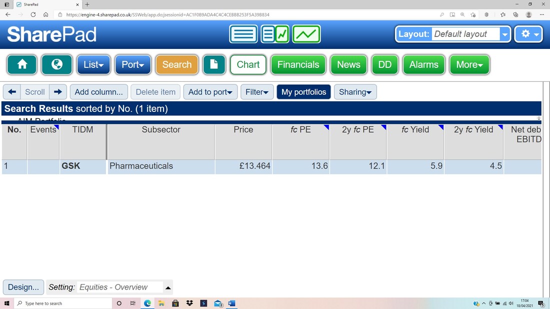
Here are the Forecasts from SharePad upon which those values above are based:
Standard Chartered STAN
I wanted a closer look at the Technical picture on this one. My Chart below goes back about 21 years or something and it is clearly very long-term. On this one, please note the Green Downtrend Resistance Line which is marked by my Green Arrow – that is the first Line that needs to be Broken-Out of. 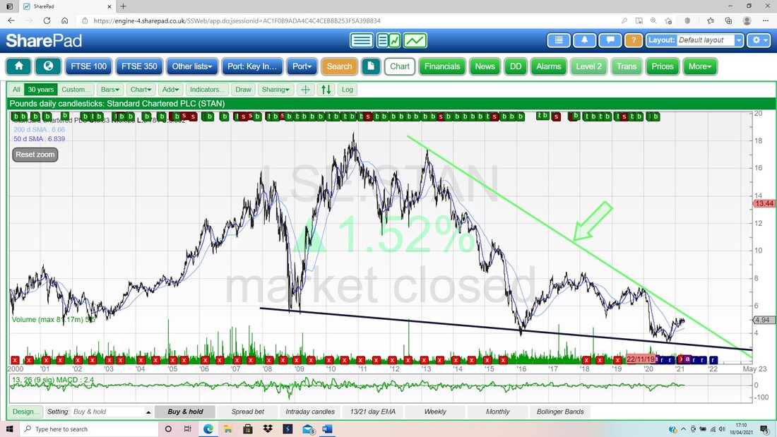
My hunch was right. I have been looking at the STAN Chart on my ADVFN App for some time on my Fone and I thought I was seeing a Triangle forming up. I hold some STAN in my ‘Normal’ Portfolio and I am expecting it to return to some sort of decent form at some point (especially if Interest Rates do rise a little).
The Green Line on the Chart below is the Green Line from the earlier Chart but I have now zoomed in to about the last 1.5 years. My Red Arrow is pointing to a pretty much Horizonal Red Line which is at about 520p. This is the Top Line of the Triangle and the Hypotenuse (ooooh, clever stuff Wheelie, you Geometrist, you) is the Blue Line (marked by my Blue Arrow) which is squeezing up from below. Sooner or later I expect this Triangle to resolve with the Price popping out of the Top Line at 520p, and if this happens, then we are looking at 600p fairly ‘easily’ and then there is a Zone of Resistance up to about 750p. It is interesting that if and when the STAN Price can Break-out of the Triangle, it should also Break-out of the Green Downtrend Resistance Line at about the same time. In addition, my Black Arrow is marking a Bullish ‘Golden Cross’ between the 50 Day and 200 Day Moving Average Wiggly Lines. The lighter-coloured Blue Wavy Line is the 200 Day MA and note how this is now turning up which denotes the start of an Uptrend. As a contrast, look back at the 200 Day MA on the GSK Chart which is still falling. 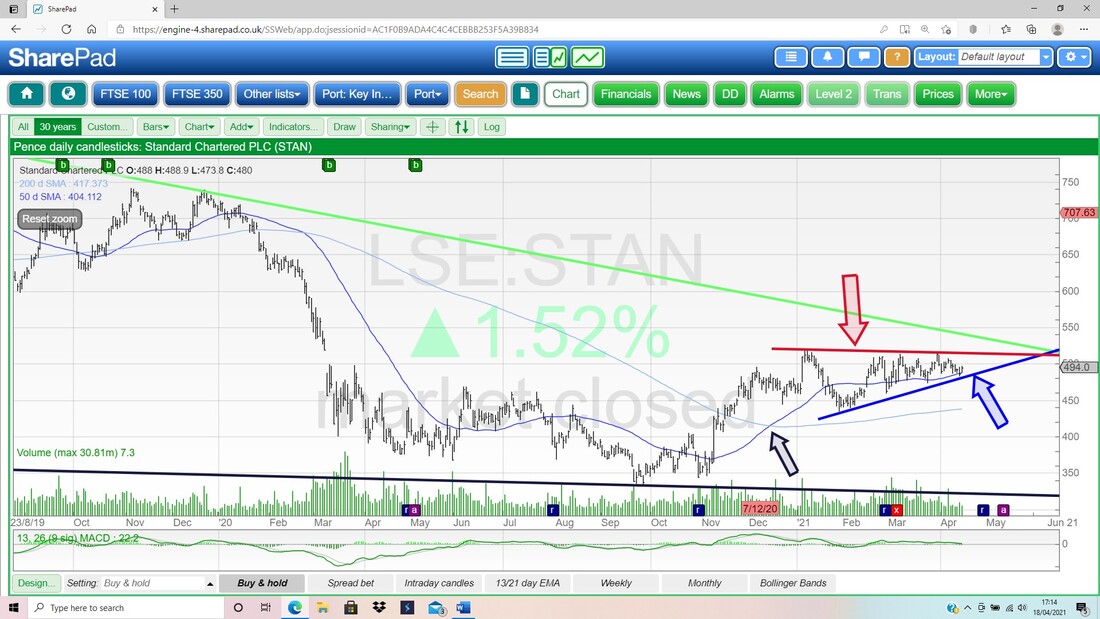
As with GSK, here are the Numbers for STAN:

And here are the Forecasts.
OK, that’s it for this Weekend. Good Luck with your battles against the Markets in the coming week and make sure you get out and about and give that Soul some rest. Cheers, WD. 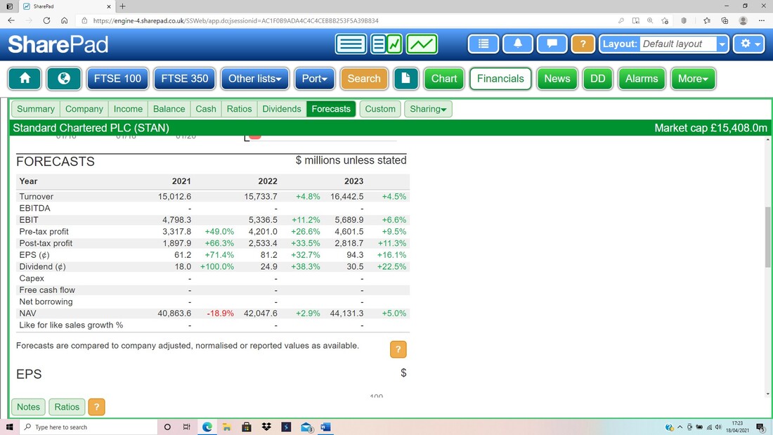
1 Comment
KevinS
4/18/2021 02:26:03 pm
I Pete, Leave a Reply. |

Stocks & Markets WheelieBlogsThese tend to be more Markets and Stocks related and timely - the Blog Page on the Main WheelieDealer Website has the 'Educational' stuff (well that's the theory anyway !!). Archives
October 2021
Categories
All
|
