

|
stocks & Markets blog |
|
Just when we think the Political world cannot get any more nuts, we find out that the President has got C19. Goodness knows where this goes and there seems to be so much conflicting information emanating from White House sources. In reality, although Trump is not a young chap and he is so say ‘obese’ etc., his risk of expiring is actually quite low and of course he will have the advantages of probably getting access to the best medical resources on the planet.
It’s pretty obvious from the videos Trump has put out that he is ill but as yet he doesn’t look like he is about to keel over. There seems to be an implication that he was given oxygen a few days ago so clearly C19 has got its teeth into him, but the mere fact he is able to sit up and do a video without being out of breath suggests it ain’t got him yet.
I have just watched a News Conference at about 4.45pm on Sunday 4th October and it appears Trump’s condition is improving and he might be discharged from the Hospital on Monday.
In terms of the Markets it was quite a development; I got the sense on Thursday Night from the Charts that the US Markets were starting to turn up again and were getting very near to 13/21 Day EMA Bull Crosses (Exponential Moving Averages), but after the Trump news they dropped down again although it wasn’t hugely dramatic. It does make the Charts interesting and I suspect it is more like a Sideways Range again but I will look in detail at the Charts in a bit. The mere fact that we have got through September without a major dump in the Markets is some sort of progress I suppose – September has the reputation as the Worst Month although the whole Autumn period can be pretty dicey and the strength we have had since the total meltdown in March/April, in itself points to a more subdued period as the powerful forces of ‘mean reversion’ come into play. It might simply be that we need a period of consolidation to enable the ‘heat’ to come out of Markets which would allow more rises in due course. Something I keep picking up is that whatever the outcome of the Presidential Election, there will be some sort of Court challenge and this in itself will create uncertainty which the Markets won’t like. This applies whether Biden or Trump win (or whoever ends up on the ticket !!). It could be messy so we need to be aware of this and positioned in advance in readiness. Last Week Things started pretty well for me which was nice but sadly as the week tailed on, my gains fell away and I only managed a gain of 0.4%. I can’t complain though and remember, if I was to make 0.4% every week then my Annual Return would be nearly 21% so that would be a very acceptable outcome. Of course that never happens because of the down weeks, but it shows how we should never get too upset with a small gain because at least it is progress in the right direction. Since January 1st 2020 my Portfolio is now up 0.9% which ain’t that much Profit yet but at least it is above water. I am pleased because my Portfolio had got back to Profits many weeks ago but then it fell away after Boohoo BOO got spanked (which is a big Position for me) and because I lost about 2.5% on a screwed-up Index Trade. So to be back into the black again is a nice feeling and hopefully if I can keep doing what I am doing then the Profits should build in the remaining months of 2020. The irony is that September was actually a pretty good month for me I think. I haven’t worked out the numbers yet but I will do them soon and I will update the ‘Monthly Performance’ page on the website. I must say I am really pleased I made the change on that page from a Weekly breakdown to a Monthly breakdown because not only is it much quicker and easier for me to do, but I also think it is more meaningful and useful for Readers and you can now match your own performances against these numbers in a simpler way. In terms of my Strategy nothing much will change again. I am 50% Hedged via Spreadbets on the FTSE100 and the S&P500 (full details can be seen on my ‘Trades’ page) and I am pretty happy with my Stocks and I am in no mood to buy more and I have no ‘Slots’ available anyway. I would like to top-up on a couple of Positions but as yet I am in no rush to do this and one of them, Gateley GTLY, has a really weak chart although the recent Results were pretty good. I don’t see any sense in topping-up on a Stock that is falling – I will let it drop and wait for it to look more perky. I like the Company though and am very happy to holding the relatively small Position I have at the moment. My intention is to do a Long Spreadbet on GTLY as part of my ‘mirroring’ but obviously the timing is even more crucial when dealing with Leverage. The most recent Podcast we recorded talks about all this sort of stuff in part and we will be recording the next one very soon. If you haven’t heard TPI 32 yet, you can find it here: https://soundcloud.com/user-479955511/conkers3-wheeliedealer-32-micropayments-loop-dplm-dddd-song-wtb-fpo-biln-aa-call-ipf This is the Soundcloud Link but you can find it under the ‘Conkers Corner’ Channel on other Apps like Audioboom, Apple, Overcast, Spotify etc. (to be honest it keeps appearing on Podcast Platforms that we don’t even put it on ourselves; but that is all very welcome as far as I’m concerned !!). Blog Slate A few days ago I released an Educational Blog about how the Numbers move in a Spreadbetting Account and what things you need to look at. As always, I meandered around the subject and included a lot of other stuff about Spreadbetting and the use of Leverage and I suggest you look at that Blog if you want to use Spreadbets or are using them but finding it difficult to make progress. I also started writing another Blog of an Educational bent and related to psychology, but this is one that will probably appear in another publication first and then appear as a Blog later. It might be a while before it gets issued but I will crack on with it in coming days. There should be a New Podcast later in the coming week but for the week after I will make sure there is some sort of Blog issued and that will probably be an Educational one that I have partly written. As I mentioned, I will try to update the ‘Monthly Performance’ page soon and I must also highlight that I updated the ‘Little Black Book’ a couple of days ago and this has loads of ideas for Stocks in it which need further in-depth research. Blogs from Past Events Over the last 6 years and more, I have published loads of Blogs and the full bunch can be seen on the ‘Blog Index List’ on WD2. From that list I have picked out this one for your delight and misery (in equal measure I suspect): https://wheeliedealer.weebly.com/educational-blogs/pin-the-tail-on-the-monkey-musings-on-portfolio-management-part-1-of-2 https://wheeliedealer.weebly.com/educational-blogs/pin-the-tail-on-the-monkey-musings-on-portfolio-management-part-2-of-2 From a quick glance through those Blogs they look pretty comprehensive on Portfolio Management concepts like running your winners and suchlike. I sort of remember writing it but I have totally forgotten what it contained !! Right, time for them blessed Charts…… S&P500 As ever, my Charts are screen-grabs from the superb SharePad software I use and assuming I have set them up correctly on my website, you should be able to click on them for a bit larger image so you can see more detail. To close that window there is a blue cross in the top right-hand corner if you hover your mouse there. As always, I am starting with ‘big picture’ stuff and I will then drill in. Regular Readers (don’t worry, I won’t say it !!) will know that I strongly assert that Technical Analysis (Charting) only works well if you keep it simple and you repeat the same stuff over and over and you stop using Indicators/Signals that simply don’t work in a consistent and reliable way. Quite frankly lots of Technical Analysis techniques and tools are completely useless and just create more noise and confusion which will not be helping you. Be ruthless and just cut out the junk. First up we have the 13 and 21 Day EMA Lines and the Black Line is the 13 Day and the Red Line is the 21. If you look at the bottom left my Black Arrow marks a Bull Cross between the Lines and look how this predicted a massive rise, and if you simply had followed the Signals from this Indicator then you would have stayed in this Trade for a long time. Then where my Blue Arrow is we have had a Bear Cross and my Red Arrow is pointing to where this is still ‘in force’ and until we get another Bull Cross this is likely to keep falling or at best going sideways. The Candlesticks shown here are Daily ones. I have a relatively small Short Spreadbet on the S&P500 and one of my key Signals regarding this Trade will be how the 13 and 21 Day EMA Lines behave. If we get a Bull Cross, I will be seriously considering closing the Short because it is unlikely to work out well. 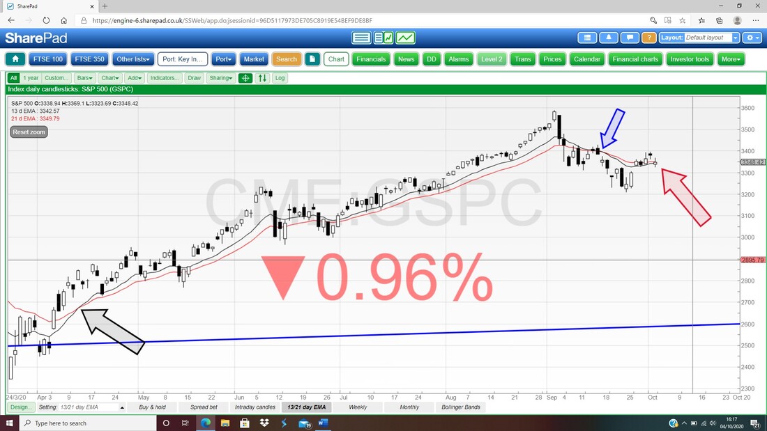
I nearly forgot about this but it is really important. My Chart below has the Monthly Candles for the S&P500 and of course the one for September is now complete and my Blue Arrow is pointing to it. You need to ignore the little Black Candle that follows because this is the one for October forming up and it is false as yet because it is not valid until a complete Candle is created.
Anyway, if you combine the September Candle with the August Candle, I think this is a ‘Bearish Piercing Line’ or ‘Dark Cloud Cover’ pattern (in my ancient copy of ‘Candlestick Charting for Dumbos’ it appears on page 172 but newer copies probably have it on a different page – look in the index at the back) and that would suggest downside from here. 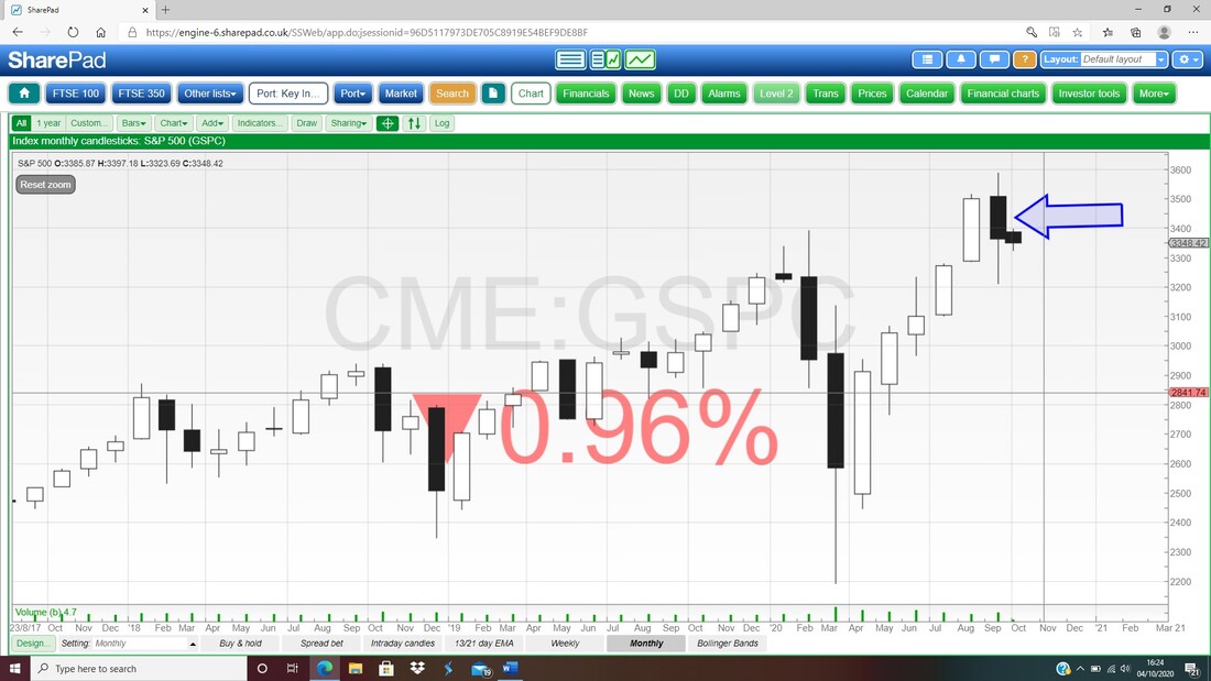
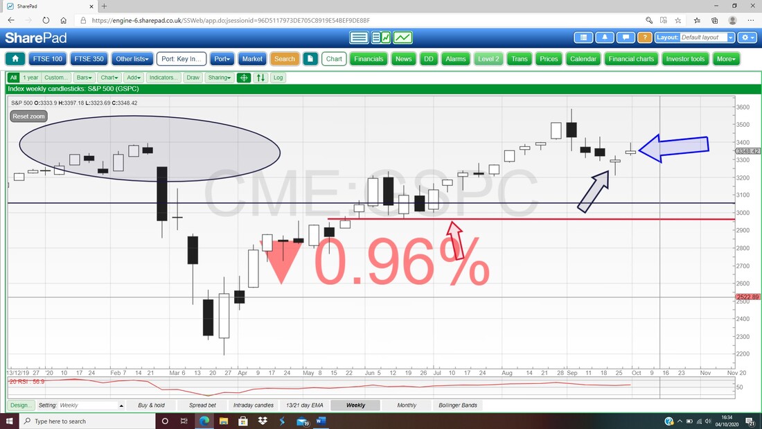
My next Chart has the Weekly Candles for the S&P500 and my Blue Arrow is pointing to an ‘Inverted Hammer’ sort of Shape from last week and this is a bit bearish. What stands out here is that for the week before (where my Black Arrow is) we had a bit of a Hammer and that suggests we have a Sideways Range between 3200 and 3400. If 3200 fails then there is Support down around 3000 and down where my Red Line (Red Arrow) is at about 2960.
I won’t show the RSI (Relative Strength Index) for the S&P500 because the Daily is reading pretty much on RSI 50 which is Neutral and doesn’t tell me much. My Chart below has the Daily Candles for the S&P500 and the Pink Zone marks the Upper and Lower Bollinger Bands.
My Red Arrow is pointing at the Doji Candle from Friday and note how it dropped back from the Candle on Thursday which was up near the Top Bollinger Band. Now the Doji is sat near the Red Midpoint Line at about 3315 and that could be Support. The Bottom Bollinger is at about 3225 and that should be Support. To get proper Bullish on the S&P500 I would want to see a Breakout over 3480 which is the High of the Candle from 4th September. I have pointed at that Candle with my Blue Arrow. 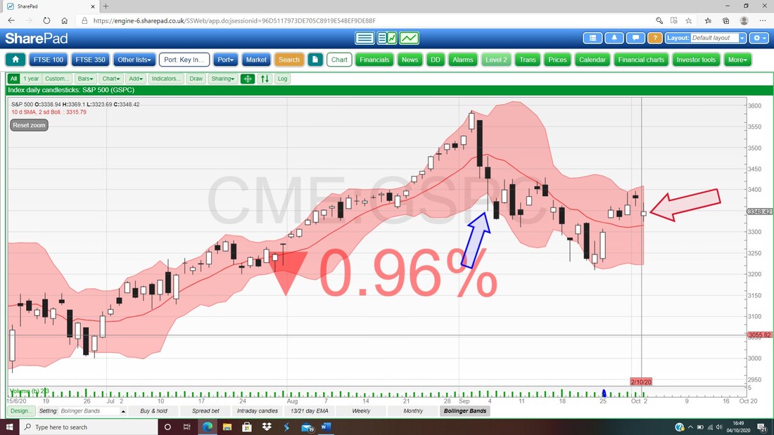
Nasdaq Composite
It’s certainly no shock to me to see that the Nasdaq Comp is pretty much like the S&P500 on the Monthly and we have the same ‘Dark Cloud Cover’ pattern going on as highlighted by my Red Ellipse. 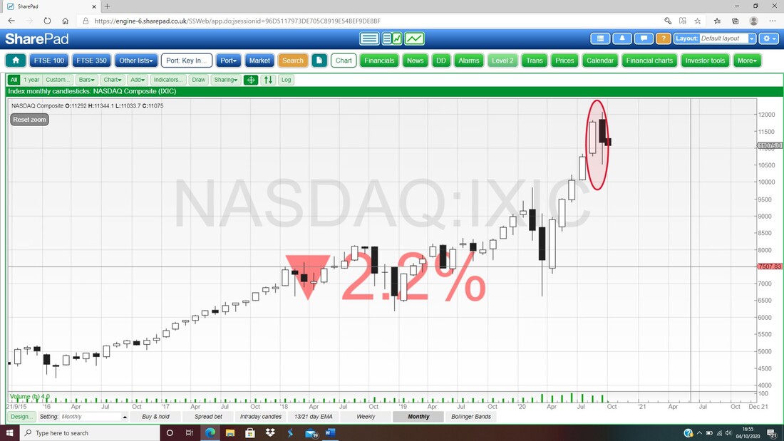
Next up the Weekly for the Nasdaq Comp and my Blue Arrow is pointing to a Bearish Shooting Star shaped Candle and like the S&P500, this suggests a Sideways Range between about 11344 at the top of last week’s Candle and the bottom of the week before’s Candle at about 10500.
If 10500 fails as Support, then there is Support around 10190 and below that 9500 looks pretty good. 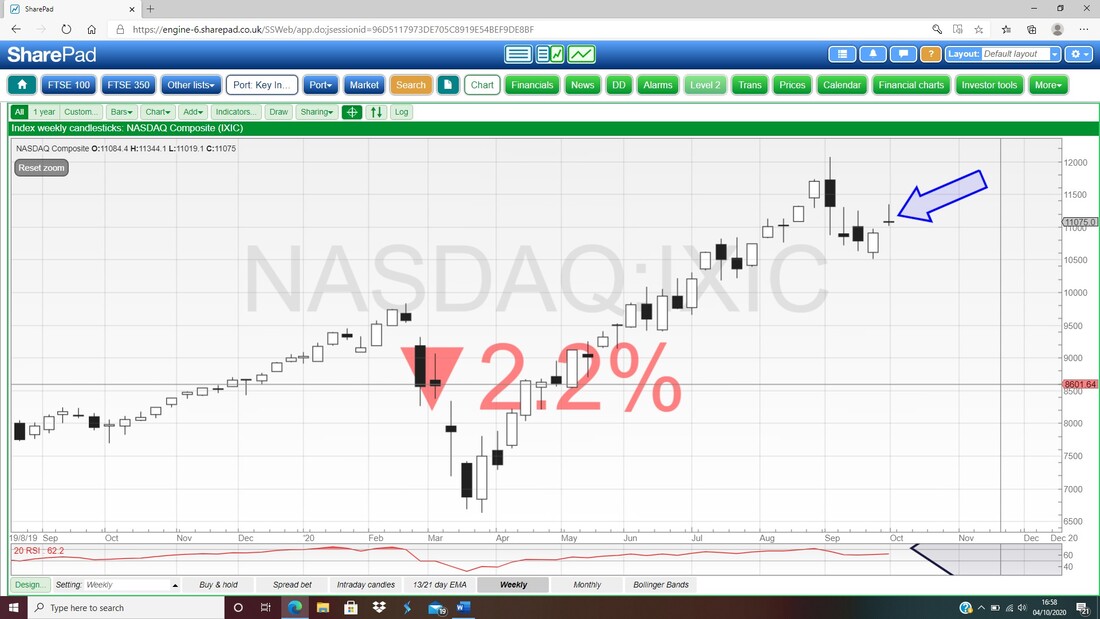
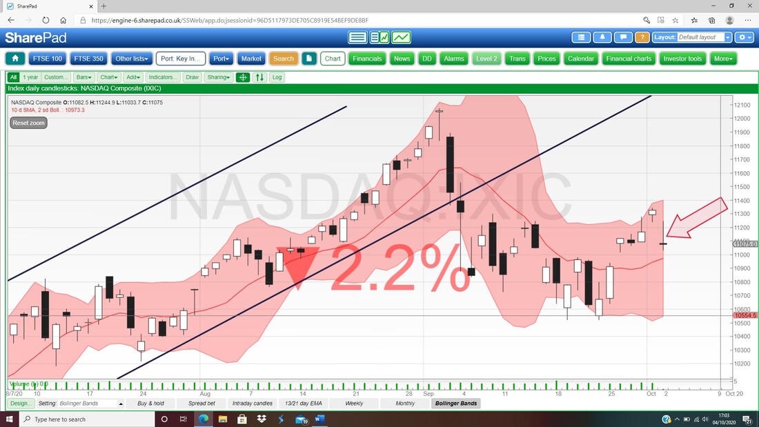
The next Chart has the Daily Candles for the Nasdaq Comp and again it is similar to the S&P500 although perhaps a bit worse. My Red Arrow is pointing to a Doji Candle from Friday and the key thing here is that it fell back through the day and couldn’t hold the High. There should be Support at the Red Midpoint Line at about 10975 and then below this there should be Support from the Bottom Bollinger Band at about 10560.
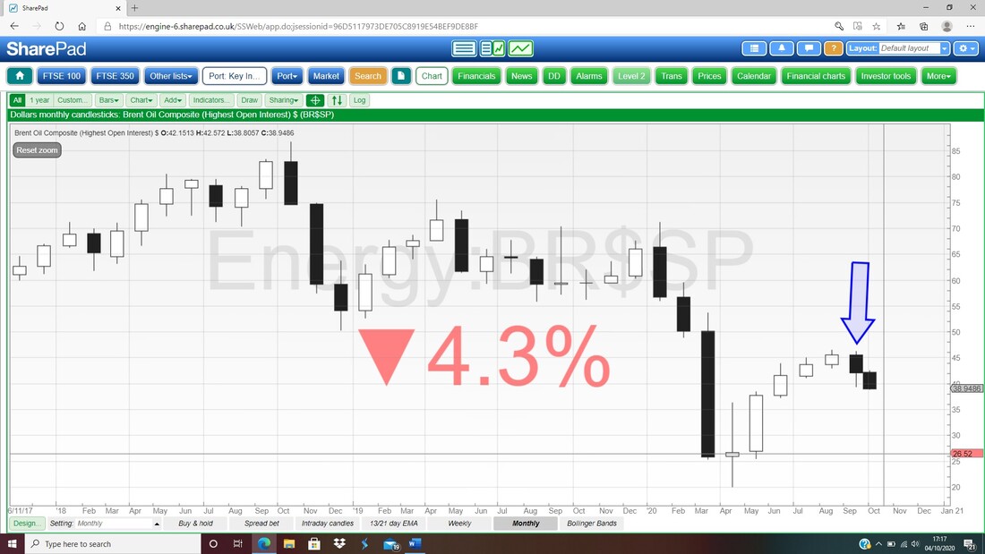
Brent Oil Composite
With the Oil Majors having quite a Weighting in the FTSE100 (although a lot smaller than it was !!) I always keep an eye on what Oil is doing because of my FTSE100 Short in particular. First up note the Bear Cross between the 13 and 21 Day EMA Lines where my Blue Arrow is and again the predictive powers of this Signal are proving pretty damned good. But arguably more worrying is the failure of Support from where my Red Line is (marked by my Red Arrow) and this was breached on Friday where my Black Arrow is with a big ugly Down Candle. Support from Friday is now $38.8 and below that we are looking at $34 as a very real possibility. 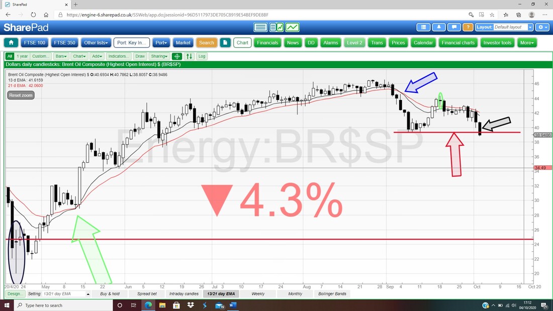
My Chart below has the Monthly Candles for Brent Oil Comp and my Blue Arrow is pointing to a Black Down Candle from September and it looks dodgy. The next Candle must be ignored because it is for October and is not yet valid (however, the start for October is not exactly impressive !!).
Next the Daily Candles for Brent Oil Comp with the Pink Zone marking the Bollinger Bands. My Red Arrow is pointing to how the Big Black Down Candle from Friday dropped below the Bottom Bollinger Band and although it can ‘hug’ the Band and drop lower, the most likely scenario I would say is that it goes sideways for a little bit but overall things are obviously pretty Bearish here.
When the Price falls outside the Bollinger Bands this is an unnatural and unstable situation – so the normal action is to get back inside the Bands which means either a move up or a bit of Sideways. 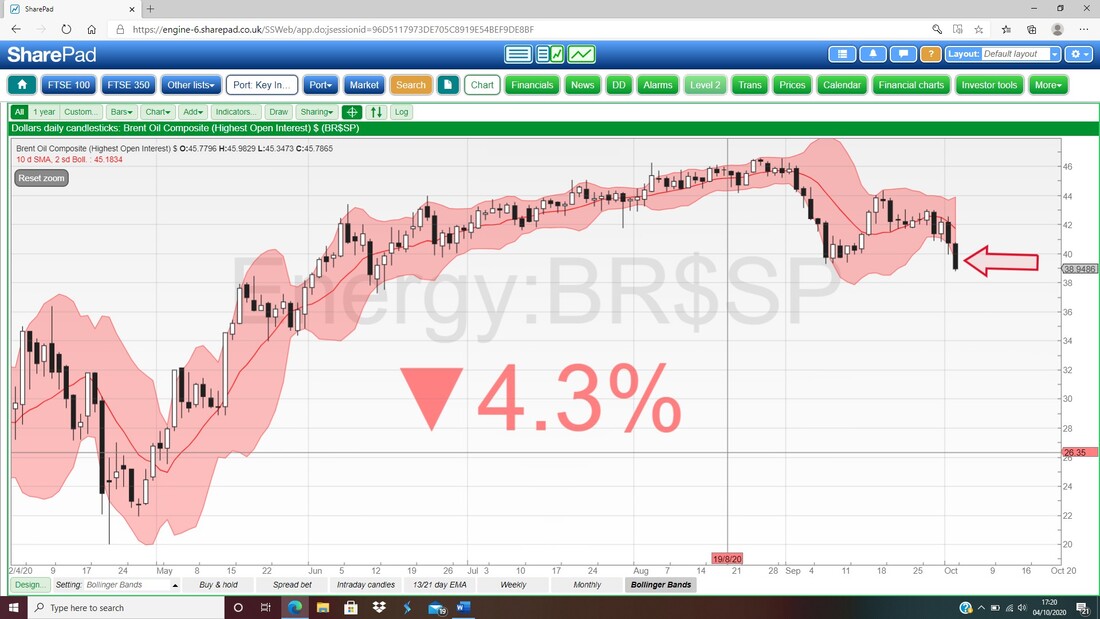
Gold Composite
I won’t dwell on this because quite frankly Gold doesn’t interest me much but I know lots of Readers will be on the case here. My Chart has the Monthly Candles and my Blue Arrow is pointing to a big Down Candle for September and this looks pretty Bearish. After the Long Tails Doji from August this looks to be turning down with the Turning Point at $2074. You have to ignore the little White Candle as that is October forming up and not yet valid. 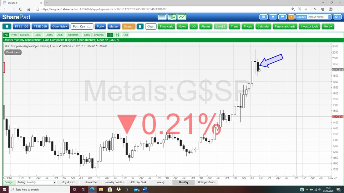
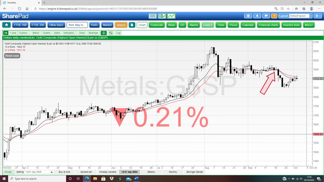
I also noticed a Bear Cross on the 13 and 21 Day EMA Lines for Gold Composite as per my Red Arrow below.
FTSE100
I have a sizeable Short Spreadbet on the FTSE100 so I am very focused on this one. First up the 13/21 Day EMAs and my Black Arrow is pointing to a Bear Cross and this is still in force. Note where my Red Arrow is the Lines got really near a Bull Cross but they couldn’t manage it (which is in itself a Bearish Sign). 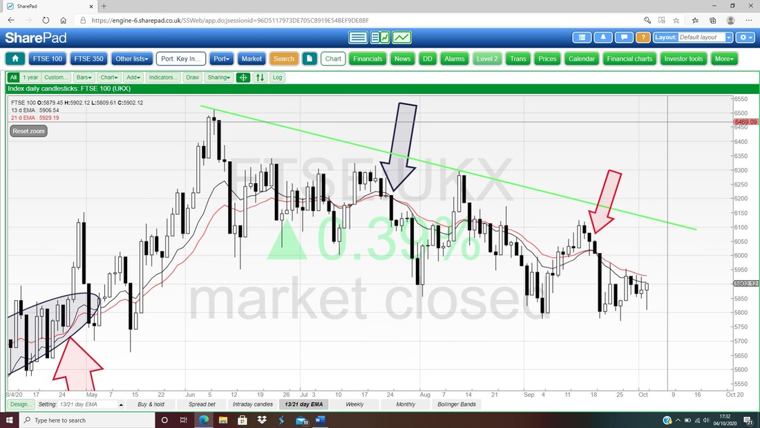
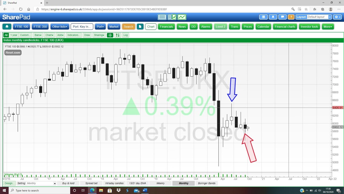
Below we have the Monthly Candles for the FTSE100 and my Red Arrow is pointing at the Down Candle from September although it has some Tails on it which shows how choppy it was. The overall picture here though is that the FTSE100 has turned down off that Candle from June where my Blue Arrow is with the High at 6500. As ever ignore the little White Candle after the September one because it is not yet valid.
Next the Weekly Candles for the FTSE100 and my Blue Arrow is pointing at a little White Up Candle from last week. Simplistically in combination with the week before you could make a case for a Bullish Harami pattern but the context is weak here (you would need more of a sharp and sustained drop before for a Bullish Harami to be really predictive). The key really is the Support at 5771 and that must hold.
Below that, there is Support from 5750, 5660, 5575, 5415, 5350. 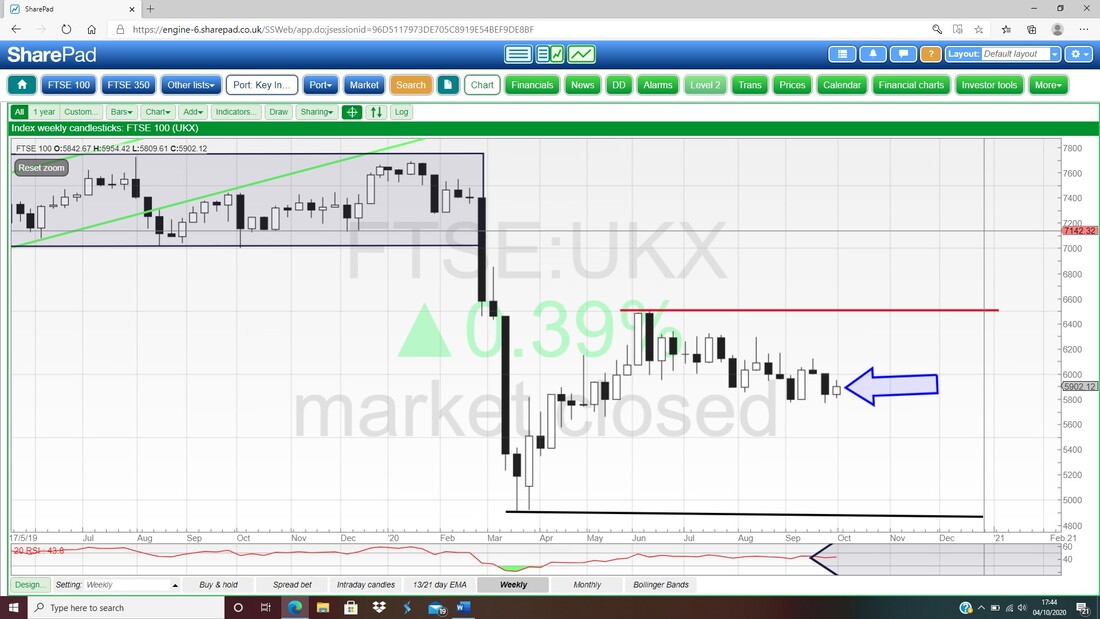
Finally we have the Daily Candles for the FTSE100 and the Pink Zone showing the Bollinger Bands. My Blue Arrow is pointing to a Hammer shaped Candle from Friday and this reversed nicely up off the Low at 5809 which was down near the Bottom Bollinger Band. The context is not great here for a Hammer to be really Bullish and at best it might crawl up a bit maybe. However, I think the US fell away later in the evening when the FTSE100 was closed so perhaps there is some catch-up needed here. What we can safely say is that this Market is chopping about a lot !!
OK, that’s it for this week, good luck in the coming travails and stay calm and objective, Cheers, WD. 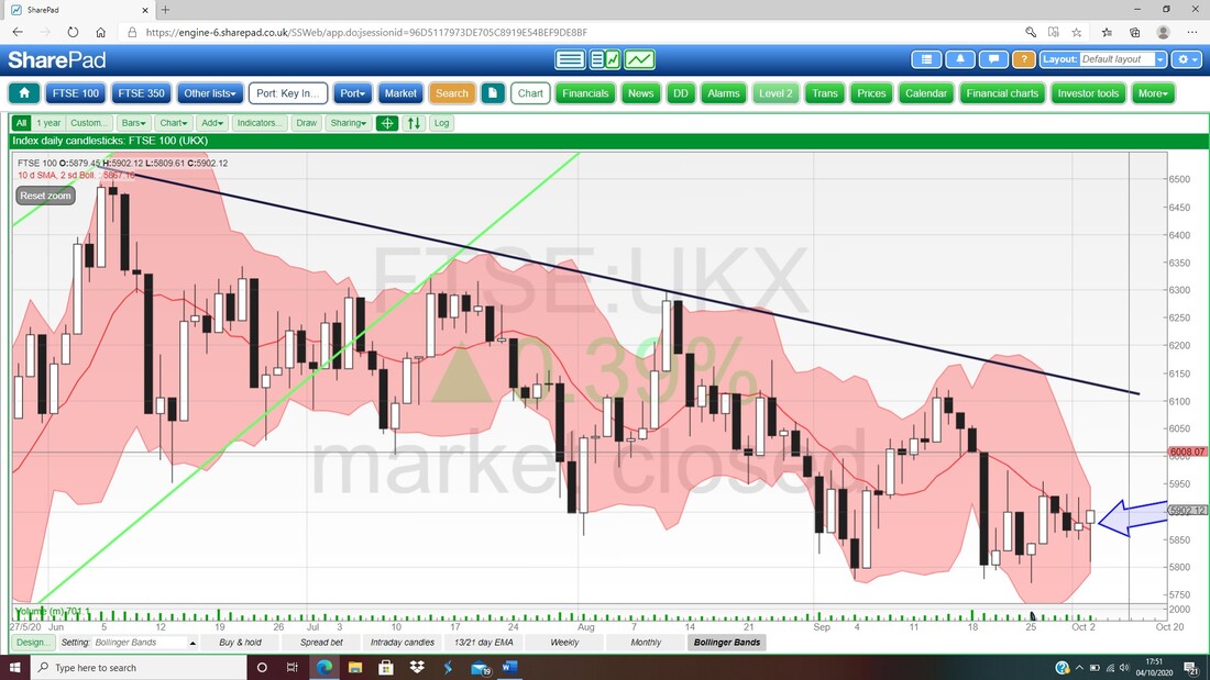
0 Comments
Leave a Reply. |

Stocks & Markets WheelieBlogsThese tend to be more Markets and Stocks related and timely - the Blog Page on the Main WheelieDealer Website has the 'Educational' stuff (well that's the theory anyway !!). Archives
October 2021
Categories
All
|
