

|
stocks & Markets blog |
|
From what I can tell those words are the title of an album by Lewis Capaldi and it did make me smile (to be fair, he probably didn’t mention BGO). I heard it during an interview with Ken Bruce on Radio 2 the other day and although I am no fan of his ‘work’, I must say Lewis was a great interviewee and has a charming self-deprecating manner.
I am so pleased to be about 95% ‘fixed’ now and incredibly the root of my difficulties seems to have been because a Doctor had told me to take Senna Tablets (nothing to do with Ayrton Senna but they do make you go fast !!) which are clearly quite a powerful laxative. I always assumed they were pretty mild because they are just chopped up and dried plant stuff, but I learnt the hard way that they are seen as quite ‘aggressive’ by the Health people.
I wish I had sussed this out earlier – I had probably 4 or 5 weeks of feeling pretty ropey and being unable to sit at my table and read stuff or to sit at my desk and type. It was incredibly frustrating as well although the perhaps positive side-effect was that I got several weeks away from updating my Websites and writing Blogs and after nearly 7 years, the break probably did me good. I have come back quite invigorated and enthused to get stuff done.
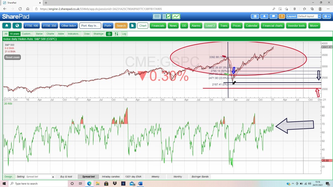
Fortunately the obvious main effect of a powerful laxative never actually happened to me in all those weeks; but I guess my paralysed body was freaking out because it must have been constantly feeling in a state of needing a dump !! It turns out I did have a Bladder Infection but this was an awkward distraction and smoke shield that covered up the real cause of my discomfort. Once I had the Emergency Doctor’s diagnosis and the Horse Pills he gave me, I just assumed the Infection was causing the trouble and it deflected me from the real problem. It is a bit disappointing that several GPs (why is it I can never get the same GP from visit to visit or phone chat to phone chat?) failed to figure it out but eventually one of them cracked it. With this experience highlighting to me the value in having some time away from writing, I might exploit this discovery in coming years around Xmas and not do too much. We shall see – in reality I will probably get bored and decide to write something anyway. Last Week Sheesh, these Markets feel like hard work at the moment and really turgid; like wading through super-cooled golden syrup. I guess after such an amazing Week 1 to 2021, we were due some sideways wiggling and that seems to be exactly what we have had to endure. I really hate sideways markets and in many ways I would prefer a proper drop because at least something is happening and of course I could be Hedging it. On balance though, I see no reason for a drop to be coming (apart from nutty valuations but that is another topic for another day or another format, such as the Podcast) and this sideways movement is most likely just Consolidation after the recent strong gains. So for my Portfolio to have gained 0.75% last week is ok really and I can’t whinge too much. I got hit hard on igIndex IGG after it put out a decent Trading Update but they also announced a big acquisition in the US and the Market didn’t fancy that one bit. I think it is an over-reaction but it is frustrating because IGG was getting near its All Time High and a potential Breakout; which could have led to more fairly quick upside. I am warming up to actually do some Trades very soon and one thing I have been looking at closely is a potential new Stock for my Income Portfolio. I am not quite ready to pounce but I will likely do something in the next couple of weeks or so. On my main Portfolio I have several Stocks I want to buy more of and I need to dump McCarthy & Stone MCS which is the subject of a Takeover Bid and it looks like the Deal is settled so I will sell in the Market and move the Cash on to one of the other tempting opportunities I want more of. Apart from that, I am sticking with the usual Strategy of staying pretty much 100% Invested and just monitoring the Indexes for any Technical Signs that I need to get Hedging via an Index Short or two. As I mentioned, there are countless worrying valuations but I am not sure they will cause a major Market problem (yet); but having said that I am wary of the usual seasonal pattern of Markets taking a hit in late February/March and perhaps April – so I will be on my guard with full focus once we get to those points in time. Blog Slate and more I finally managed to get out the ‘Scores on the Doors 2020’ blog and you can read this on WD1 in the ‘Educational Blogs’ bit. This includes a full and detailed breakdown of the 2020 performance for all my different Portfolios and also several other bits of relevant info like how much I spent in 2020 and also how some Portfolios I run with friends did. For what was perhaps one of the hardest years I have ever experienced on the Markets, my results were pretty reasonable and I am happy how it all turned out in the end. Just a shame 2020 was such a cruddy year in terms of C19 and the imprisonment etc. I also managed to update the ‘Monthly Performance’ page on WD1 and this means the entries for all the months of 2020 are now complete at the top of that page. My plan is to take that list of months and plonk it down at the bottom of the page and I will do this every year going forwards, so that over time there will be a historical record of the months and maybe some seasonal patterns will become evident. It could be interesting but of course will need around 5 years to get any kind of trend forming. Last night (I am typing this texty bit on Saturday evening) I made a start on a ‘Stock Buy Rationale’ blog but I didn’t achieve much and this will take several weeks to create I suspect. Anyway, I will work on it when I am in the mood and hopefully it won’t drag on forever. It is about a Stock I already hold and I will probably be buying more of them soon anyway. Later this coming week I will no doubt be recording Podcast TPI 41 with @Conkers3 and I already have loads of ideas for discussion items scribbled down on my cheat sheet. That will likely be out for next weekend. If you haven’t heard the Podcast, or didn’t even know I did one (can that really be possible?), then skip over to the ‘Twin Petes Investing Podcast’ page on WD2 and it’s all on there. From past misdemeanors Over the years I have written stacks of Blogs and they are all on these Websites somewhere or other. If you go to the ‘Blog Index List’ which sits on WD2, then you can find the full list of what I have written and there are links to the ones that matter. There is also a Search function you can use. This week I am dragging one out kicking and screaming which came from back in September 2018 (relatively ‘recent’ then) and covers an extremely important concept: https://wheeliedealer.weebly.com/educational-blogs/think-in-percentages OK, time for the pretty charts !! S&P500 As is always how things are done around these parts, all the Charts I show are Screen-grabs from the excellent SharePad software that I use and if you click on the images they should get a bit bigger so you can actually see them without your Mr Magoo specs. If you fancy experiencing the delights of SharePad or ShareScope yourself, then there are loads of ‘adverts’ around my websites where you can click through and get 1 month’s worth of Data for free. I get a payment from SharePad/ShareScope for introducing you and that will keep the Wheelie Beer Fund overflowing, ready for when we are actually allowed to enjoy a civilized pint of real ale in a pub. It is best practice in the Charting world to start with longer timeframes (the infamous ‘Big Picture’) and of course that is how I will look at the Indexes and I will drill-down through the Charts as I ‘analyse’ them. I am starting off with a Chart that is completely not valid !! (I don’t like using the word ‘invalid’ for personal reasons !!) Below we have the Monthly Candlesticks for the S&P500 and my Blue Arrow is pointing to the Candle which is forming up for January, but it is not truly applicable and valid until January 31st is out of the way. However, it is good to be aware of what is likely to shape up and because Markets for most of the time don’t have massive moves in a week, this does give us some clues for what lies ahead. My Green Arrow is pointing to a small Up Candle for December and this was Bullish and it turned out that way in reality. The thing to watch now is whether or not we can get a Big White Candle for January, but just with a long Tail pointing downwards, or, more worryingly, if we get more of a Hammer shape where we end up with a small Body on the Candle and this could mark a ‘Bearish Hanging Man’ sort of Candle. However, I suspect this is unlikely because we would need the S&P500 to drop in the coming week a bit (but not too much !!) and it would not make a ‘pretty’ Hammer shape. We shall see, but Bulls need to be alert that only a nice big White Up Body would suggest the run up is going to continue with a high degree of certainty. 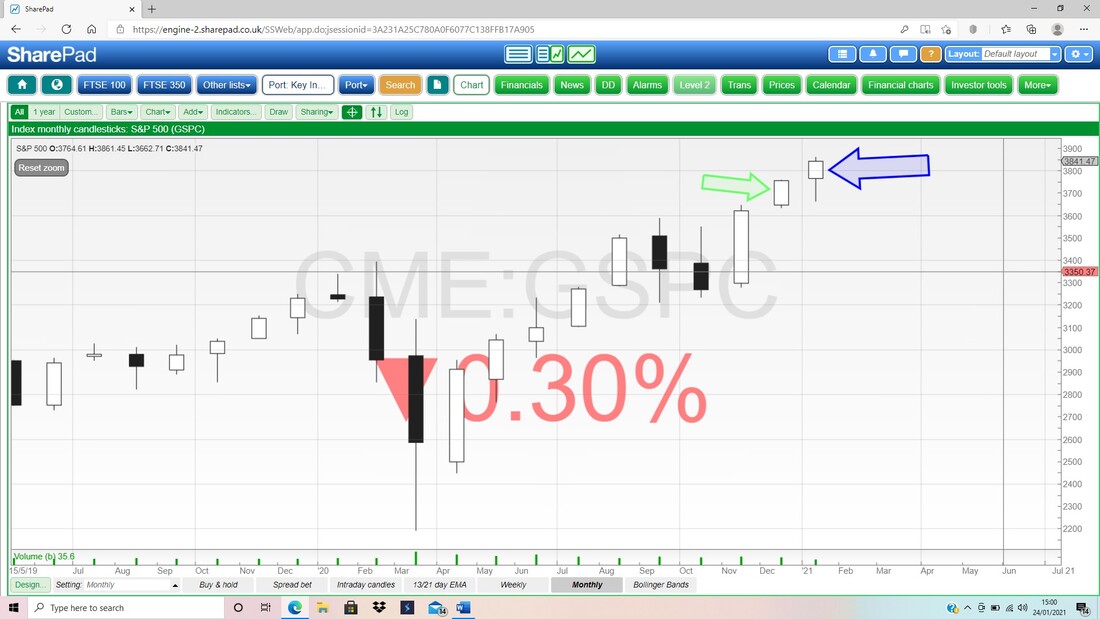
Next we have the Weekly Candles for the S&P500. This looks pretty good and my Blue Arrow is pointing to a reasonable White Up Candle from last week. From the week before that, we had a Small Black Doji Candle which could have been a ‘Turning Point’ down; but in the event the S&P500 kept managing to rise and negated the Turning Point.
Note my Parallel Black Lines which mark a pretty nice Uptrend Channel. This is still very much driving the moves. 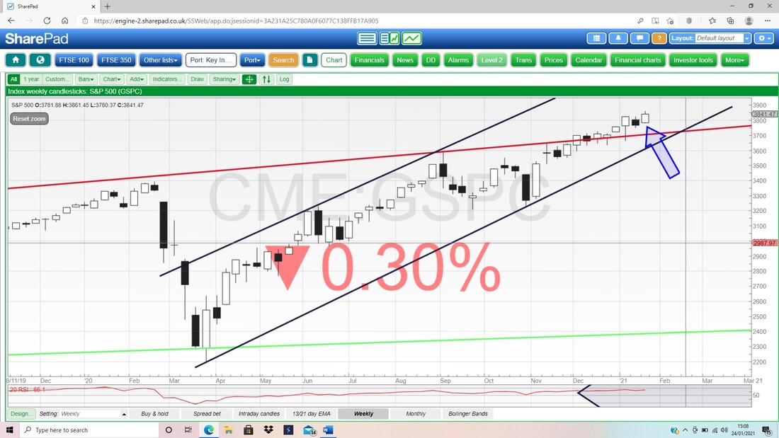
Next we have Daily Candles for the S&P500 but I am more interested in the Black Wiggly 13 Day EMA Line and the Red Less Wiggly 21 Day EMA Line (EMA is Exponential Moving Average – more weight is given to more recent values in the moving average calculation – but you don’t need to know this, just follow the Signals it gives). My Green Arrow is pointing to where we had a ‘Bull Cross’ between these Lines and this Signal is still very much in place and it tells us Bulls are still dominating here.
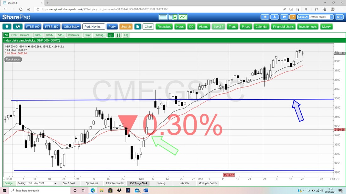
In the bottom window on my next Chart we have the RSI (Relative Strength Index) for the S&P500 Daily and on a Reading of RSI 67 where my Black Arrow is, this is very high and could limit immediate upside.
Lastly for the S&P500 we have the Daily Candles with the Pink Zone marking the Upper and Lower Bollinger Bands. My Blue Arrow is pointing to a Small Doji Candle from Friday and this doesn’t look particularly worrying. Fridays are notoriously weird and this is most likely due to lower volumes than the rest of the week and with Traders closing out Positions ahead of the weekend etc. Anyway, the Bands show that Uptrend Channel again although it is worth noting the Bands are quite tight together which might be a hint of something dramatic ahead – don’t get too concerned at this point (if you follow me on Twitter then you will see my thoughts on anything like this develop as I monitor the Charts every night).
My Green Ellipse is marking a nice Zone of Support just below and chances are this will kick in if there is any significant downside move. 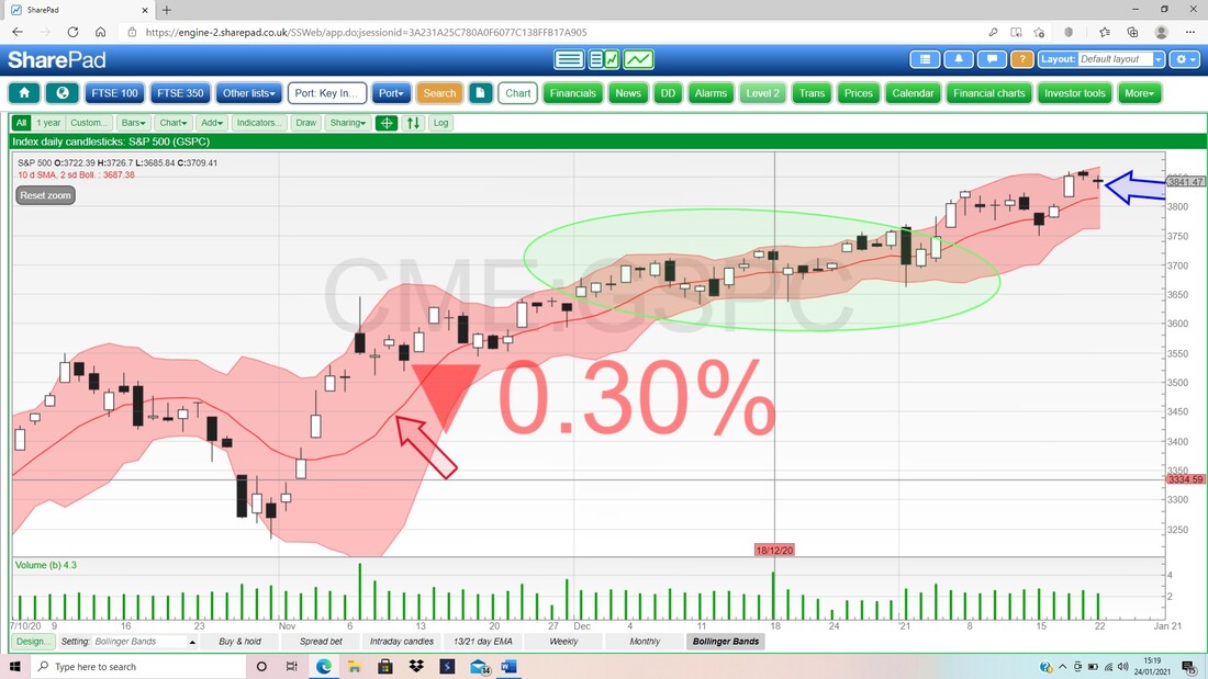
Gold Composite
Gold has been quite fascinating for a while and this is particularly because there are loads of Gold Bulls around (aren’t there always?) but it’s not 100% certain that Gold is going to rise. My Chart below for Gold Comp has the Daily Candles and the first thing to notice is that a few weeks ago I showed a Downtrend Channel which was formed by my Black and Blue Lines; and where my Green Ellipse is I am trying to show how Gold broke-out of the Downtrend Channel but it was unable to sustain the move and it fell back into the Channel. The current situation is interesting though because my Green Arrow is pointing to a stunning Hammer Candle from Friday which must have caused chaos amongst Gold Traders with such a huge move. Anyway, it clearly found Support down around $1800 and maybe this is Bulls showing that they are having none of this ‘nonsense’ by the Bears and they want to push Gold up (was it Options Expiry or something?). We are at quite an important juncture where Bulls now need to take the Price out of that Downtrend Channel and to do that in a sustainable fashion. We also need to watch those 13/21 Day EMA Lines (the 13 is the Black Line and the 21 is the Red Line) and at the moment they are in Bear Mode after a ‘Bear Cross’ (around 14th Jan) but some positivity in the next few days could trigger a Bull Cross. It is hard to know where this goes, but it will certainly be an interesting week. 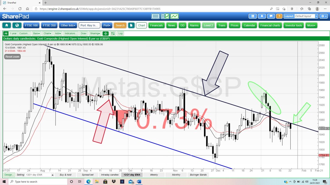
This next Chart for Gold Comp Daily shows how extreme the Friday move was. Look how the Tail of the Hammer fell out of the Bottom Bollinger Band (these Bands are based on Standard Deviations which are sort of the ‘usual’ or normal kind of move you can expect Gold Comp to do) and then recovered to get back inside the Bands.
Look also where my Blue Arrow is that we had 2 other recent days where the Price spiked down out of the Bands – this shows much volatility and extreme moves. For Day Traders, the way these Bands can help identify extreme moves can be really helpful for pocketing cash out of such panics. 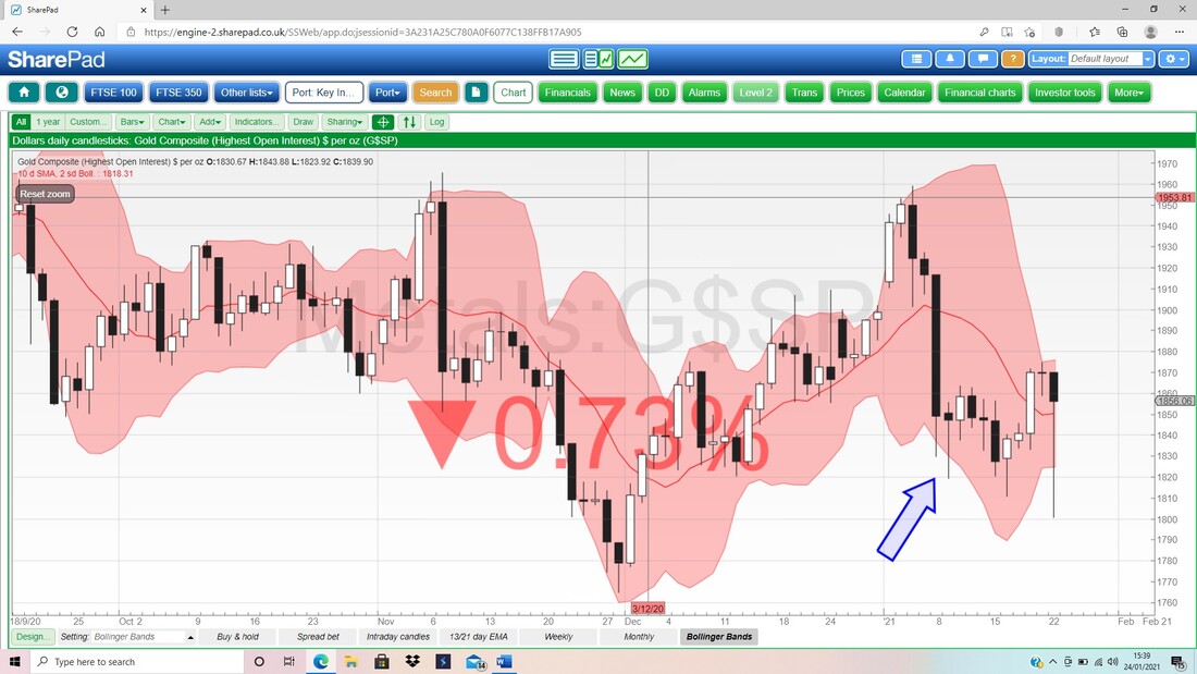
FTSE100
I won’t show Brent Oil this week because I have other Charts I want to cover. However, I will no doubt be commenting about Oil on Twitter in coming nights. First up the Monthlies on the FTSE100 and remember, the Candle for January is not yet valid but at the moment it doesn’t look too good and we need some positive upside this coming week to beautify it a bit !! My Red Arrow is pointing to the January Candle so far, and with a Long Wick pointing upwards, this is a bit bearish looking. If we can rise a bit in the coming week then this won’t be such a problem but if we fall in the coming week then the picture could look much worse come Friday !! My Blue Candle is pointing to the Candle from December and look how similar it is to what we have for January at this stage. It is interesting that the December Candle could have been interpreted as a bit bearish, but in the event it wasn’t a problem. 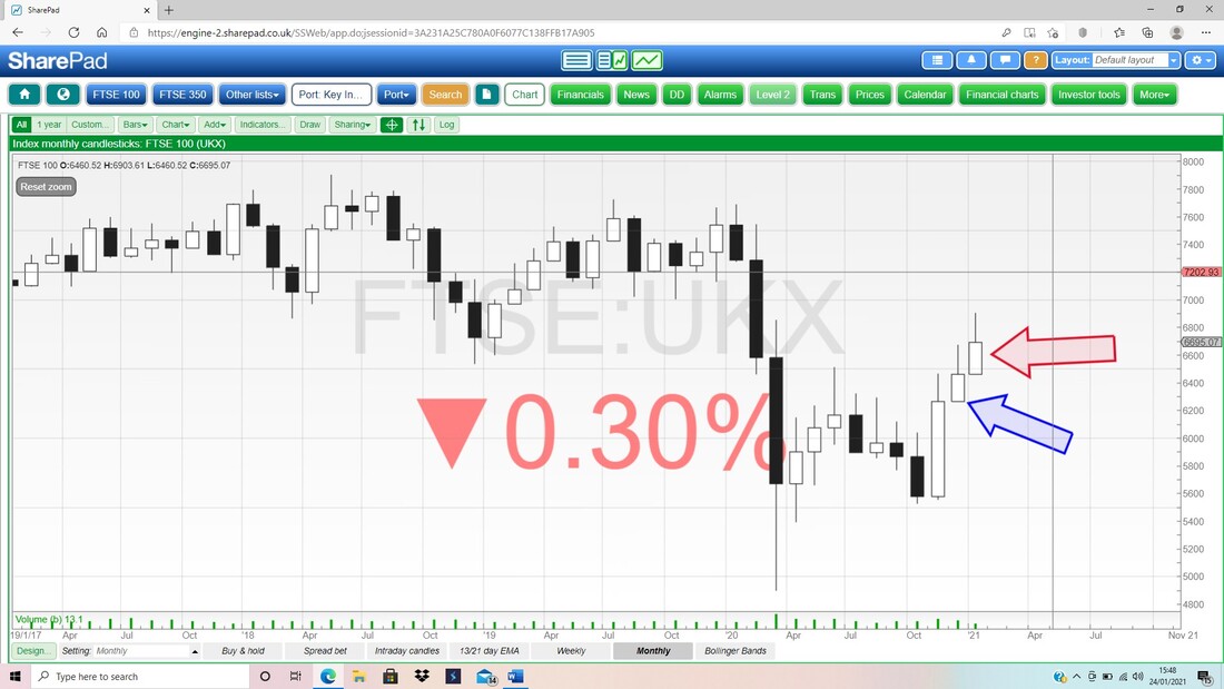
Next the Weekly Candles for the FTSE100. My Blue Arrow is pointing to a nice Doji Candle from last week and after the Small Down Candle from the week before, this could be a Turning Point and we might see a rise now. However, if it continues to drop, there is at least some decent Support just below.
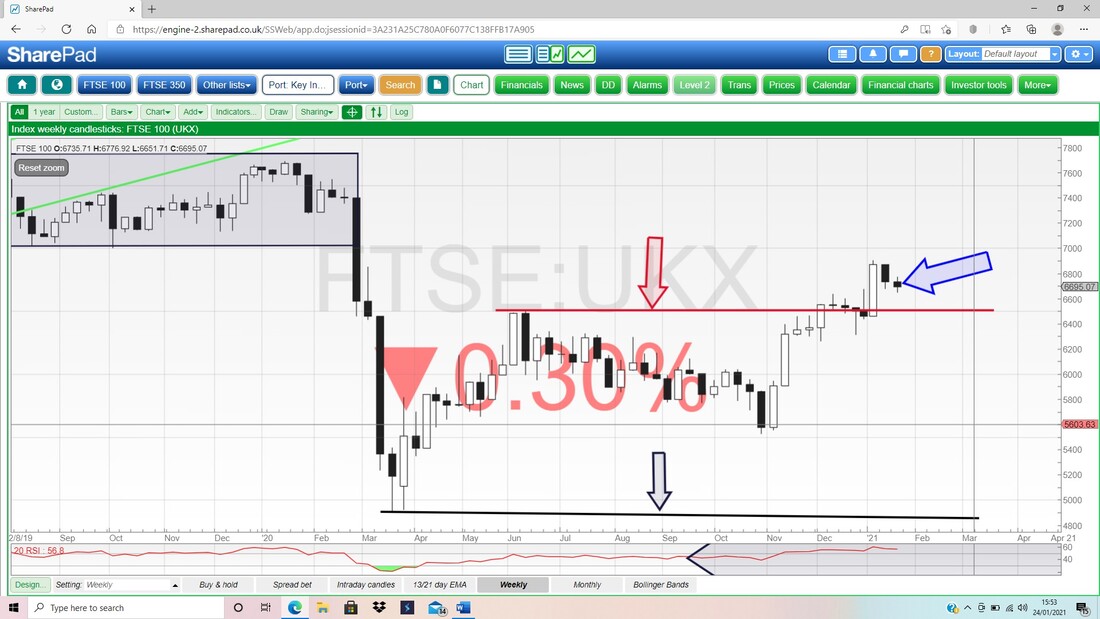
This is sweet. Next we have the Daily Candles but what I am firstly fixated on is the Bull Cross between the Black 13 Day EMA and the Red 21 Day EMA from where my Black Arrow is, and this is still in force so we are in ‘Bull Mode’. Look how predictive that Bull Cross has turned out to be.
Next have a look at my Parallel Blue Lines and now how the Hammer Candle from Friday dipped down exactly to my Bottom Blue Support Line and then reversed up (where my Blue Arrow is pretty much) - that is nice. It is quite possible the FTSE100 moves up from both my Bottom Uptrend Line and the Hammer. 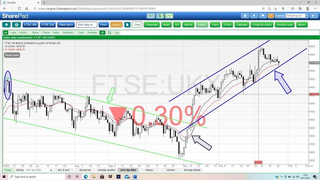
Bango BGO
I hold BGO myself (see my ‘Trades’ page for details and I also wrote a ‘Stock Buy Rationale’ Blog about it recently) and the Chart is quite interesting now. Starting with the big picture, my rather messy looking Chart below (this is because it has the Pink Bollinger Bands on it which show up better on short timeframes) goes back to 2005 and shows how BGO has moved very much in a wide range over that time between around 30p at the bottom and near 300p at the top. 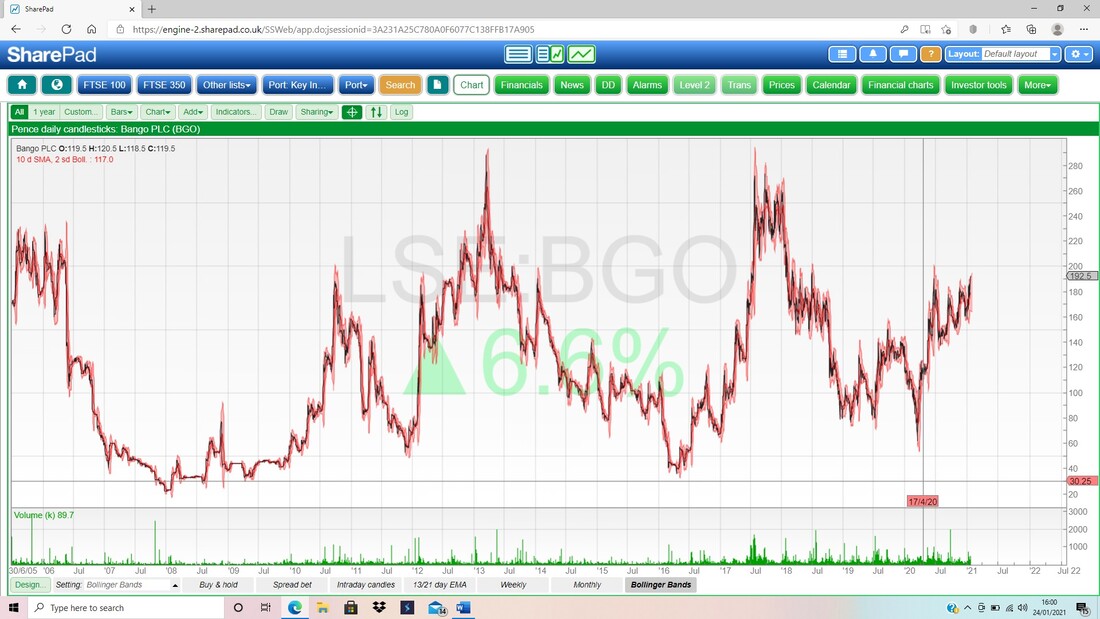
Loads on this Chart so you will need to be on top of your game !! This has the Daily Candles but on this timeframe (back to late 2017) you won’t be able to see them individually, but first off look at my Black Arrow which is pointing at a Peak at 193p and on Friday BGO Closed pretty much exactly here. We need the Price to Breakout cleanly over 193p and then we are not far to 200p and this is marked by my Black Ellipse over to the left.
If we can then Breakout over 200p the next Zone of Resistance comes in to play between about 220p and 280p, where my Red Arrow is. The key thing here is to crack the High from my previous Chart which is about 300p – crack that and we should see significantly more upside. The Green and Blue Horizontal Lines are my method for marking on SharePad where I bought my Positions. My convention is a Blue Line for a Spreadbet and a Green Line for Normal Shares. 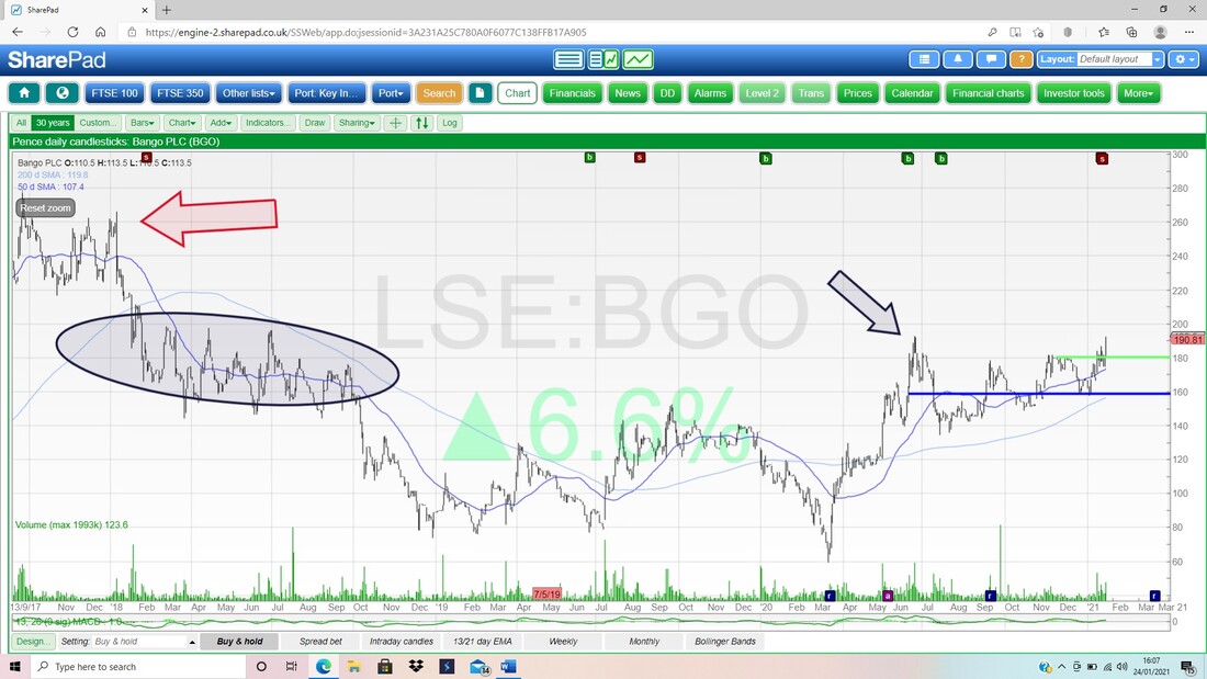
For a while on Twitter I was talking about a ‘Triangle Squeeze’ on BGO and I wanted to show that on a Chart so Readers can understand what I was gibbering on about.
The Triangle is marked on my Chart for BGO Daily Candles below as the Green Lines and note how the lower line was ‘squeezing’ up towards the Horizontal top line. Invariably when you get these Triangle Squeezes, they will pop out of the top (as BGO has done). My Blue Arrow is pointing to a Bull Cross on the 13 and 21 Day EMA Lines and my Red Ellipse is marking the Big White Up Candle from Friday where it Broke higher. OK, that’s it for this week. Have a good one and keep well out of trouble !! Cheers, WD. 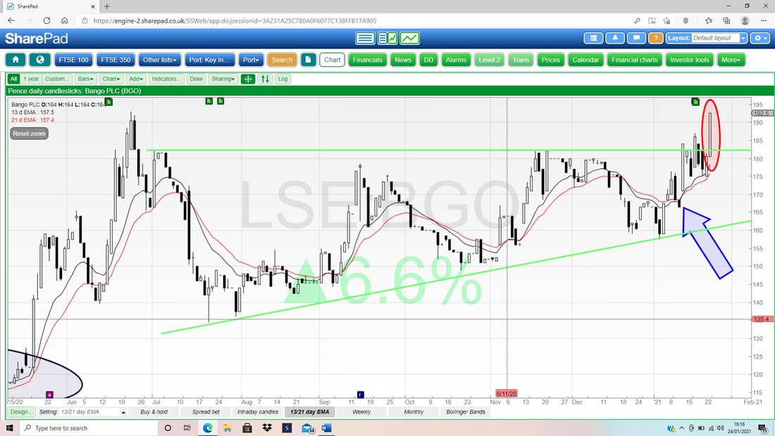
0 Comments
Leave a Reply. |

Stocks & Markets WheelieBlogsThese tend to be more Markets and Stocks related and timely - the Blog Page on the Main WheelieDealer Website has the 'Educational' stuff (well that's the theory anyway !!). Archives
October 2021
Categories
All
|
