
|
stocks & Markets blog |
|
I’m starting this late tonight so I will try to keep it short, although of course that tends to be against my nature once I get near the keyboard. The Markets took quite a beating on Friday and I want to get to the Charts and see what they are telling us with regards to the liklihood of further falls - it is clear that the Brexit thing is just utter chaos and anything could happen on that score with some scary possibilities like a General Election or various ways of extending the pain coming into view. The last thing this Country needs now is to keep stretching out the pain as Consumer Confidence hits the floor and Business Investment just dries up. Throw in the Economic woes across Europe and with China looking as iffy as it has done at any time over the last 20 years, then the backdrop is not pretty. Oh, and we have the Mueller Report about to become public and even though the brief is that there are no further bits of Court action coming from it, that doesn’t mean that Trump has got off scot-free - it could easily be the final straw in his, er, turbulent, Administration.
I meant to start this scribble with the next bit but I just got flowing and now it will sit here. I heard this somewhere last week and it touched a nerve and I felt it could be applied to the crisis Theresa May now finds herself drowning in. I can imagine her saying this in a Press Conference. This is roughly what the Emperor of Japan said at the final stage of World War 2 when he was addressing the Japanese Nation to announce the Surrender after 2 Atomic Bombs had just been inflicted upon 2 major Cities:
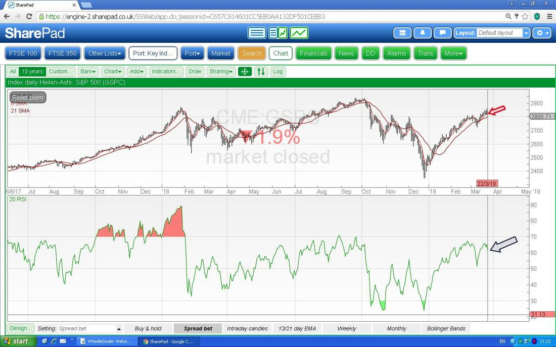
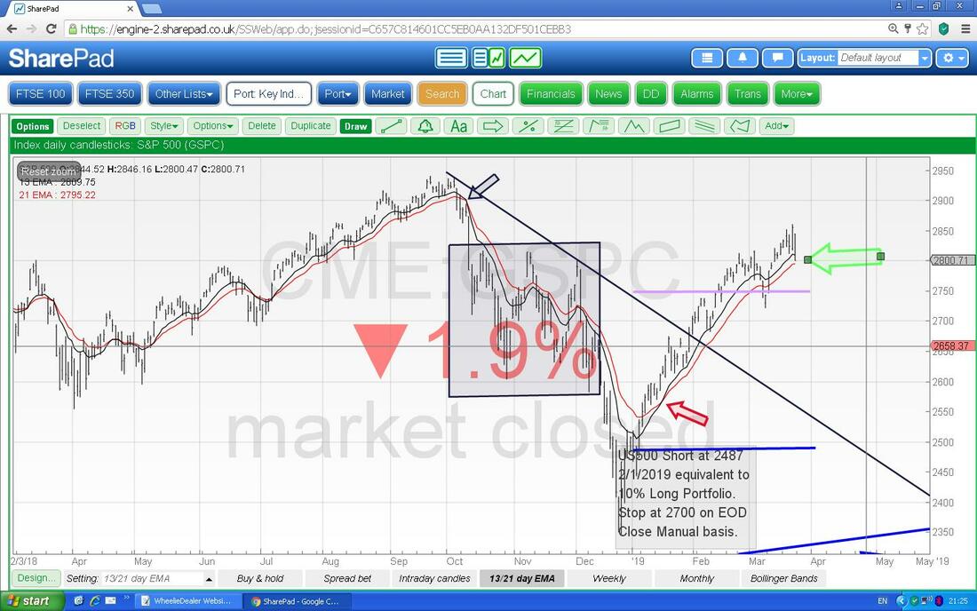
“Recent events have not gone entirely to our advantage……” Or as T May would say: “Nothing has changed…..” Last Week My Portfolio suffered quite a hit last week with it ending up down 1.75%. Much of this was endured on Friday although my Index Shorts helped reduce the damage on that particular day but earlier in the week I had the irritating situation where my Stocks would be falling but the Shorts would be hurting me as well because the FTSE100 and the S&P500 would be going up. It is a typical mismatch between the components of my Share Portfolio and the stuff in the FTSE100 etc. but I don’t think it is something that I should get overly stressed about. The simple fact is that although the FTSE250 would perhaps be a better ‘tool’ to Hedge with, it has the 2 significant drawbacks of firstly needed massive amounts of Margin Deposit to Short it on a Spreadbet or CFD and secondly it can only be traded during Market Hours and quite often I like to open or close my Index positions ‘Out of Hours’ which strangely you can do on the FTSE100 and other really big Indexes. It is clearly suboptimal but at least on Friday the FTSE100 fell with the FTSE250 and everything else so when it really matters, when Markets in generall are falling together, the FTSE100 does look like it will help me. It is this ‘Market Risk’ that I am trying to hedge against (as opposed to ‘Stock-specific‘ Risk which I lower by Diversification etc.). The other gripe is that there is a definite asymmetry with my Stocks - I find that when the FTSE100 goes up strongly (and therefore my Short Positions take a big hit), my Stocks might move up but they don’t move up as much and the ‘offset’ is less than perfect. However, when the Markets are falling, I find that my Stocks fall lots more than the FTSE100 does so it fails to reduce the damage to my Portfolio to the extent I would like. It is a pain but it does vary and sometimes the effect is not so awkward and against me. Anyway, with the problems that are facing us on the Political front and with various bits of evidence that most major Economies apart from the US are looking shaky, I am happy to keep my Strategy as it has been for all of 2019 and to remain heavily Hedged and very cautious about doing anything much. I am largely happy with the Stocks I hold and want to keep this as it is and hopefully if Markets do take a bit of a hit, then the Hedges will start to turn my way and offset much of the damage. With Summer supposedly not far off, I suspect that it won’t take much for nervous Stock Holders to dump what they have and I just can’t imagine many People being all that eager to buy stuff. I can’t believe the sacrifices I make sometimes to bash out this bilge for you Readers - the latest that has been niggling me for a while is that whenever I get into some serious typing, I get pins & needles in my left hand and elbow. I have no idea why this is happening and I can only guess it is because I am putting weight on my left arm for some reason - it is really bugging me now !! Briefed Up If you have looked at the ‘Useful Links’ page recently you might have noticed a Link there to my mate Jon’s Website (@BriefedUp on the Tweeterer). Anyway, I just wanted to highlight to Readers that he does a FREE Report thing that you can sign up for and these are for specific Stocks that he covers. It is worth a look and Jon is offering something very good here that is worth taking advantage of. You can find more details here: https://briefedup.com/ This page gives details of the Report and you can see an example down the bottom and right at the bottom you can sign up for the FREE Reports: https://briefedup.com/parity-peg-price-report-a-guide/ Master Investor Show I PUT THIS EXACT TEXT IN A WEEK OR SO AGO BUT I FELT IT WAS WORTH REPEATING AS IT IS A GOOD OPPORTUNITY FOR A LOAD OF US TO MEET UP AND HAVE A CHIN WAG ABOUT STOCKS ETC. I have finally made a decision and I intend to be at the Master Investor Show in Islington at the Business Design Centre on Saturday 6th April and I will get there around 12 noon and normally I tend to hang out in the Restaurant/Canteen area bit for most of the afternoon. As a Wheelchair User I am easy to spot so come and say “Hi” if you are there. The UK Investor Show which is at the Queen Elizabeth Conference Centre in Westminster (just over the road from the Parliament Madhouse) is the Weekend before on Saturday 30th March but with them so close together I don’t want to attend both of them and the Islington one is an easier drive for me really. The Tickets are £20 normally for Master Investor but if you do a Google Search and put in ‘Master Investor Discount Codes’ then you should be able to get FREE tickets (shout if you have no success with this). You can find out more about the Master Investor Show here: https://events.masterinvestor.co.uk/master-investor-show/about-the-show/ And the UK Investor Show is here: https://www.ukinvestorshow.com/ Blog Slate A few days ago I published the 2nd Part of those ‘Mechanics of a Trade’ Blogs which tries to dig into the process of Buying and Selling a Share and what happens ‘behind the scenes’ and how this moves the Price and all that. I think the next Part (probably the final one) is in good shape and I will most likely issue that later this coming Week - depending on how distracted I get by Brexit and the potentially tasty weather that is on the cards !! For all the angst and stress that the Brexit fiasco generates, it is strangely quite fascinating……. Last night I made good progress on the Blogs about what I look for when I read Company Results announcements and Trading Updates in the mornings and I think this will evolve into 3 separate parts and hopefully the first of these will emerge in the next fortnight. I am quite pleased with what I have ‘created’ so far and I think Readers will find this very useful. My current thinking is that I am going to use MPAC as an example to explain a particular concept around what I am looking for on Company Updates and this will probably be Part 3 when it turns up in a few Weeks. There is something else lurking in the background which I won’t tell you about just yet but I think that could appear later this Week - keep your eyes peeled !! Oh, and don’t forget to listen to the TPI Podcasts - go to the ‘Podcasts/Videos’ page on WD2 and you can find Links. And I also put a Link to Michael’s (@Vilage_Idoit) FREE eBook on the ‘Weekly Performance’ Page last Week and this is something worth getting a copy of. This Weekend’s pointer for stuff on the Websites A slight detour from the usual ‘Memory Lane’ stuff this Week where I try to introduce Readers to Blogs I have produced in the past in an attempt to make people aware of what is in the Archive (I am so pleased to see new Twitter Followers and more and more Readers on the Websites but I worry that many aren’t aware of how much stuff there is buried away that is well worth taking advantage of). Anyway, all I am going to say this Week is have a look at the ‘M3 Manifesto’ Page because there is loads of quality information on here about how to run a Portfolio - I unusually looked through it myself a few Days ago and had forgotten just how comprehensive it was - well worth a reminder if like me you haven’t seen it for a while: http://wheeliedealer.weebly.com/m3-manifesto.html Now the Charts then……. Oh, and “Hi” to all those New Readers……. S&P500 This doesn’t make much sense - I have been typing away quite merrily and now my arm and hand are fine - very strange. As always the Charts are grabbed from the wunderbar SharePad Software that I subscribe to and if you click on the pics then they should get bigger (assuming I have highlighted the right box when uploading them of course !!). I have a relatively small Short on the S&P500 so I am quite focused on this one and the FTSE100 and if you look back at last Weekend’s Markets Blog then I wrote quite a lot about my Strategy for the Hedges I have. The Chart below has the Daily Candles going back around 5 Months or so. Sorry about the mess on it and the best way to understand this is to follow my guidance according to the Arrows. First off my Red Arrow is pointing to a Big Black Down Candle from Friday and this looks quite Bearish although we must remember it was on a Friday where Volumes are often low and weird moves can happen. On the Thursday just before we had a Big White Up Candle and note that it failed up at about 2860 so this is now Resistance and is really the key level that needs to be cracked. My Black Arrow is pointing to the Black Horizontal Line and this was Resistance for quite some time and the Breakout on Thursday was Bullish but the failure to ‘follow through’ (that was lucky, nearly needed new undies !!) is a negative sign and more Bearish stuff. My Blue Arrow is pointing at the slanting Blue Support Line and the Big Black Down Candle from Friday stopped at this Level and if it falls below this and most important CLOSES below this then that would be bad. There is Support at 2722 which must hold - if it fails, then expect more trouble. My sort of Pinky Arrow is pointing to where the Darker Blue Wavy Line which is the 50 Day Moving Average is moving up towards the Lighter Blue Wiggling Line which is the 200 Day MA - if they cross, then this is a Bullish Sign for a longer time period - however, it is not a hugely reliable Signal and it can achieve a ‘Golden Cross’ and then drop back and do a ‘Death Cross’ quite quickly. The 50 Day MA Line could act as Support. 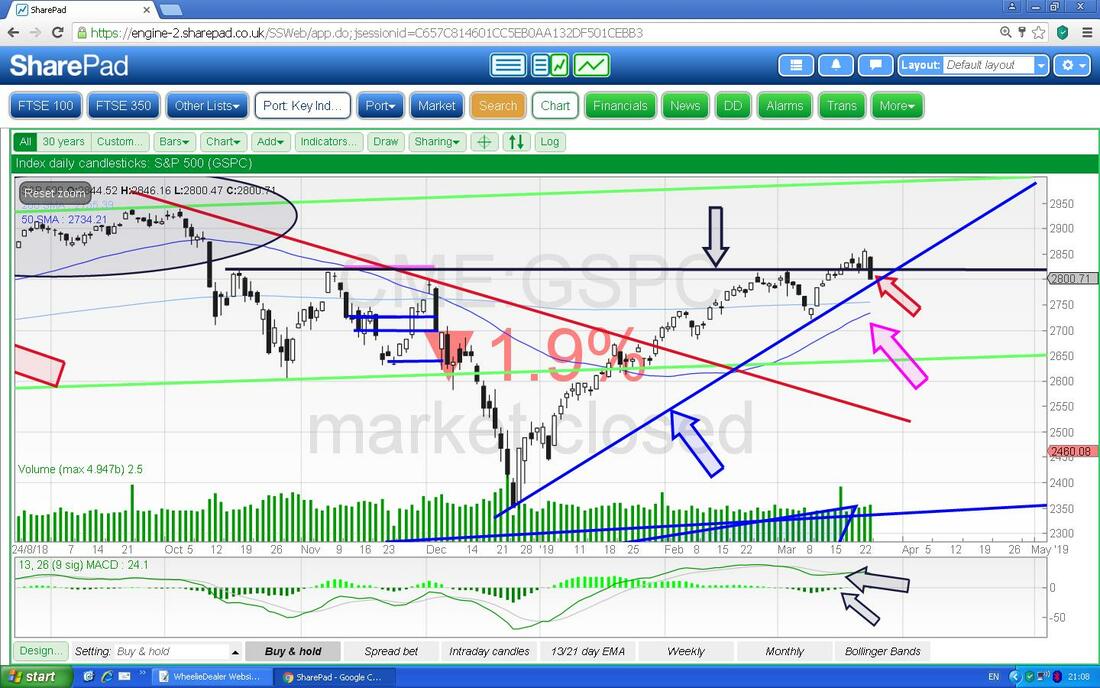
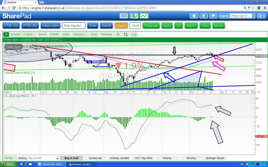
The next Screen merely takes the image from the Chart I have just shown and now I have dragged the ‘centre line’ up so that we can see more detail on the MACD Indicator. Where my Black Arrows are we have a Bearish MACD Cross (Moving Average Convergence Divergence) which happened just after a previous Bullish MACD Cross - again it is a failure to ‘follow through’ (another pair of Boxers saved). You can see this best on the Histogram Bars format I find, which I have pointed at with the Bigger Black Arrow and the Signal Lines format above shows it but not so clearly.
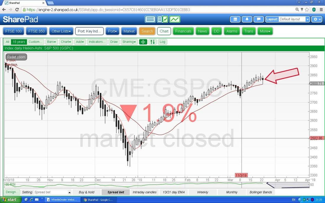
Now we have the Daily Heiken Ashi Candles for the S&P500. My Red Arrow is pointing to a Narrow Black HA Candle and note how it has changed colour from Bullish White to Bearish Black but as yet it has merely ‘gone narrow’ and to get more worried you would need to see a Big Black Down Candle soon.
In the bottom window below we have the RSI (Relative Strength Index) for the S&P500 Daily. My Black Arrow is pointing to where we have a reading of RSI 61 which is not crazily high but it is really about the direction of travel and this is moving down from a higher Level, which is consistent with what we saw on the Candles above.
On the next one I am drawing your attention (wake up !!) to the Green Arrow and this is trying to show that the 13 Day EMA Line (Exponential Moving Average), which is the Thin Black Wavy Line is above the 21 Day EMA which is the Red Wavy Line. I love this Indicator and it tends to be highly reliable and predictive - at the moment we are in Bullish Mode after a Bullish Cross back where my Red Arrow is and what Bulls don’t want to see is a Bearish Cross as per the Black Arrow from back in October. You can see from these Crossovers how predictive these are.
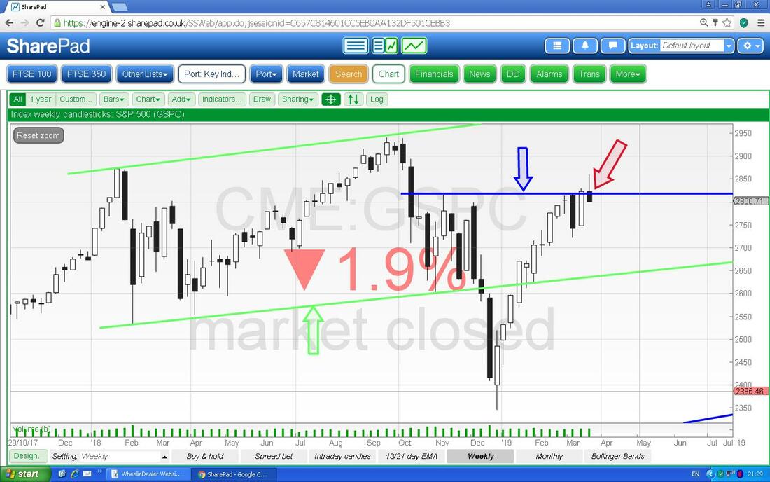
Oh dear, this doesn’t look too good. Now we have the Weekly Candles and my Red Arrow (please ignore the others) is pointing to an Inverted Hammer Candle from last Week and in this context of a really strong run up (too far and too fast I would say !!) this could very easily mark a turn in direction. This is text-book really.
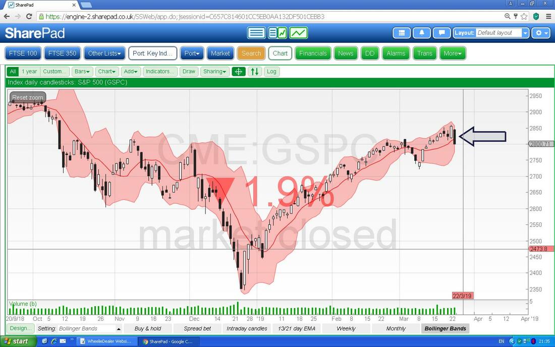
Next we have Daily Candles with the Pink Zone marking the Upper and Lower Bollinger Bands (these are based on Standard Deviations). My Black Arrow is showing where the Price has fallen away from the Upper Band but this is not necessarily something for Bulls to panic about from what this is telling us. It is quite possible that the Price could drop down a bit but still be nicely within the Bands and just a normal wiggle in the big scheme of things.
Nasdaq Composite
I won’t show much on the main Tech Index because it is pretty much the same as the S&P500 in what its Charting stuff is showing although the RSI is a little more extreme. Anyway, the Chart below has the Weekly Candles and my Black Arrow is pointing to a Bearish Inverted Hammer like on the S&P500. I find that the S&P500 moves very much like the Nasdaq and less like the DOW (Dow Jones Industrials Index - just 30 mega Stocks) and I have been saying for a while that the run up in the Nasdaq has been far too strong and we are pretty much back near the All Time Highs. It doesn’t make a whole load of sense when back in 2018 everyone was saying the Nasdaq was overvalued, yet that has now been totally forgotten. 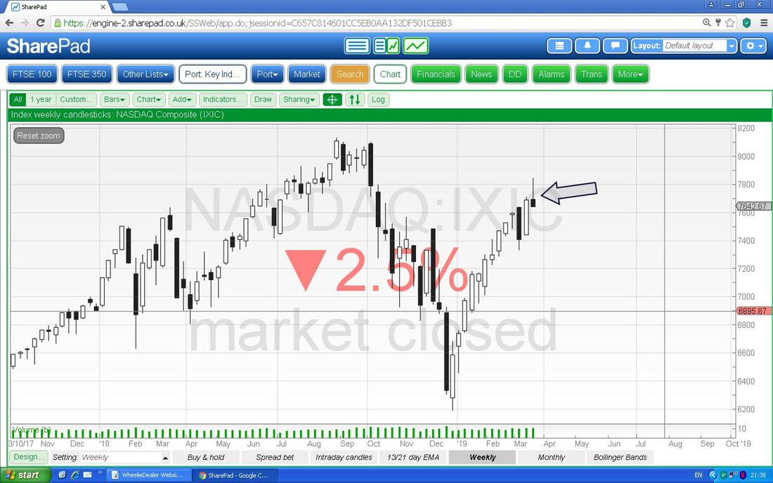
DOW
I won’t take long on this one but I just noticed this on the Weekly and it is a bit different to the other 2 major US Indexes that I already covered. Here we got an Inverted Hammer type Candle last Week but in this case the ‘context’ is not so sweet because it is not at the top of a run up. However, note my Blue Arrow which is pointing to a ‘Narrow Body Doji’ or ‘Spinning Top’ if you like - this was clearly the Turning Point (if you look back a few Weeks ago I suspect I flagged this at the time - I should have !!). Anyway, it looks bearish. 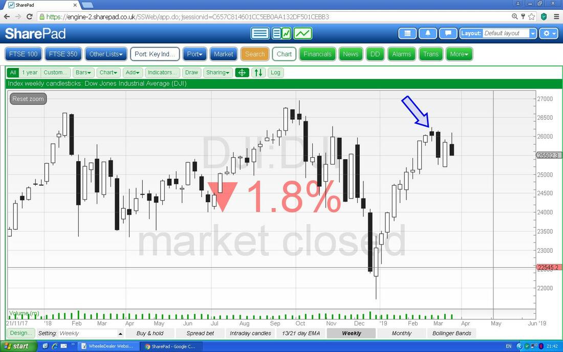
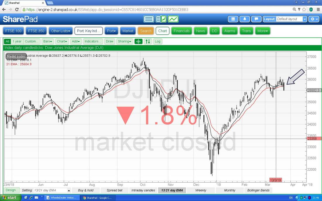
This is something to watch. Here we have the Daily Candles for the DOW but what I am trying to show is the 13 and 21 Day EMA Lines (see my comments on the S&P500 above). Here my Black Arrow is pointing to where we are now with the 13 Day EMA above the 21 Day EMA but note they are much closer than on the S&P500 or Nasdaq and this is something to watch - we could get a Bearish Cross very soon.
FTSE100
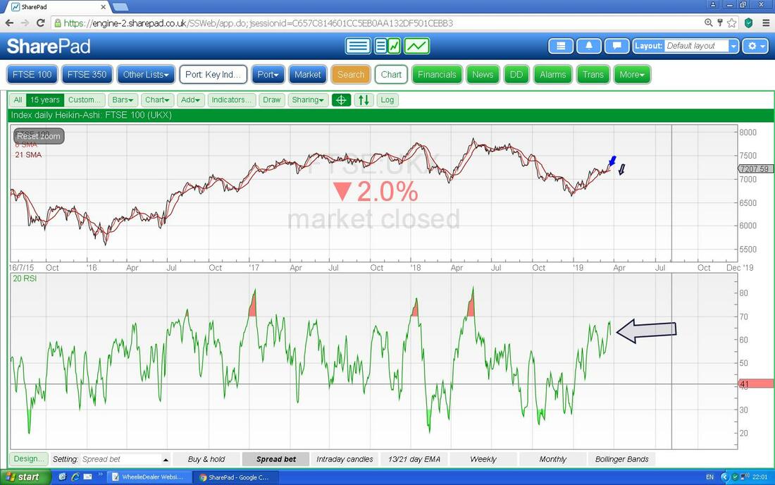
My big Short is on this one so I am particularly fixated on what is happening here. First off we have the Daily Candles and despite the Big Black Down Candle from Friday which is pointed at with my Blue Arrow, there is overall quite a Bullish picture here. In terms of Resistance the FTSE100 needs to get over 7370 in the near term and for Support we are down around 7041 for the really important level. If you look in the Top Left then you should see a Red Arrow which is marking a Bearish ‘Death Cross’ between the 50 and 200 Day Moving Averages and if you follow these along you should see that the Darker Blue 50 Day MA is moving up towards the 200 Day MA - we are near a Bullish ‘Golden Cross’ but there are no guarantees. Obviously much of what happens to the FTSE100 will be influenced by how the Pound moves in relation to developments on the Brexit catastrophe - but if we see Major Global Indexes turn down then the FTSE100 will probably go with them. 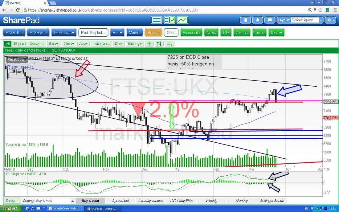
The next Chart has the Daily Heiken Ashi Candles and my Blue Arrow is pointing to a Black Narrow HA Candle from Friday which hints at Bearishness but is only confirmed if we now get a Big Black Down HA Candle.
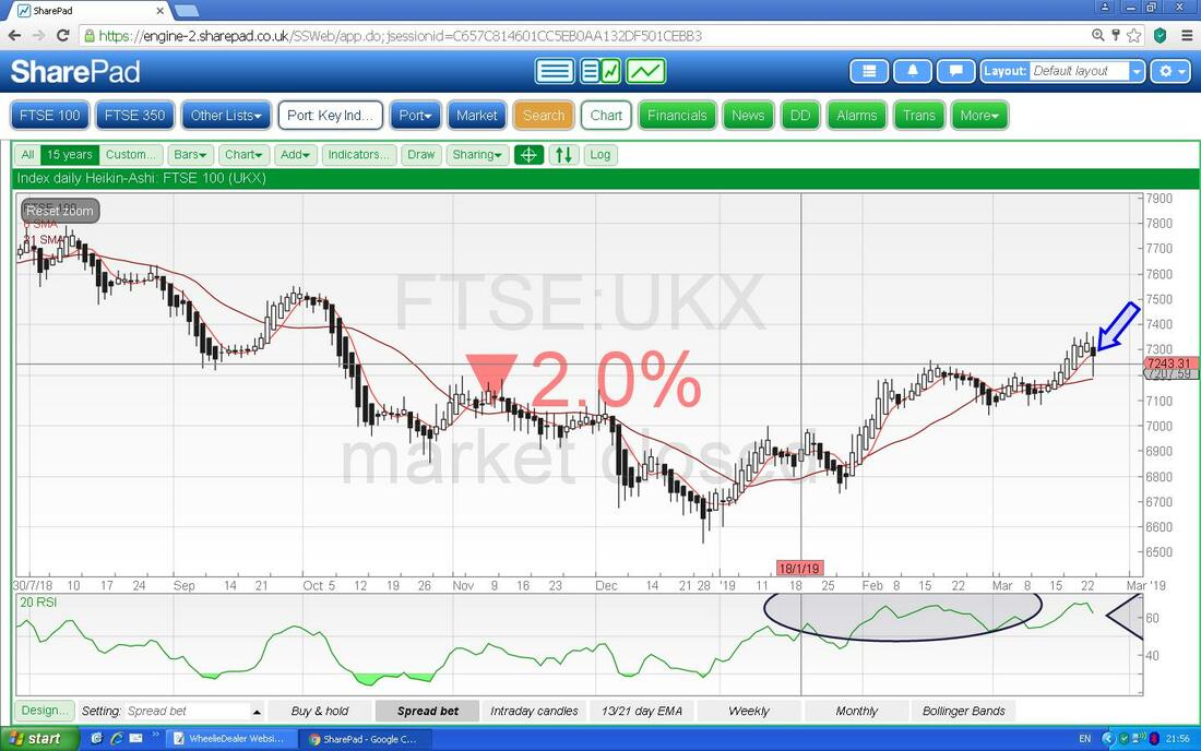
In the bottom window below we have the RSI for the FTSE100 Daily. On a Reading of RSI 62 where my Arrow is, this is quite a high level and it has turned down.
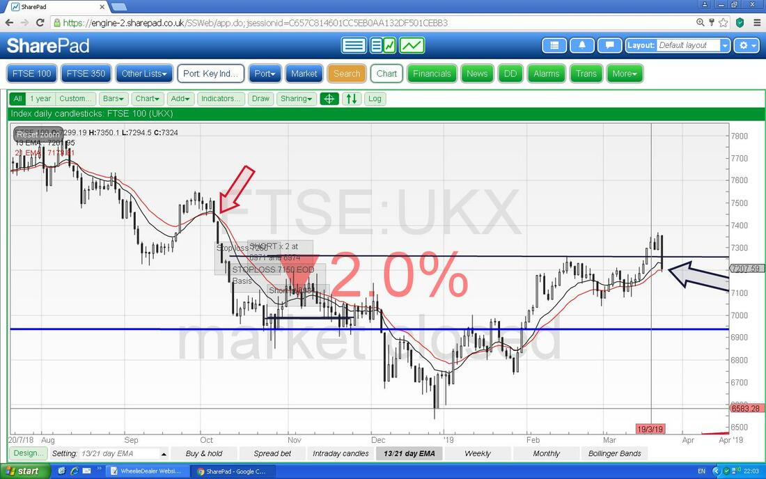
The next Chart has the Daily Candles with the 13 and 21 Day EMA Lines. My Black Arrow is pointing to where we are now and this is still in Bullish Mode. Bulls don’t want a Bearish Cross which is as per my Red Arrow.
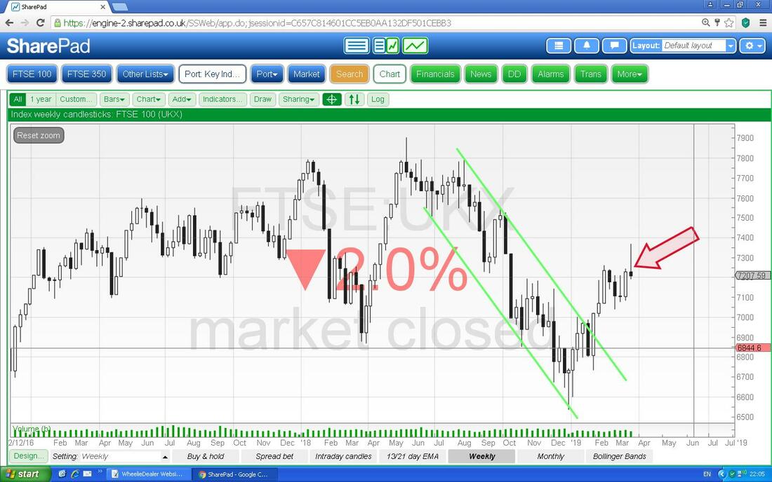
Now we have the Weekly Candles - this is quite a shocker. My Red Arrow is pointing to a cracking example of a Bearish ‘Shooting Star’ kind of thing - not nice and especially in the context of the run up.
This final Chart has the Daily Candles with the Bollinger Bands. My Black Arrow is pointing to where the Price has dropped back to the mid point but this is all in order and quite normal behaviour. This isn’t concerning on its own but that Weekly Candle doesn’t look so good that I showed on the previous Chart.
Right, I will leave it there. Good Luck for the coming Week and I hope your Portfolios withstand any storms ok. Cheers, WD. 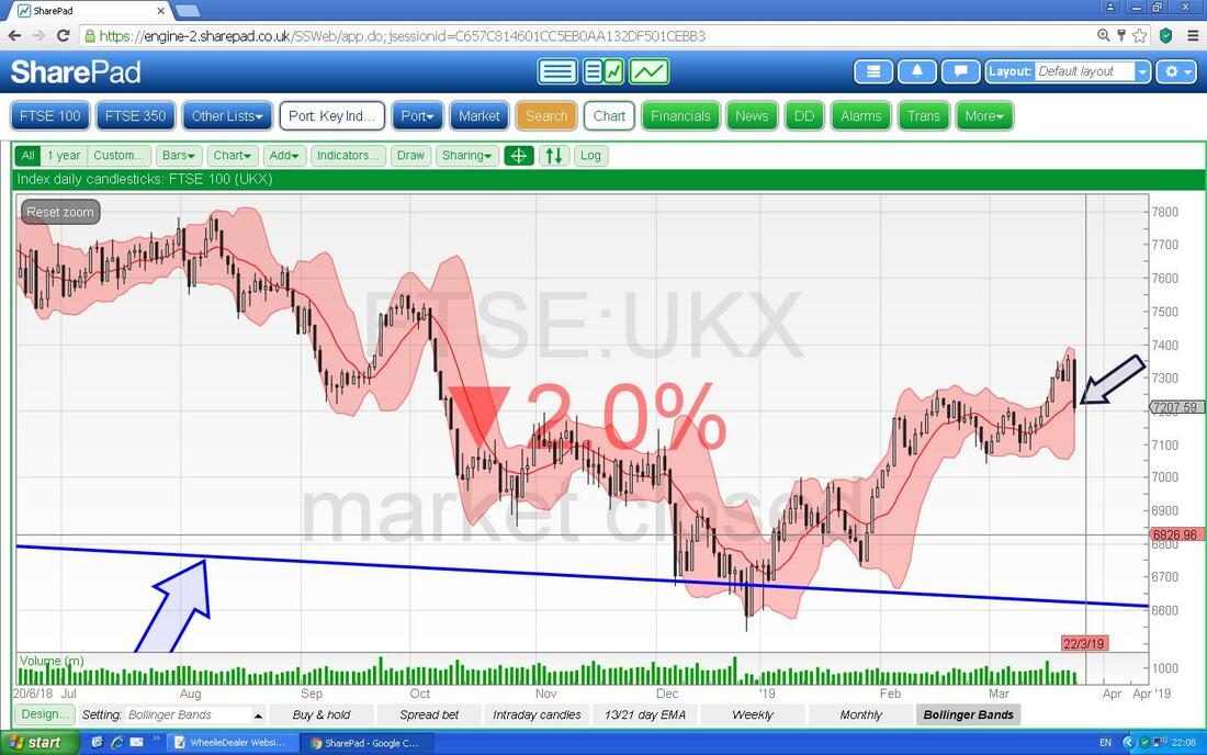
0 Comments
Leave a Reply. |

Stocks & Markets WheelieBlogsThese tend to be more Markets and Stocks related and timely - the Blog Page on the Main WheelieDealer Website has the 'Educational' stuff (well that's the theory anyway !!). Archives
October 2021
Categories
All
|
